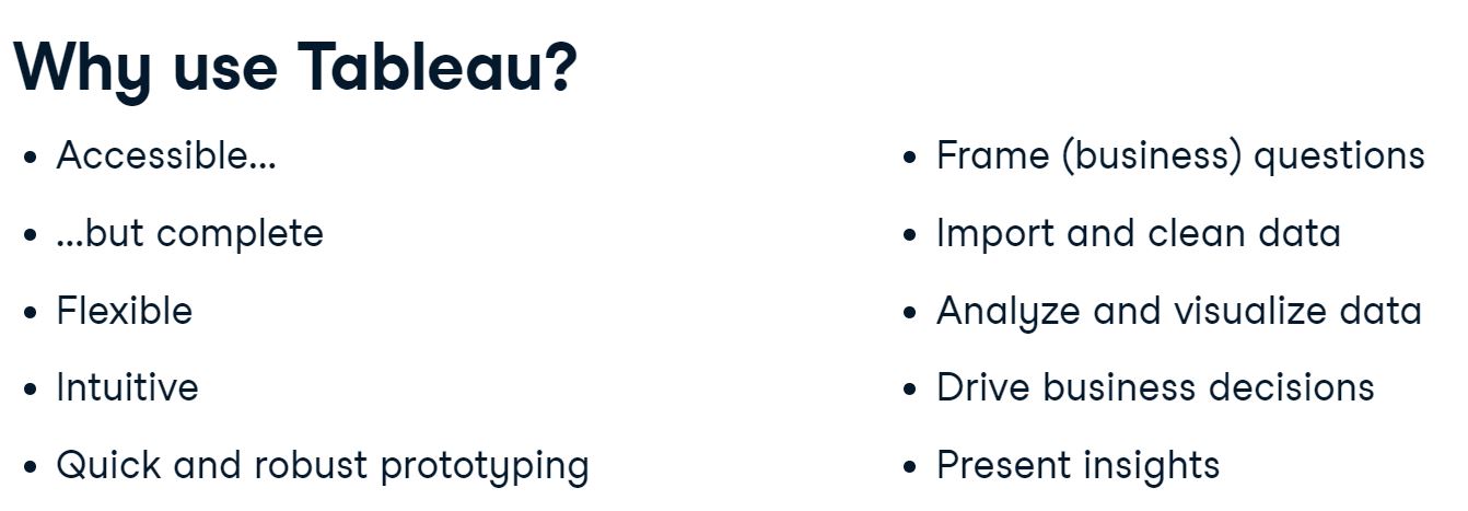
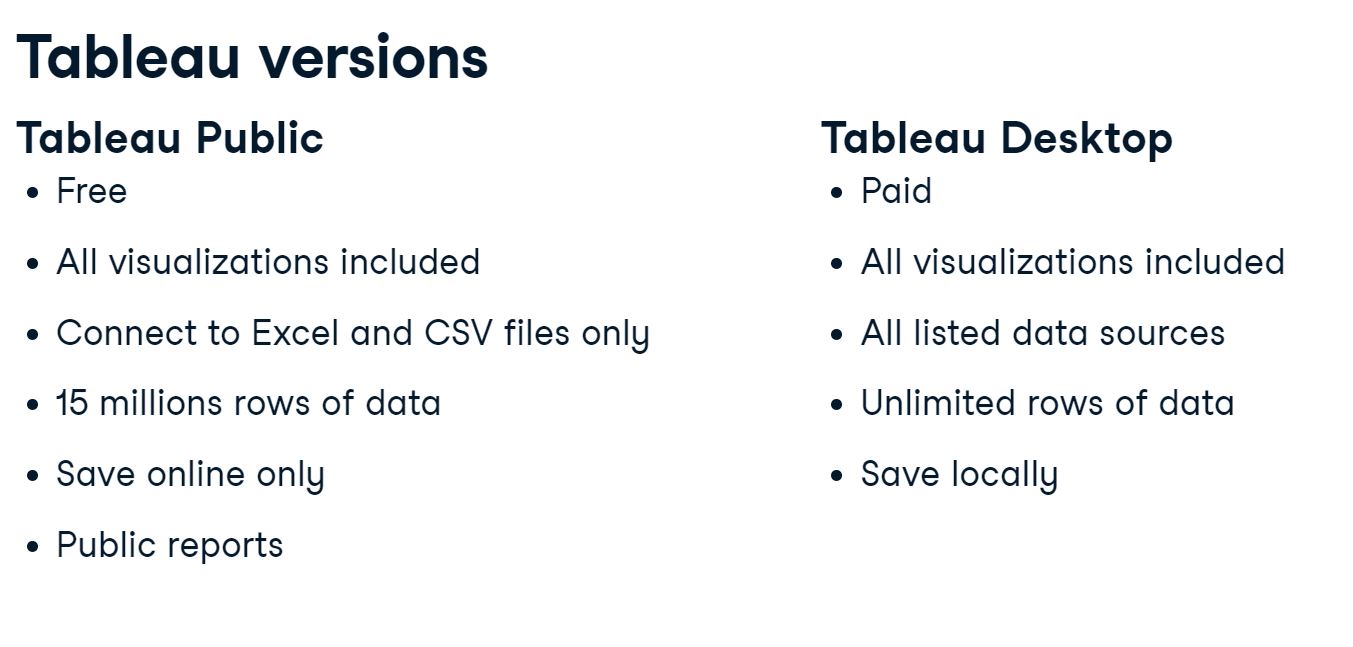
Tableau is a widely used business intelligence (BI) and analytics software trusted by companies like Amazon, Experian, and Unilever to explore, visualize, and securely share data in the form of Workbooks and Dashboards. With its user-friendly drag-and-drop functionality it can be used by everyone to quickly clean, analyze, and visualize your team’s data. We’ll learn how to navigate Tableau’s interface and connect and present data using easy-to-understand visualizations. By the end of this training, we’ll have the skills we need to confidently explore Tableau and build impactful data dashboards. Let’s dive in.
1. Getting started with Tableau
We will get an understanding of Tableau’s fundamental concepts and features: how to connect to data sources, use Tableau’s drag-and-drop interface, and create compelling visualizations. We will explore an Airbnb dataset for the city of Amsterdam.
1.1 Introduction
1.2 Connecting to data
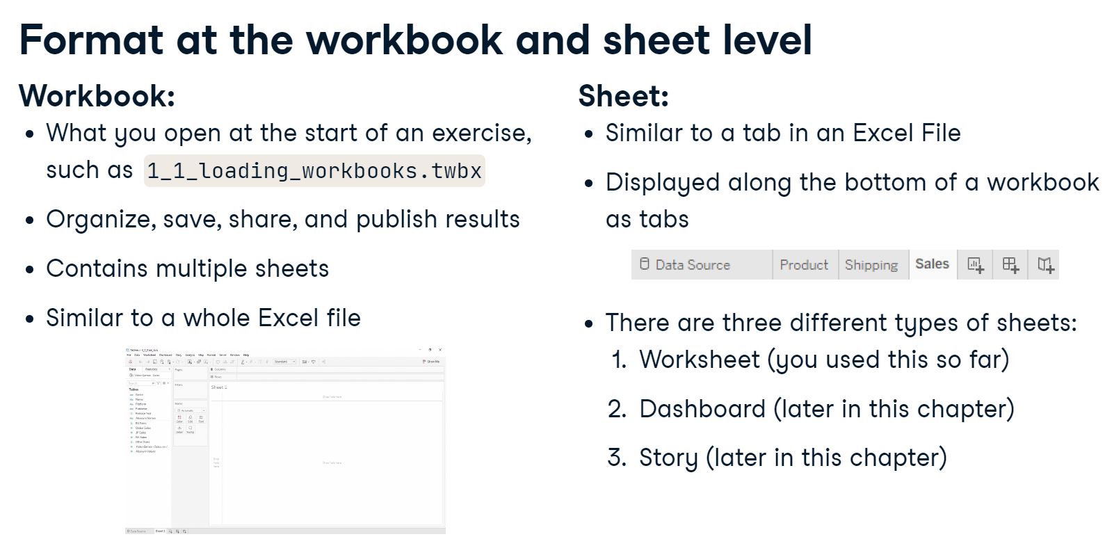
1.2.1 Loading workbooks
2015
1.2.2 Loading data
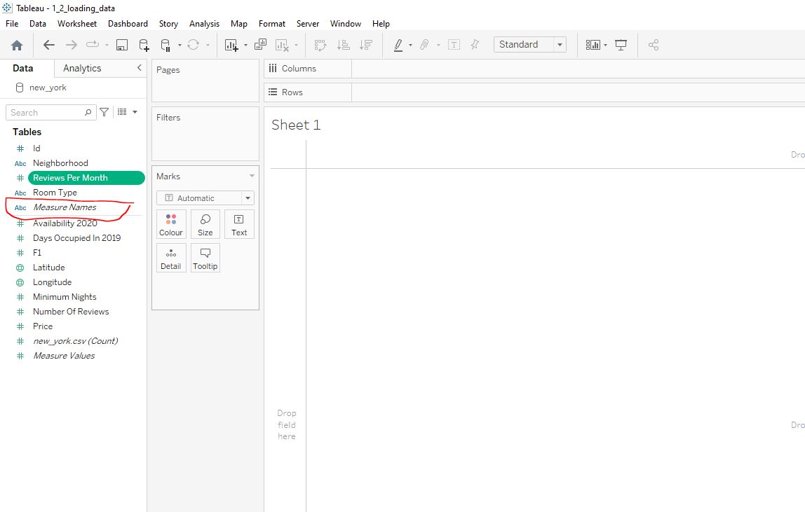
In this exercise we will start by loading the new_york.csv dataset which we will use throughout this section.
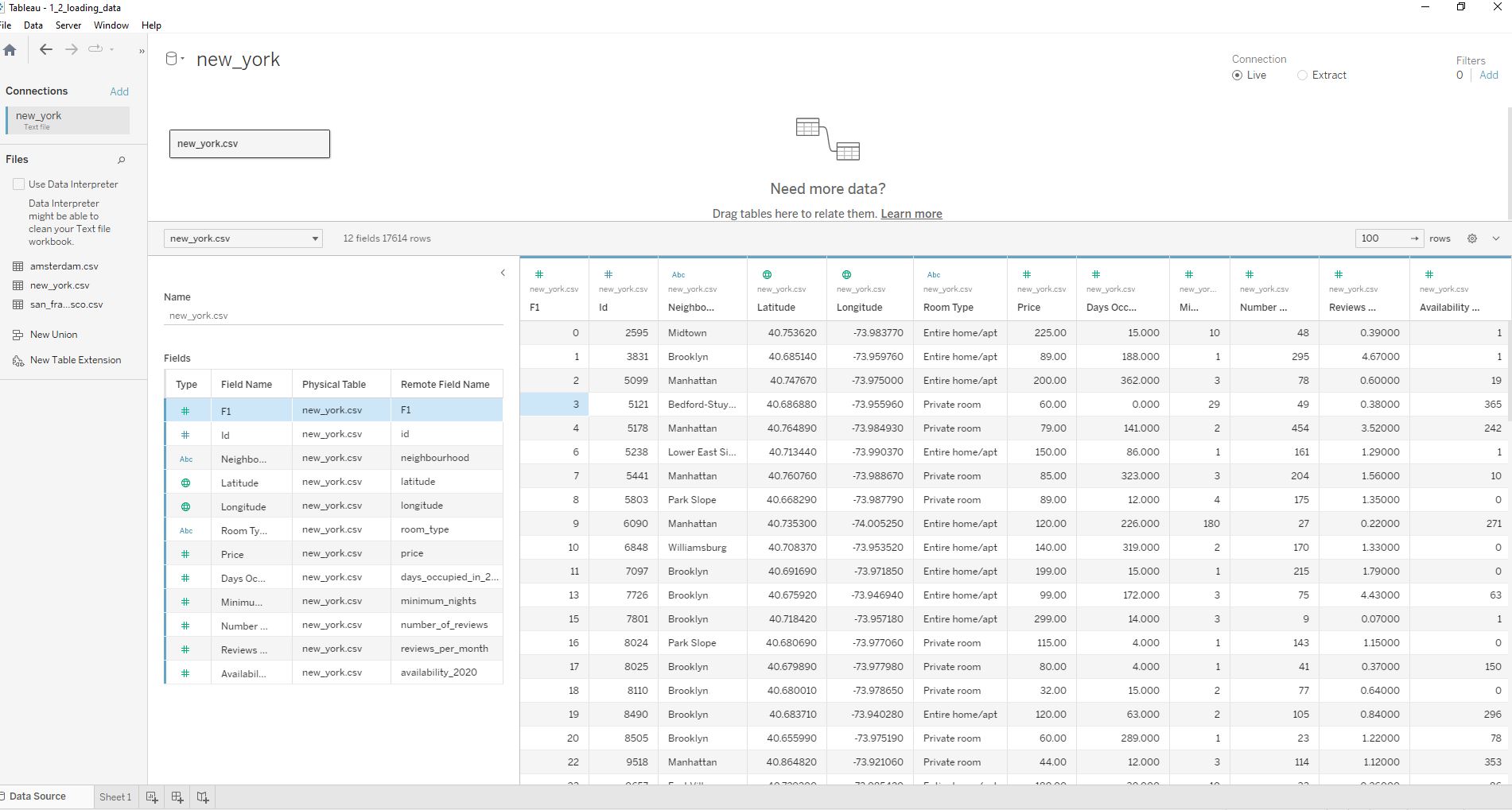
The dashboard gives us an overview of our data - we can see there are 12 fields or columns and we have different data types indicated at the top of each column:
# numerical
Abc text
globe geographical
Note that continuous data is green and categorical data is blue.
The displayed column names can be changed although their remote field name will remain unchanged.
We can see that there are 17,614 rows or observations.
1.3 Navigating Tableau
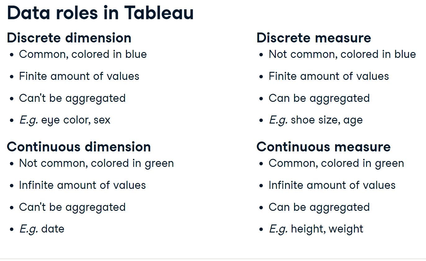
1.3.1 Dimensions and measures
Now that we have connected our data sources let’s now look at the Worksheets interface, where we will create our visualizations:
Dimensions positioned at the top of the data pane contain qualitative values such as names or dates - in our example Id Neighborhood Room Type.
Measures positioned below our dimensions contain numerical, quantitative values that can be measured and aggregated - in our example Days Occupied in 2019 Minimum Nights Price and so on.
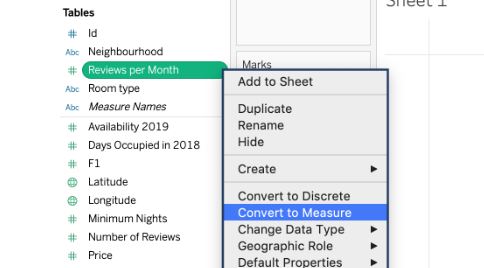
Note that we have Reviews Per Month included here. This data is not qualitative, and should be converted to quantitative as shown below:
1.4 A tour of the interface
1.4.1 New York neighbourhood prices
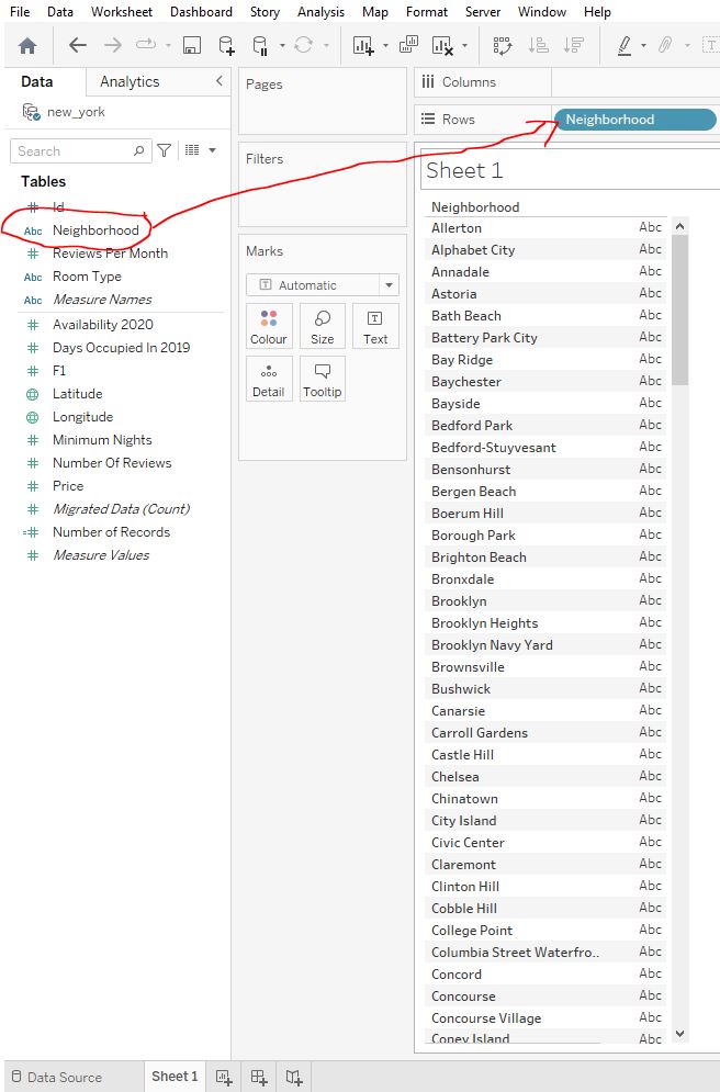
Let’s visualize our data. Start by dragging the Neighborhood field to the Rows shelf :
Drag the Price field to the Text Marks card :
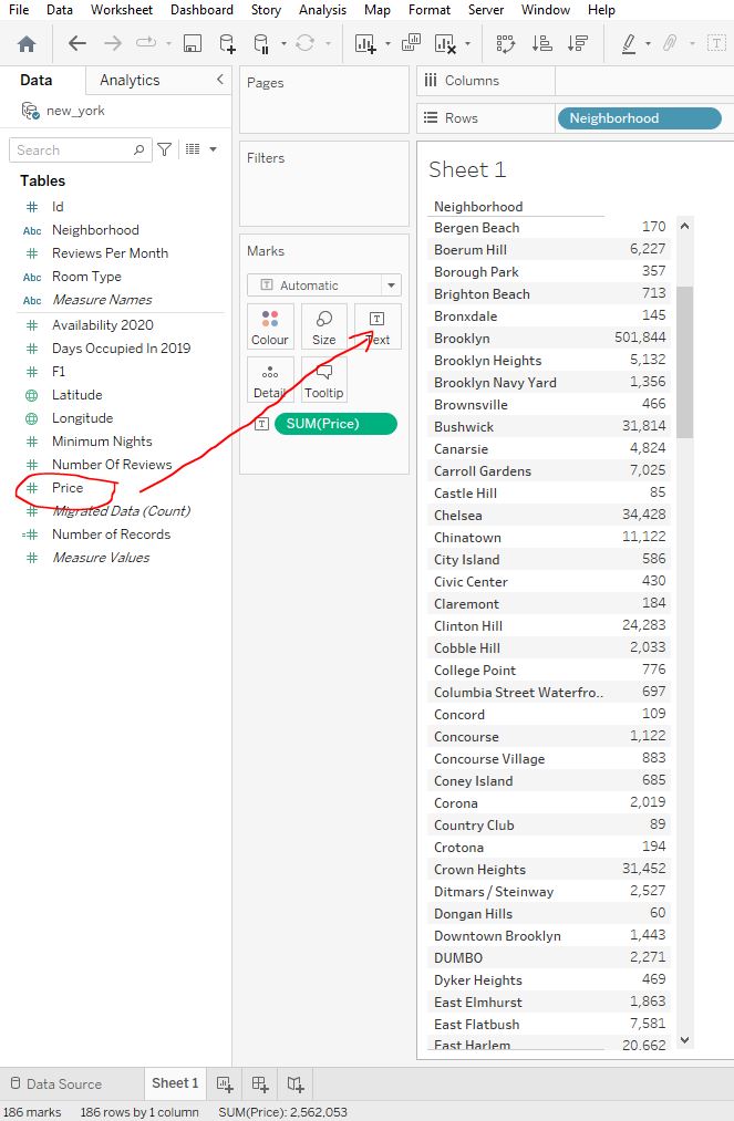
Getting the ‘SUM’ of prices does not make much sense.
However on SUM(Price) at the bottom of the Marks field, click on the down arrow that appears and instead of SUM select Average as the measure :
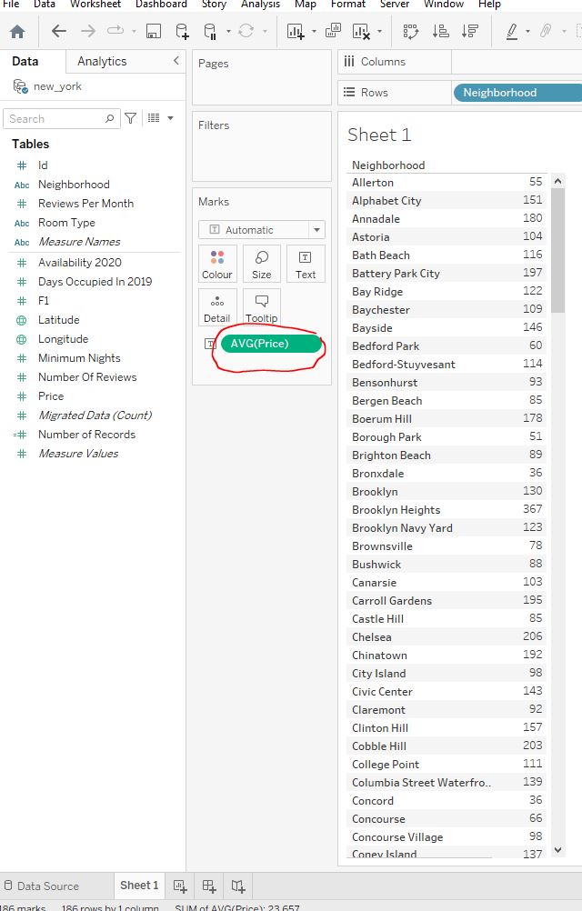
367
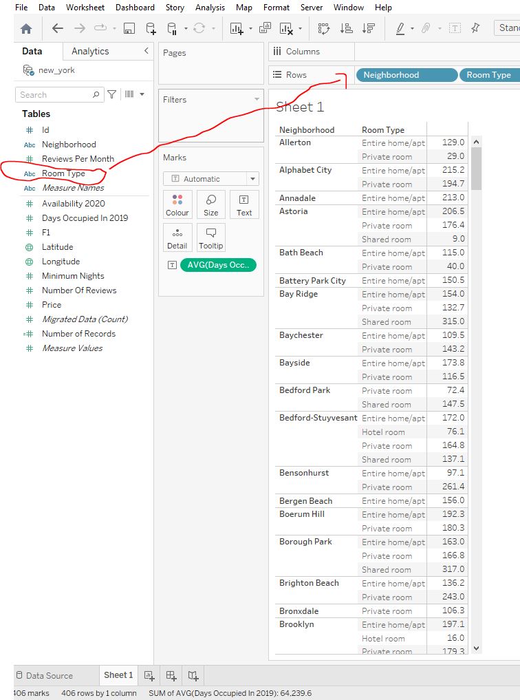
1.4.2 Segmenting by room type
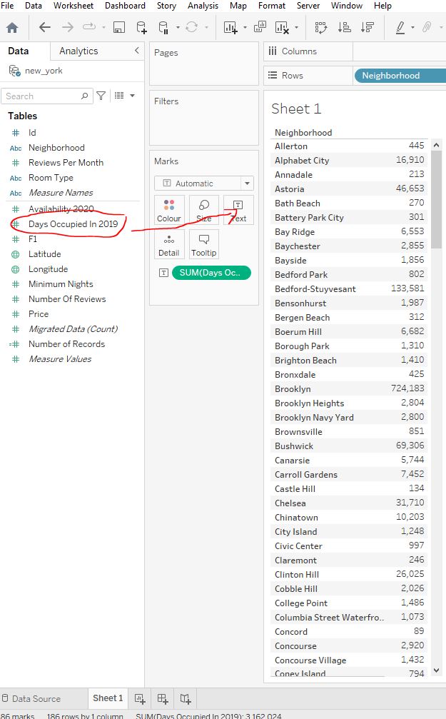
Previously we found the average price of rooms in each neighbourhood. Now, we want to know the average number of days listings were occupied in 2019 segmented first by neighbourhood, but also by room type.
First we need to replace Price from the Marks field with Days Occupied In 2019. We can do this by dragging Price outwith the Marks pane (until we see a red cross) and then dropping it, and then dragging in Days Occupied In 2019 :
Then get the AVG instead of the SUM :
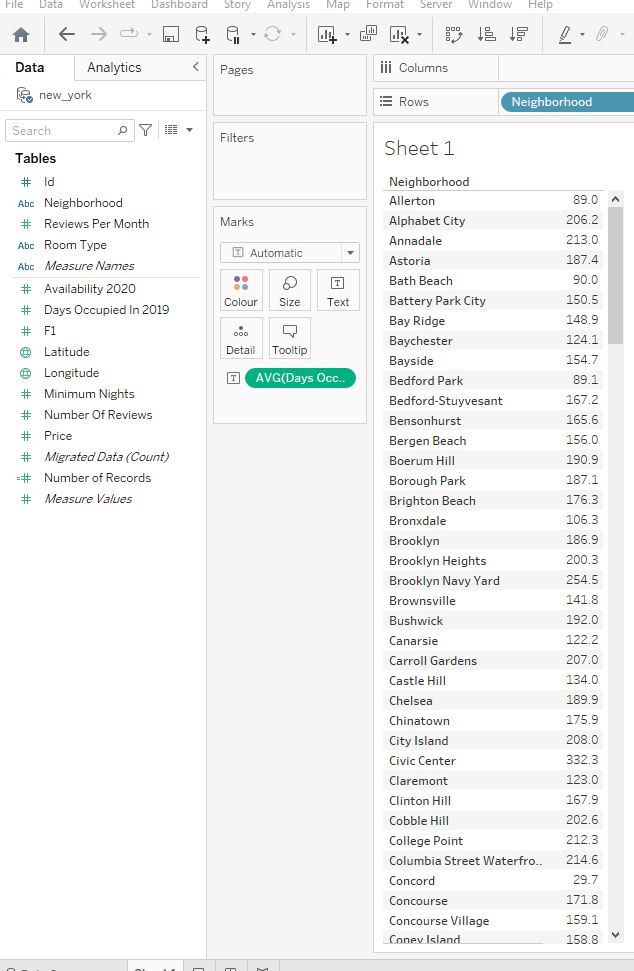
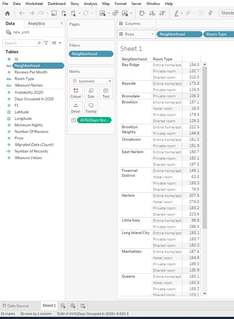
And then segment by room type. We can do this by adding Room Type to the Rows shelf :
116.5
1.5 How to create visualizations in Tableau
1.5.1 Creating our first visualization
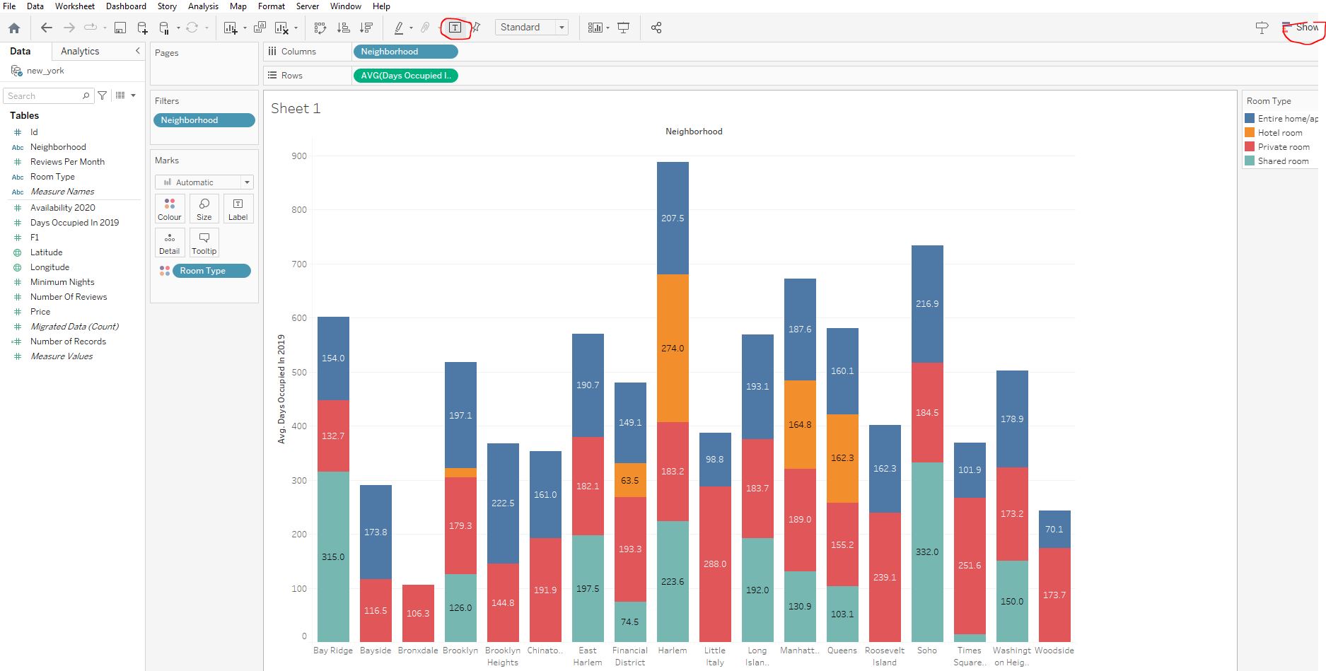
In the previous section we created a table to find out the number of days listings were occupied in 2019 per neighbourhood and rooom type. However a table is tedious to look at, so we would prefer to visualize the results instead.
However, there are 100+ neighbourhoods in New York, which can be challenging to visualize, so let’s use a prefiltered workbook focusing on a few popular areas for illustrative purposes:
Click Show Me in the top right and select the stacked barchart option. Note to show numerical values on the face of the bars, click on the T on the dashboard as highlighted below:
106.3
Note that Tableau shows the visualizations that can be used, but it is up to us to customize based on the question being asked and the type of data.
1.5.2 Bringing it all together
To close this section, we will build a visualization on our own from scratch. We will compare occupancy and average prices for each neighbourhood and room type combinations. This would be excellent information to have to hand when deciding whether an investment may be worthwhile.
Replace the average Days Occupied In 2019 with Price on the bar chart by:
- dragging
Priceon top ofAVG([Days Occupied In 2019)]in theRowssection - changing the aggregation to
Average
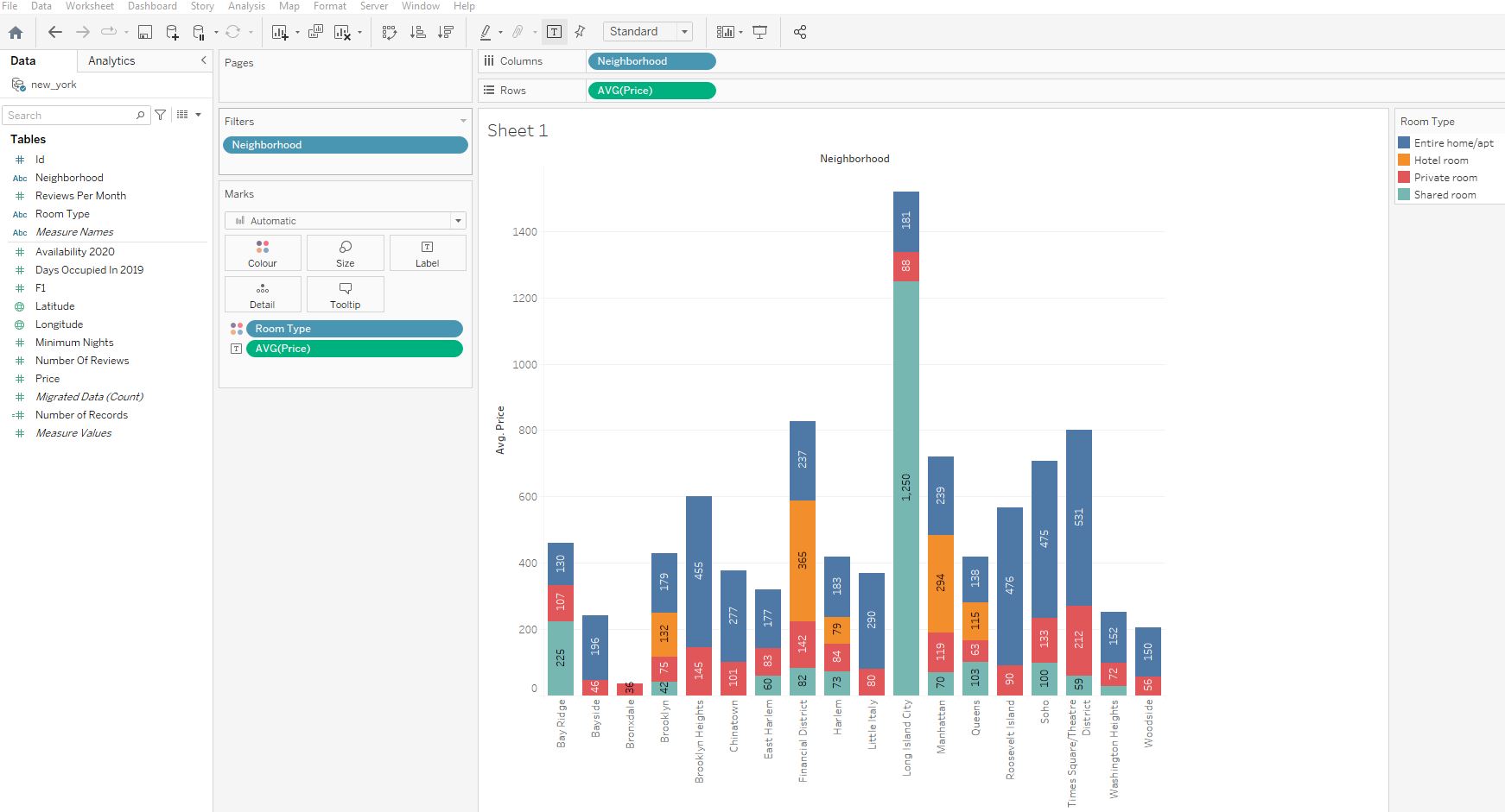
1,250
This value is suspicious - how can a shared room be that expensive and cost more than six times the price of an entire home? This outlier does not necessarily represent an error within our data, and there may a perfectly legitimate reason for the anomaly, however it must be investigated further.
2. Building and Customizing Visualizations
Let’s take it up a level and review the core concepts required for analyzing and exploring data in Tableau. We’ll learn how to slice and dice data with filters, create new columns using our own calculated fields, and aggregate dimensions and measures in a view. We will be working with education, social and infrastructure data.
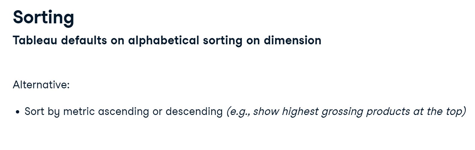
2.1 Filtering and sorting
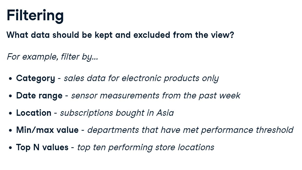
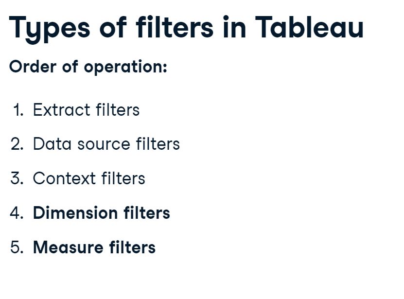
2.1.1 The order of filtering
The order of filtering is important when dealing with large datasets. The extract and data source filters are applied prior to loading our data into Tableau but we will focus on the Dimension and Measure filters.
2.2 Sorting and filtering through selection
2.2.1 Sorting and excluding multiple fields
Keep only values for 2017 and sort Country alphabetically :
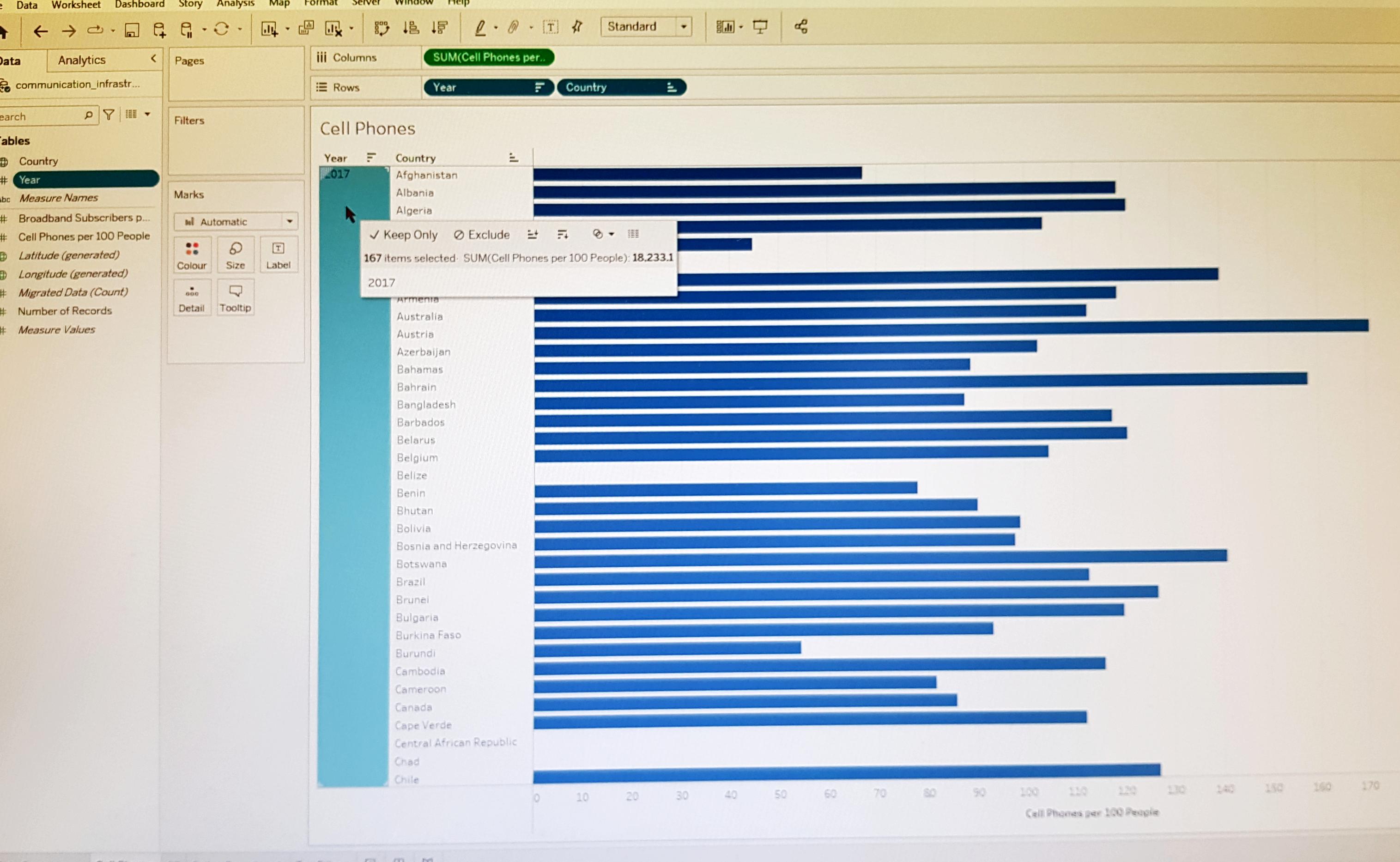
Exclude United Arab Emirates from the list, sort by Cell Phones per 100 people in descending order, and keep only the first 10 countries that are listed:
Maldives
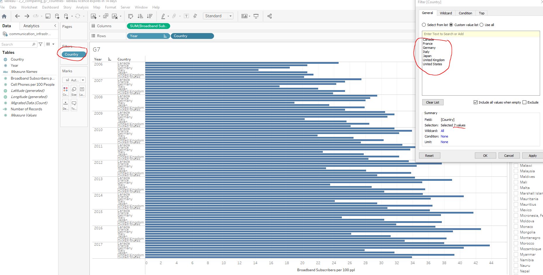
2.2.2 Comparing G7 countries
The Group of Seven (G7) is an international organization consisting of Canada, France, Germany, Italy, Japan, the United Kingdom, and the United States. In this exercise we will filter data to look only at countries that are part of the G7 with Broadband Subscribers per 100 people greater than 30.
Navigate to the G7 worksheet :
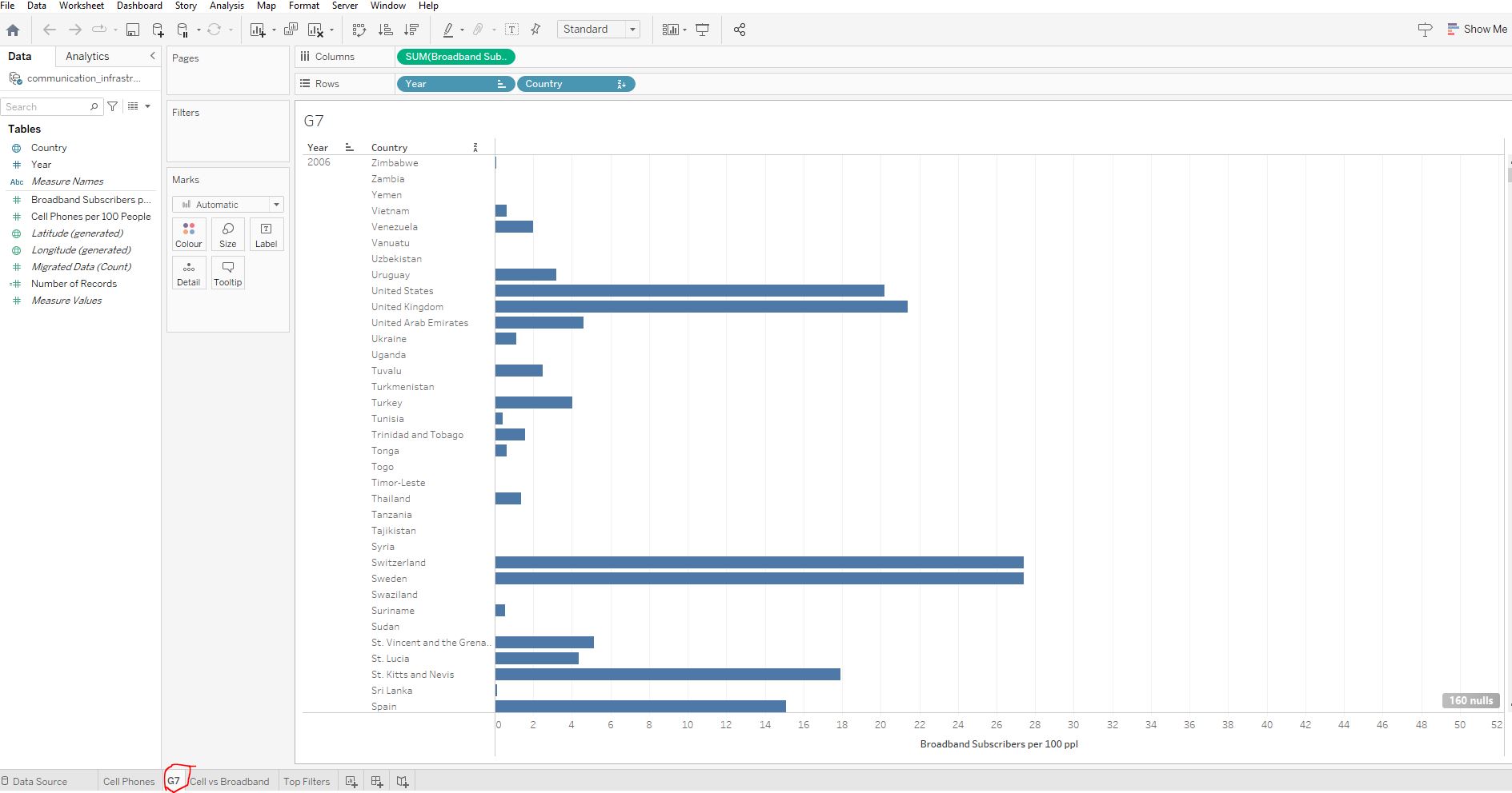
Filter Country to show the countries that make up the G7 :
Filter Broadband Subscribers per 100 ppl to show where the value is at least 30 :
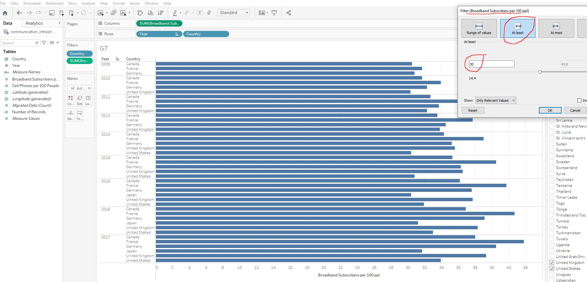
Broadband Subscribers per 100 ppl from 2009 onwards?
Canada, France, Germany
2.3 Filtering through the filter shelf
Notice that often our data includes nulls. This is misleading because it makes it look like the values are zero, but this might not be the case.
2.3.1 Filtering for null values
Navigate to the Cell vs Broadband worksheet:
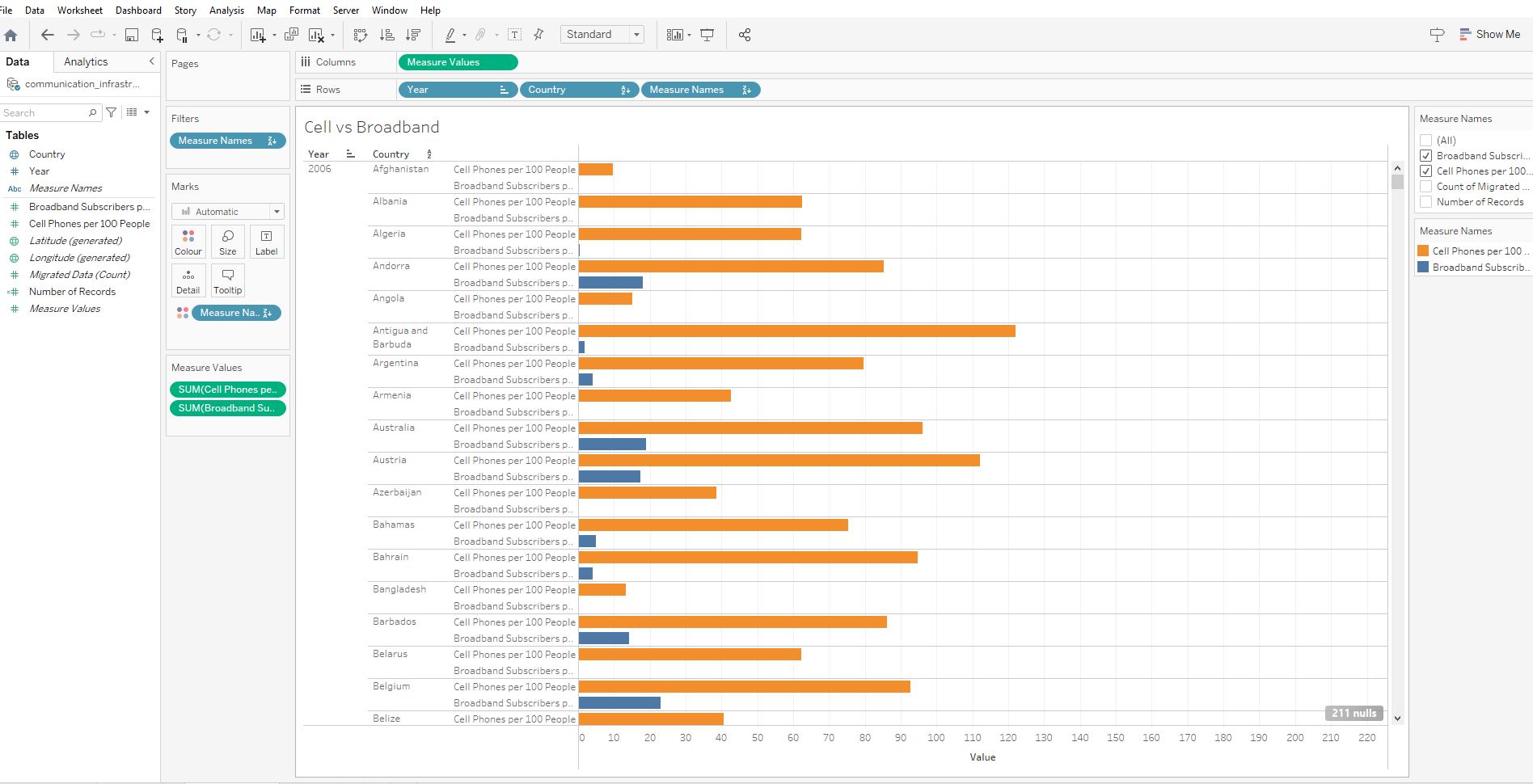
We want to know for which countries we lack values for the measures Cell Phones per 100 People and Broadband Subscribers per 100 ppl
Add Cell Phones per 100 People to the filters card. Select Next and navigate to the Special option in the pop-u. Select Null Values :
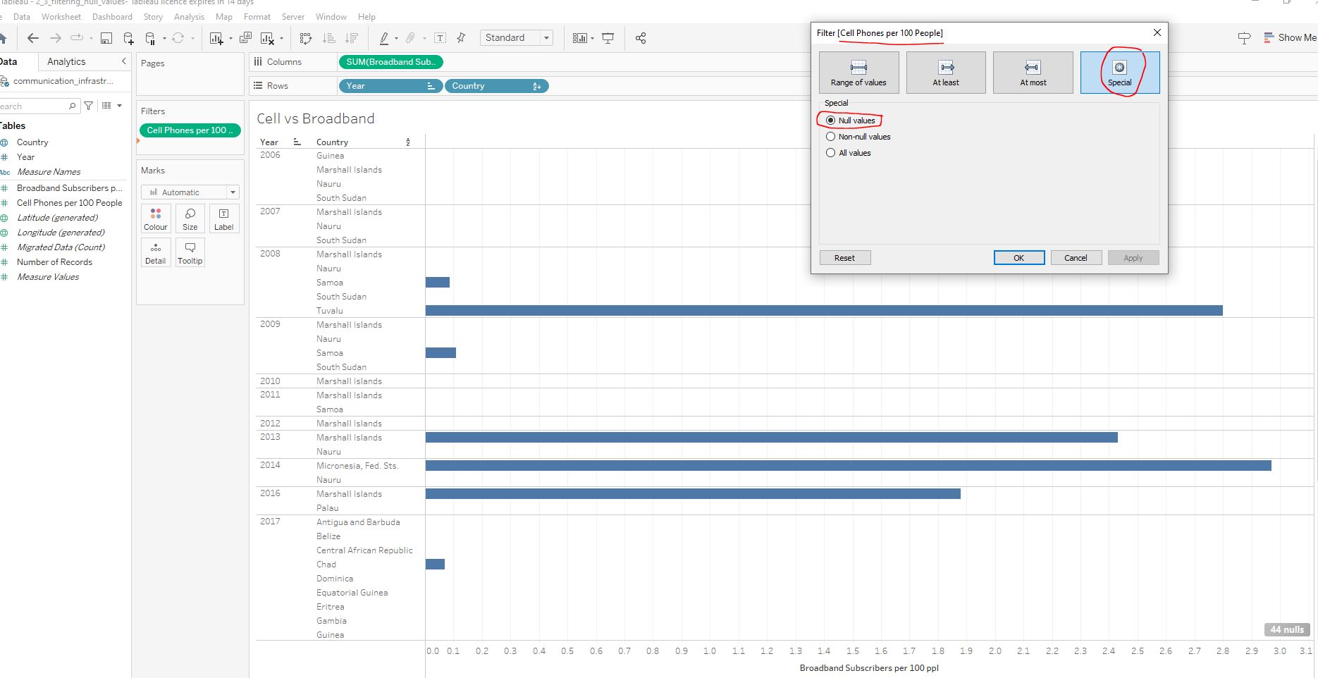
Repeat the above instruction with the Broadband Subscribers per 100 ppl field :
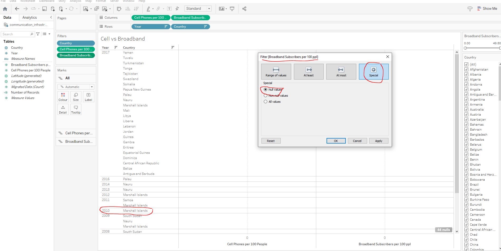
Cell Phones per 100 People and ’Broadband Subscribers per 100 ppl` in 2010?
Marshall Islands
Filtering for null values is a useful feature when cleaning and exploring our data, by identifying missing data for follow up.
2.3.2 Top filters on Tableau
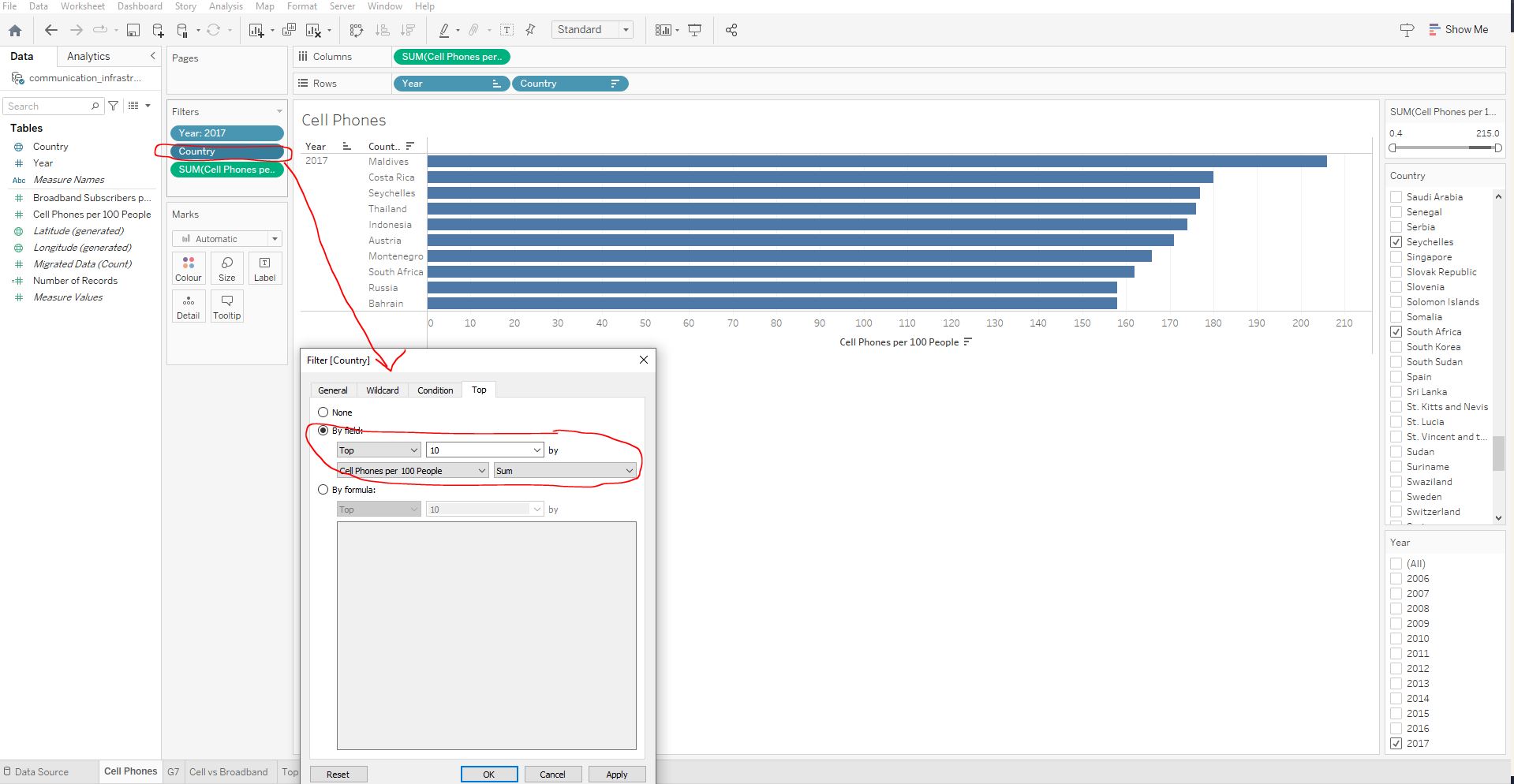
Now we want to filter countries on their average Cell Phones per 100 People across years 2006-2015. The sum aggregation is set as the default for measures so we’ll have to look out for this.
Navigate to the Top Filters worksheet :
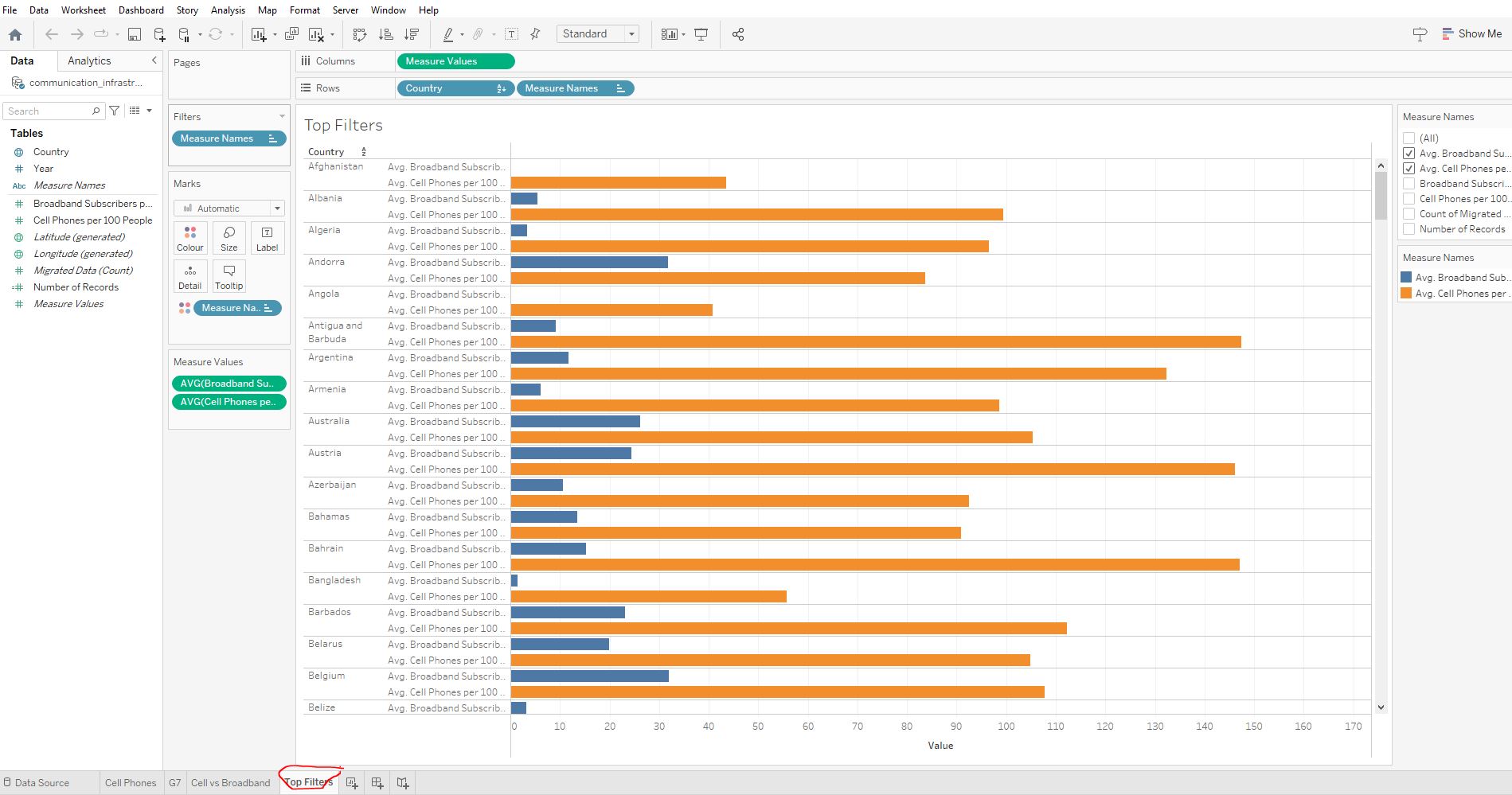
Add a filter on Country. Use Tableau’s top filter option on the bottom two countries based on the Cell Phones per 100 People average:
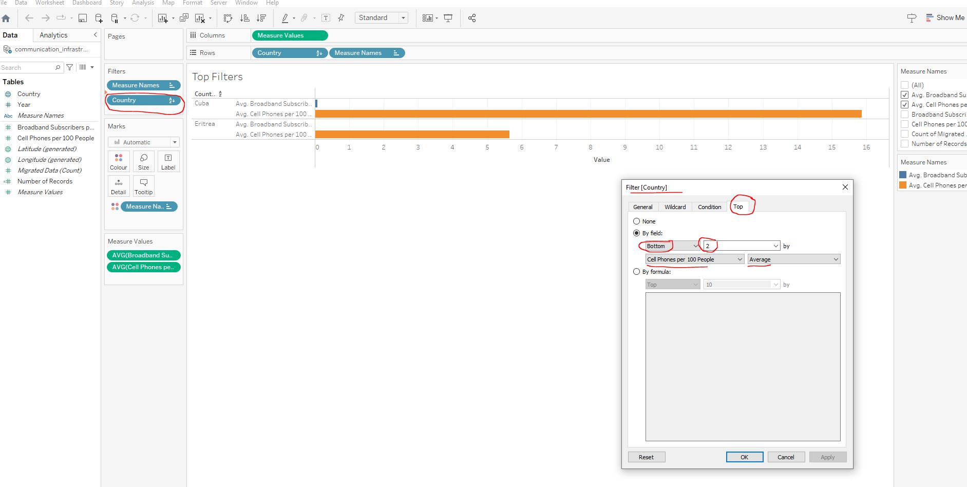
Cell Phones per 100 People ?
Cuba.
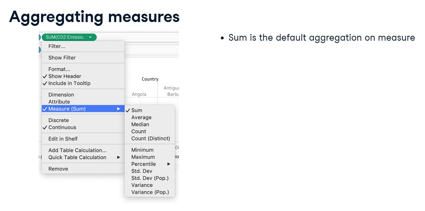
As you may have noticed, there are many other aggregation options like median, count, minimum and variance. Let’s have a closer look at these now.
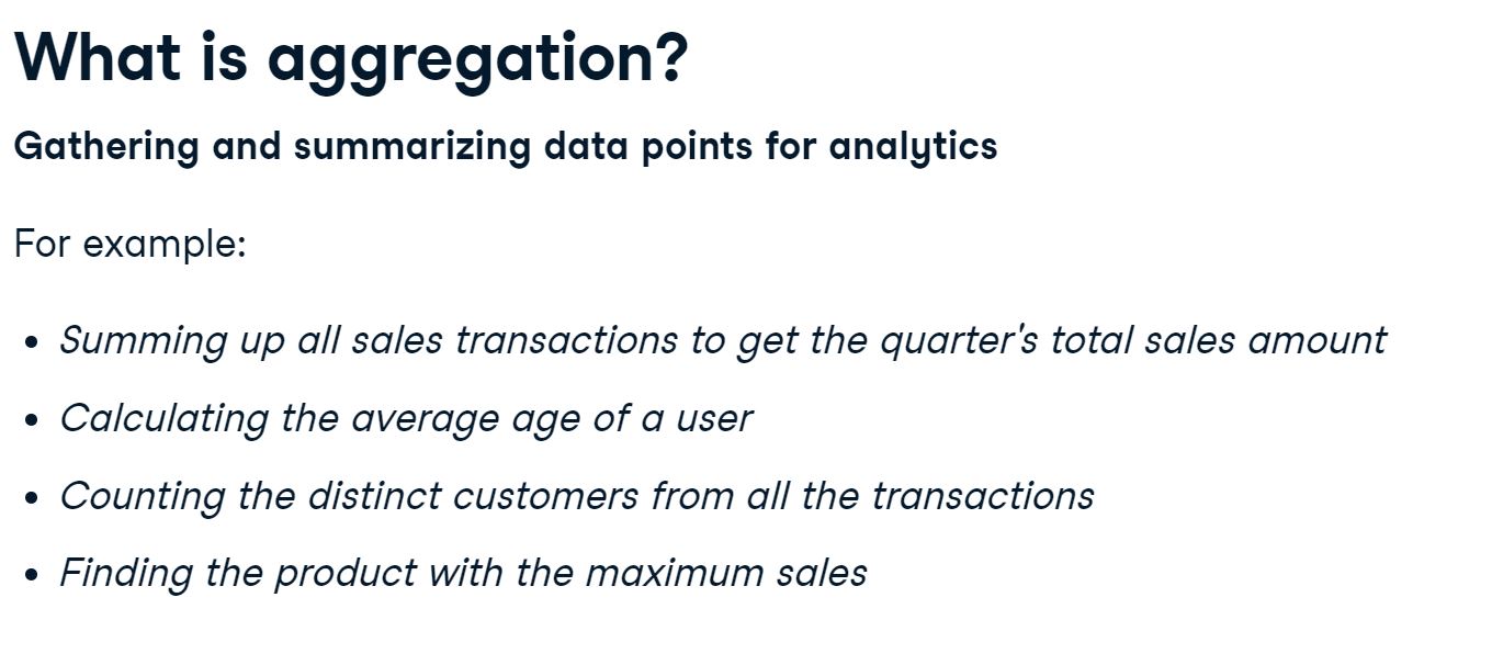
2.4 Aggregation
2.4.1 Aggregating measures and dimensions
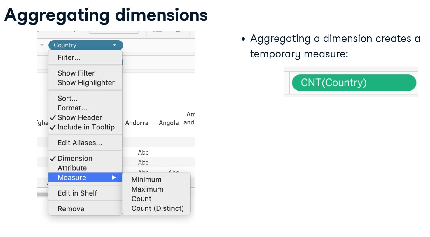
Aggregating can be defined as gathering and summarizing data points for analytics. Aggregating measures is more common, but also some dimensions can be aggregated, depending on your use case.
2.5 Scatter plots and aggregations
2.5.1 CO2 Emmisions and GDP in Sub Regions
In this exercise we will create a scatter plot comparing GDP per Capita and CO2 Emissions per Person. The data points in the scatter plot should represent Sub Regions.
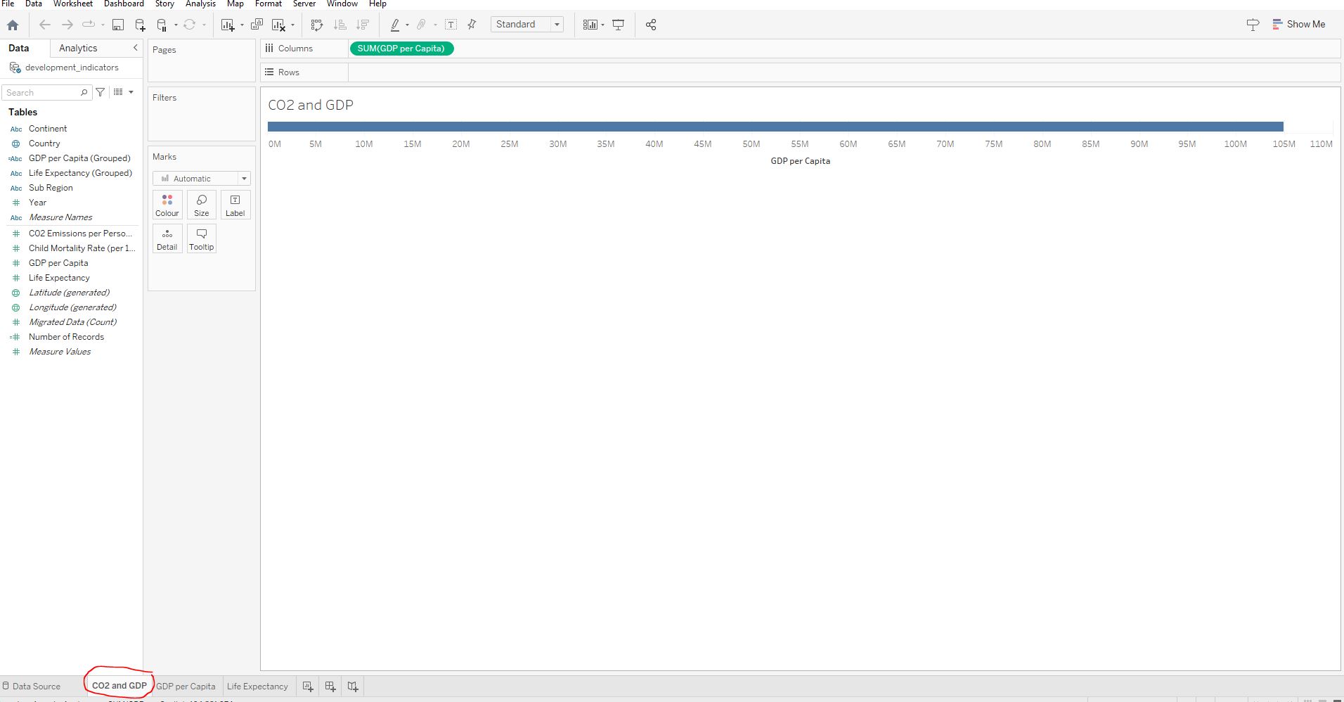
Open the workbook 2_5_co2emissions_and_gdp_in_sub_regions.twbx and ensure you are in the CO2 and GDP worksheet :
Create a scatter plot with average GDP per Capita on the x-axis and the average CO2 Emissions per Person on the y-axis :
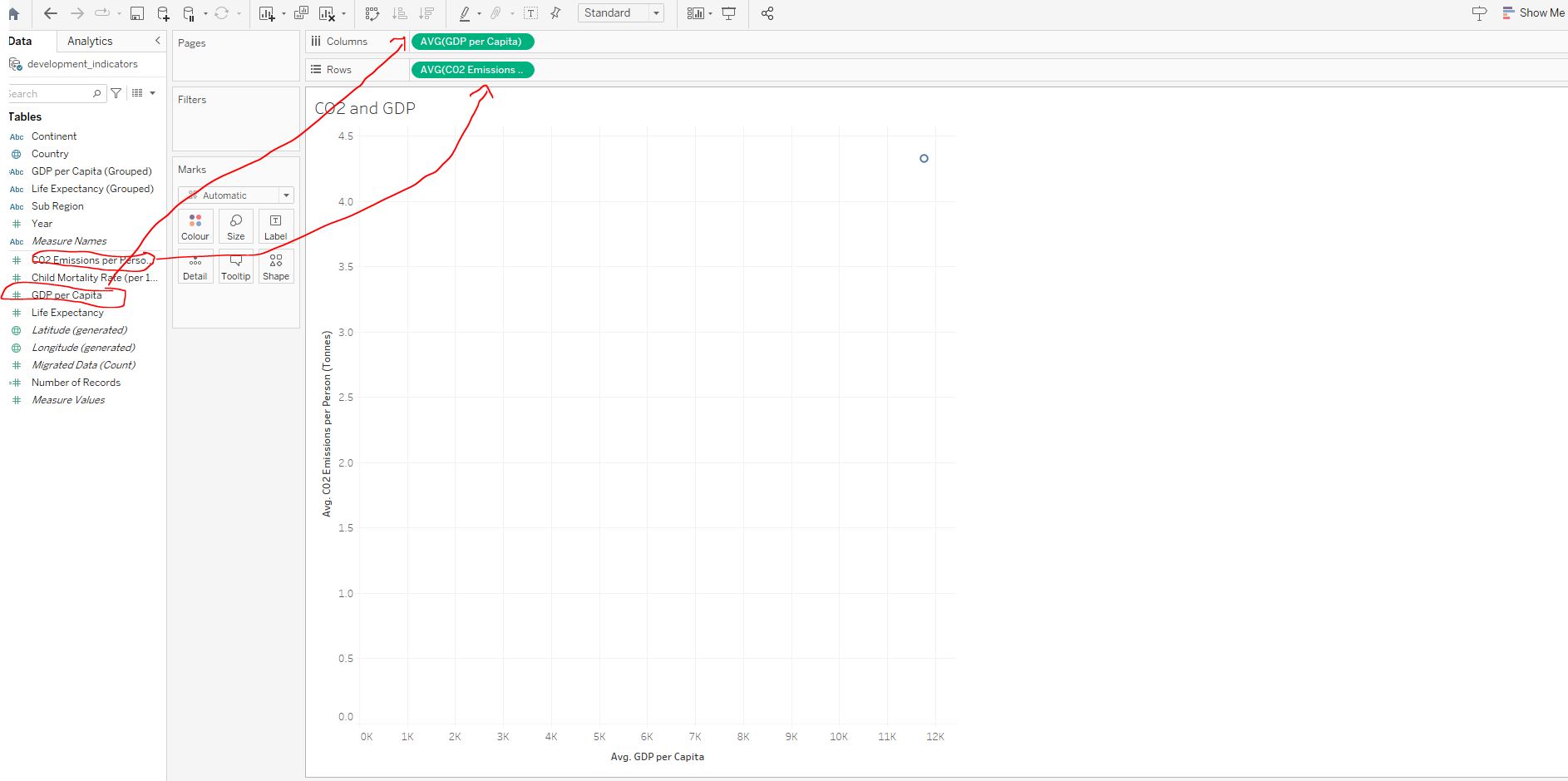
Colour the points based on Sub Regions :
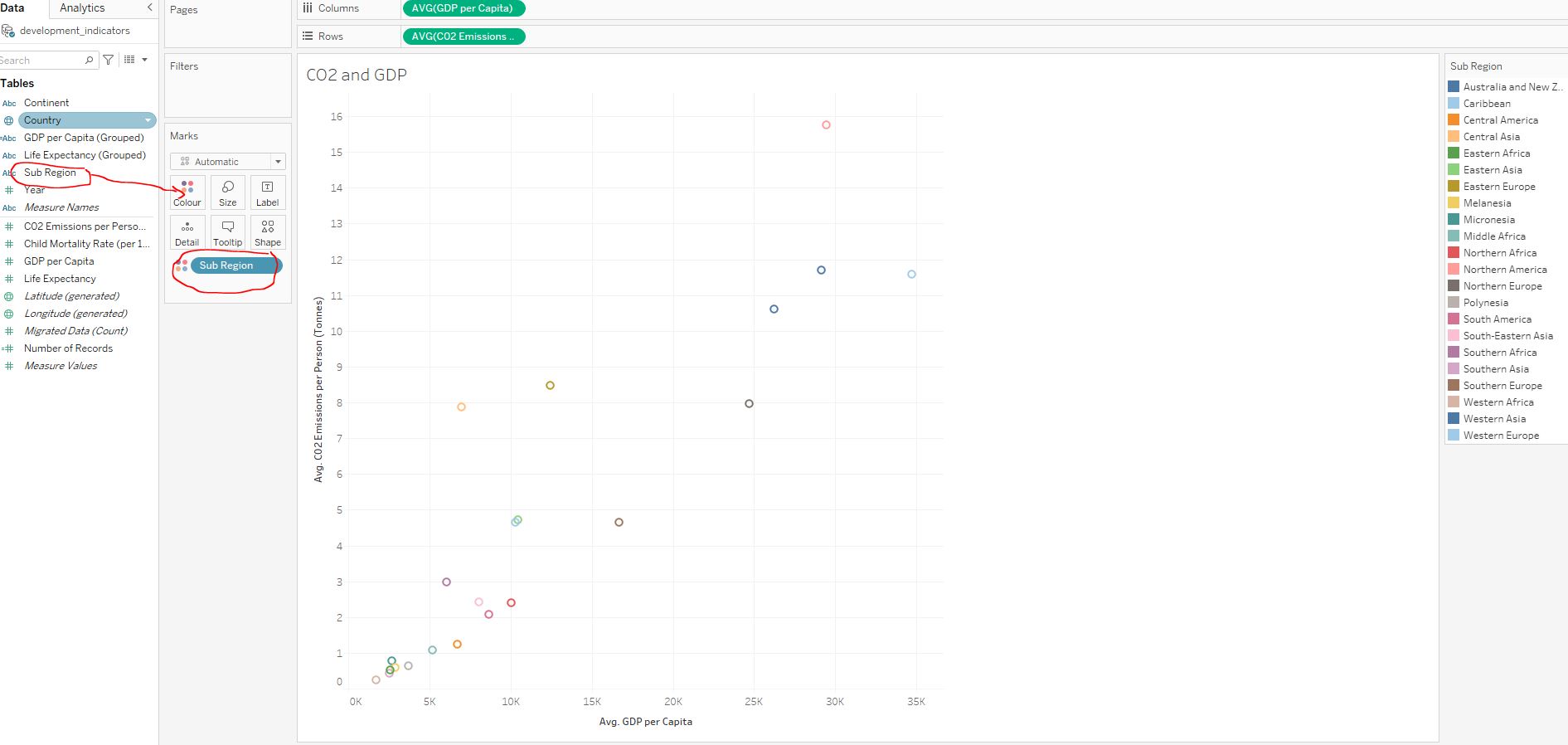
False, the values are very similar, the data points overlap on the scatterplot.
2.5.2 Counting on GDP per capita
The aggregation options Count and Count (Distinct) are useful for analyzing dimensions and whether they have reached certain dimensions.
Open the workbook 2_6_counting_on_gdp_per_capita.twbx and navigate to the GDP per Capita :
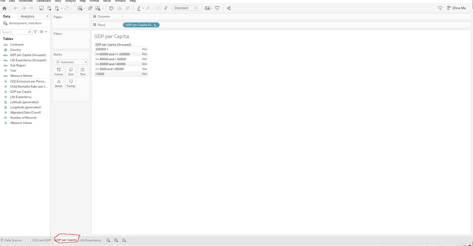
Create a chart with GDP per Capita (Grouped) as rows and the distinct count of GDP per Capita (Grouped) as columns :
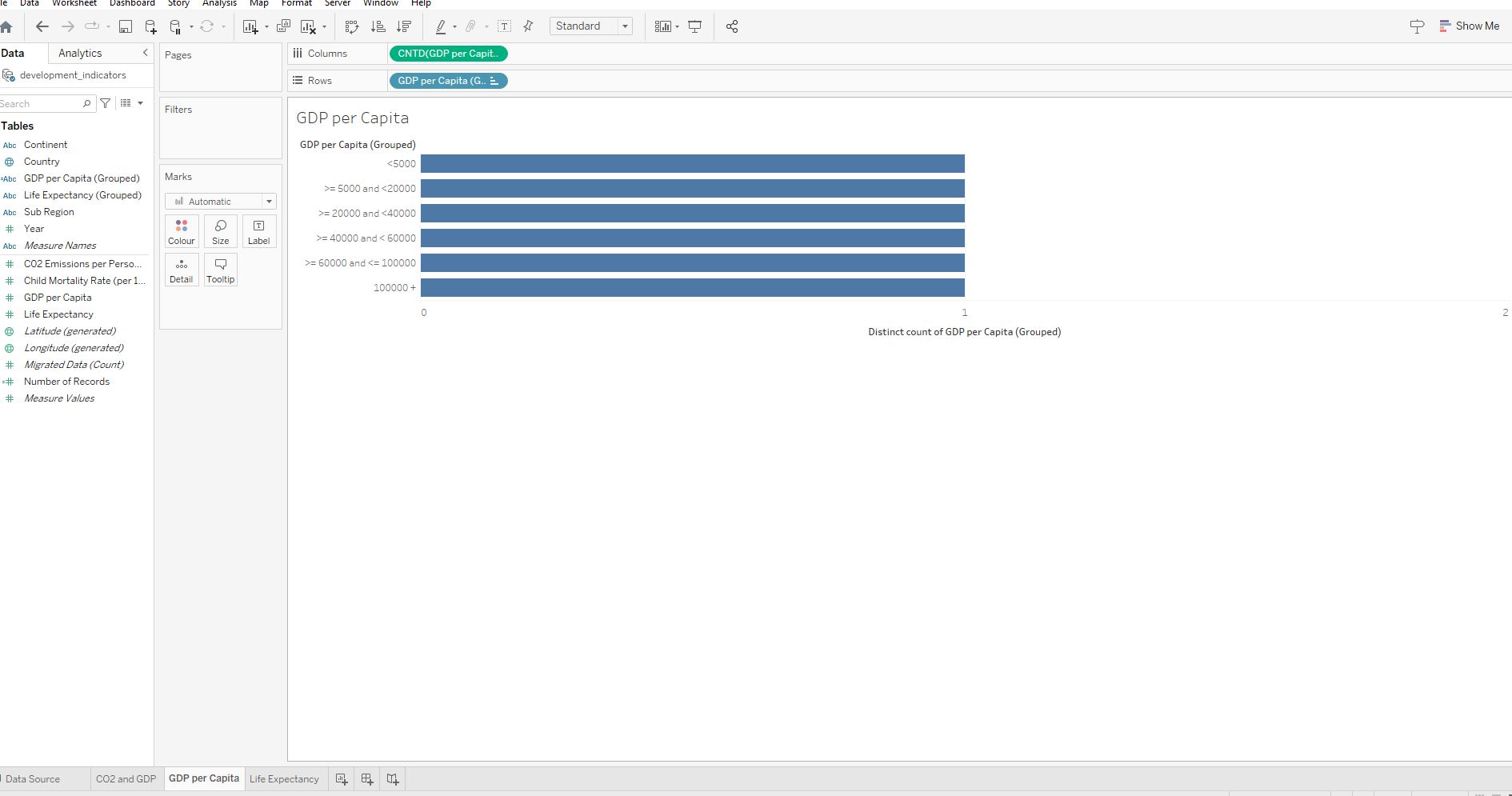
Colour the bars based on Sub Region :
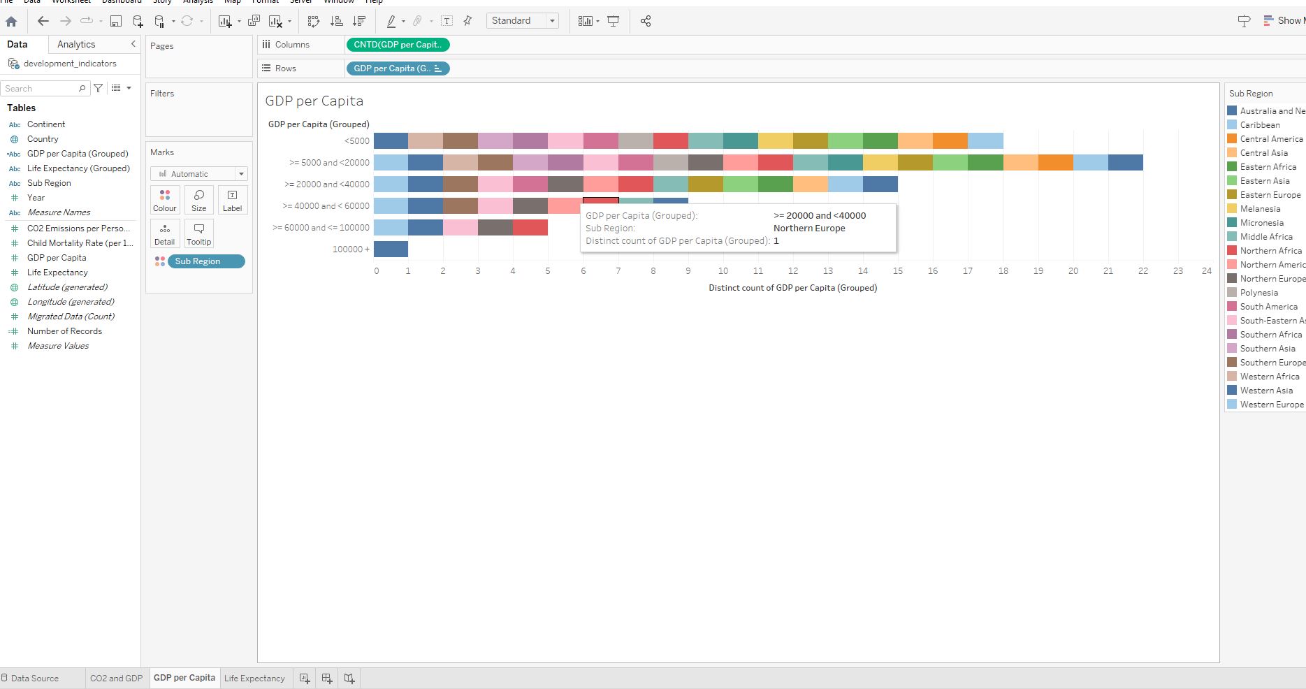
Western Asia.
Western Asia has been in all six categories since 1960 showing that it either had significant growth or a decline in GDP. We would have to see how Western Asia’s GDP has shifted over the years.
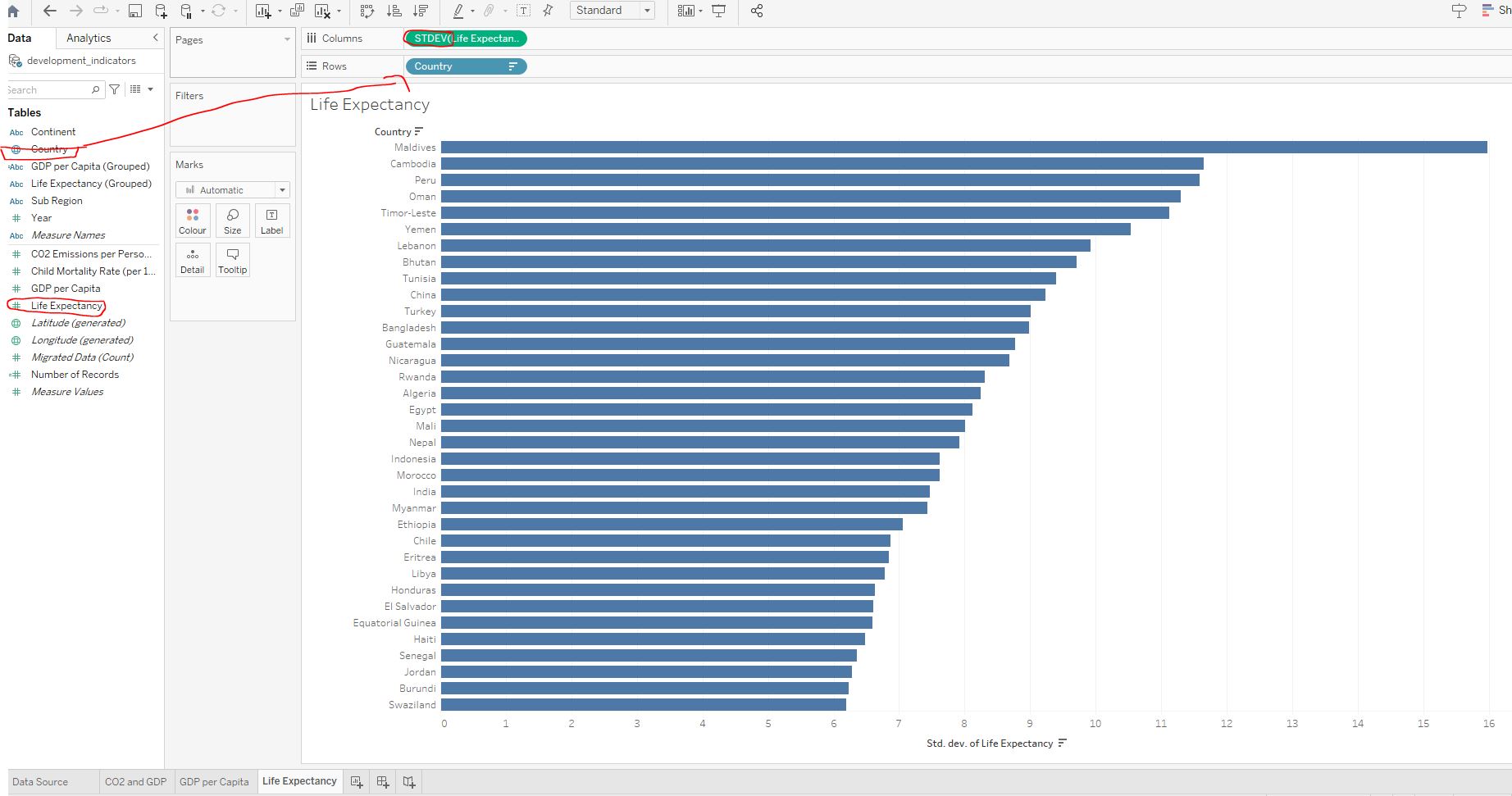
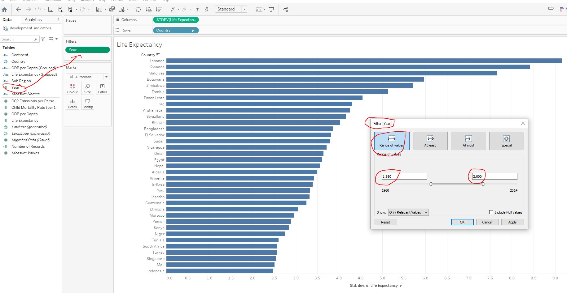
2.5.3 Standard deviation of life expectancy
Standard deviation is a useful aggregation for analyzing how much data varies. In this exercise we will use standard deviation to see how much life expectancy has varied across the years for different countries.
Load the workbook 2_7_std_dev_of_life_expectancy.twbx and navigate to the Life Expectancy worksheet :
Create a bar chart with the bars representing each country’s standard deviation of life expectancy :
Consider only the years from 1980 to 2000 :
Life Expectancy measure ?
Lebanon.
Lebanon has the highest standard deviation between the years 1980 to 2000. We would have to analyze further if this relatively large variation was due to increased or decreased quality of life.
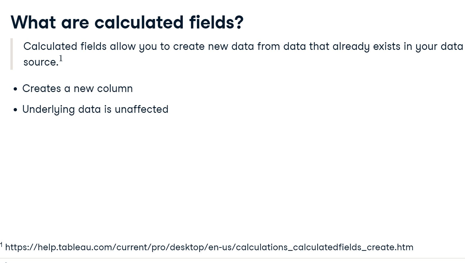
2.6 Calculated fields
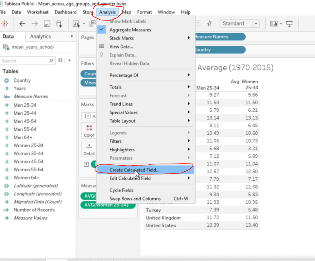
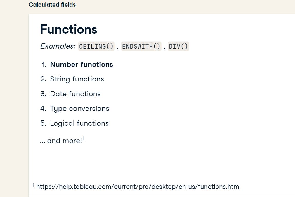
There’s no need to memorize all of the functions because of Tableau’s handy built-in documentation :
2.7 Creating calculated fields
2.7.1 Calculated field for rounding
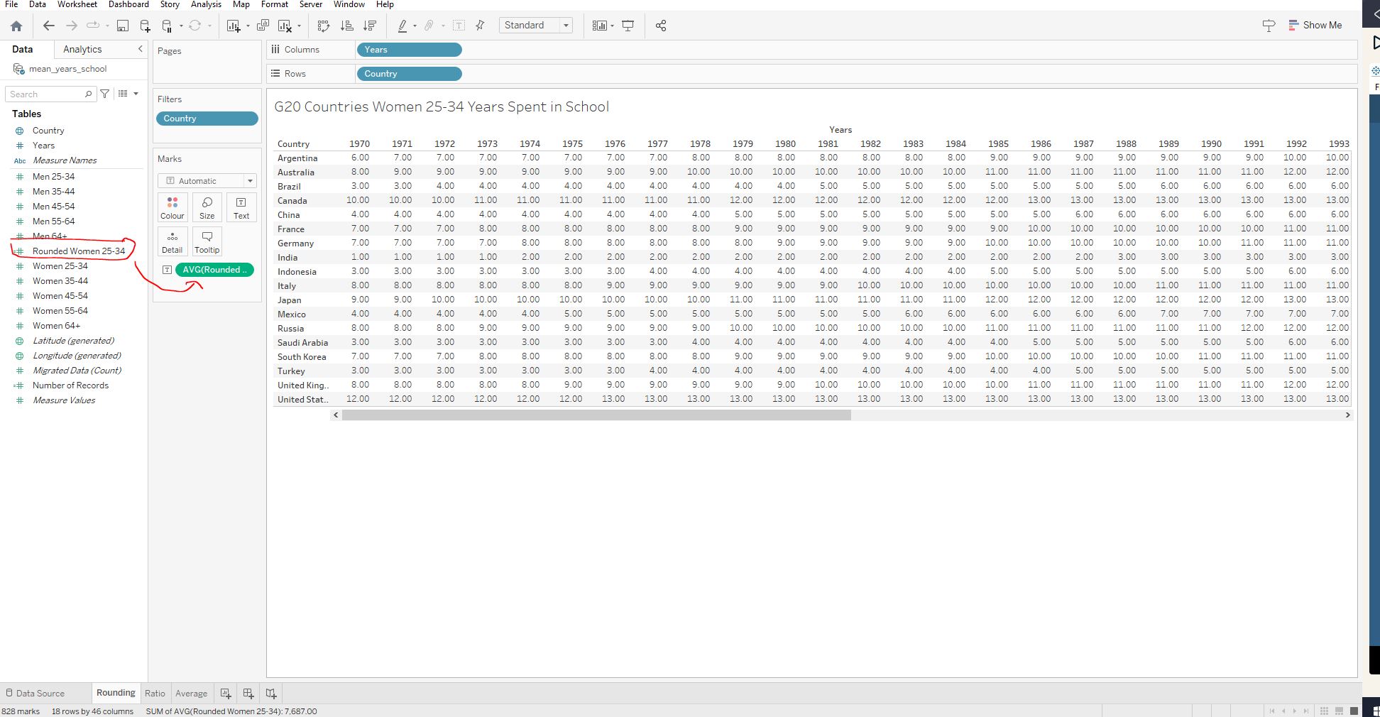
Open the workbook 2_8_calculated_field_for_rounding.twbx and navigate to the Rounding worksheet :
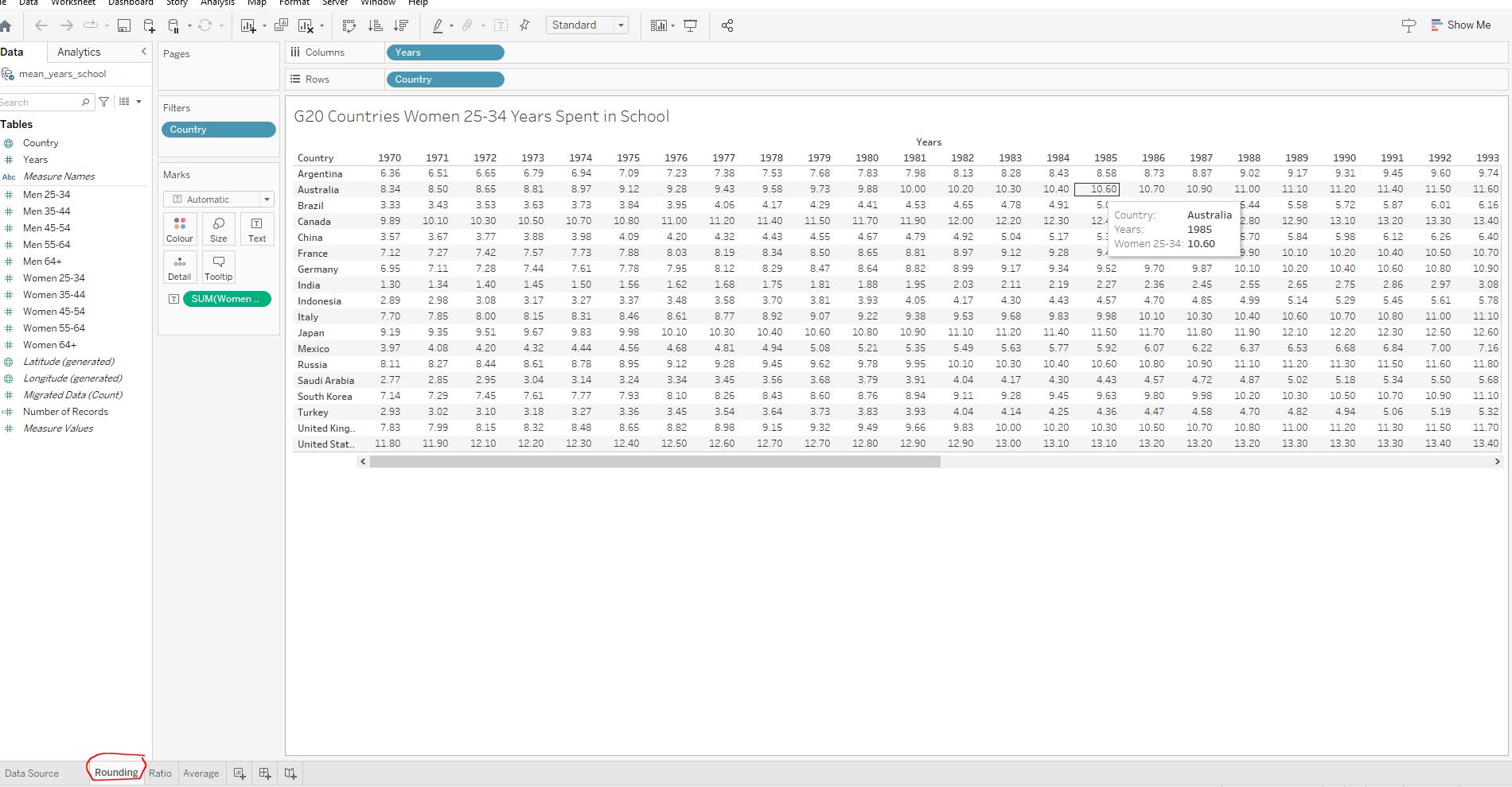
Create a new calculated field called Rounded Women 25-34 - use the built-in documentation and look up ROUND() and round the new column to whole numbers (0 decimal points) :
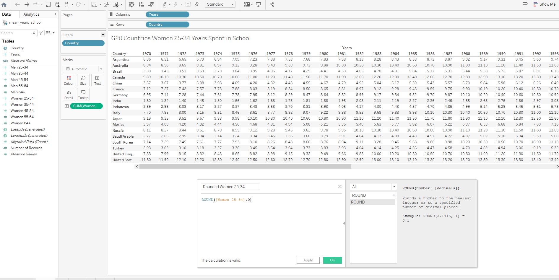
Replace Women 25-34 in the Marks field with our newly created field :
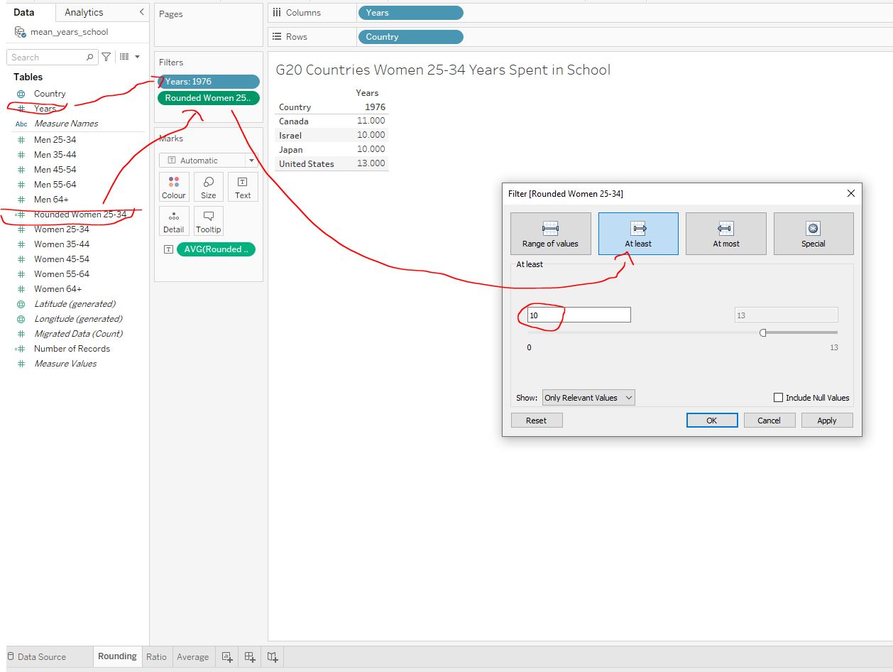
Remove any existing filters and create new filters for Year = 1976 and >=10 for our newly created field :
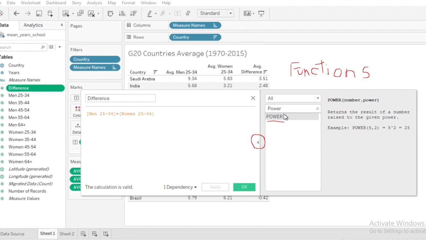
2.7.2 Ratio between genders
Another useful calculated field to make is a ratio. Ratios are ana excellent way to compare two values. In our case, we can compare the mean years of education between men and women using a ratio. The closer the ratio is to one, the more equal levels of education are between women and men.
Load the workbook 2_9_ratio_between_genders.twbx and navigate to the Ratio worksheet :
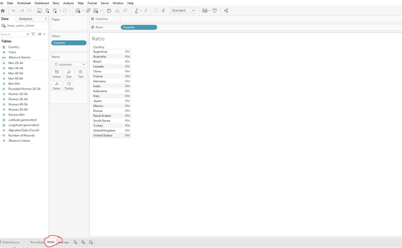
Create a calculated field called Men:Women (25-34) which calculates the men:women ratio for years spent in school in the 25-34 age group. Add this new field as a column to the table by dragging it to the Text card and change the aggregation from sum to average :
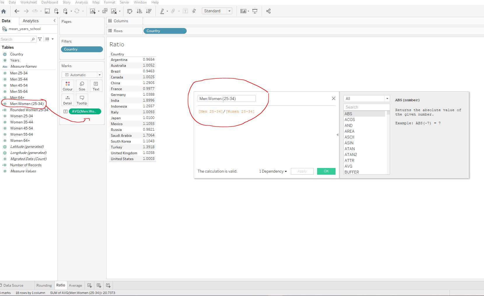
Men:Women (25-34) ratio for years spent in school?
0.9821.
Russia has a ratio of ~ 0.98 which means that Russian men have an average of 0.98 years of schooling for every year of schooling that Russian women receive.
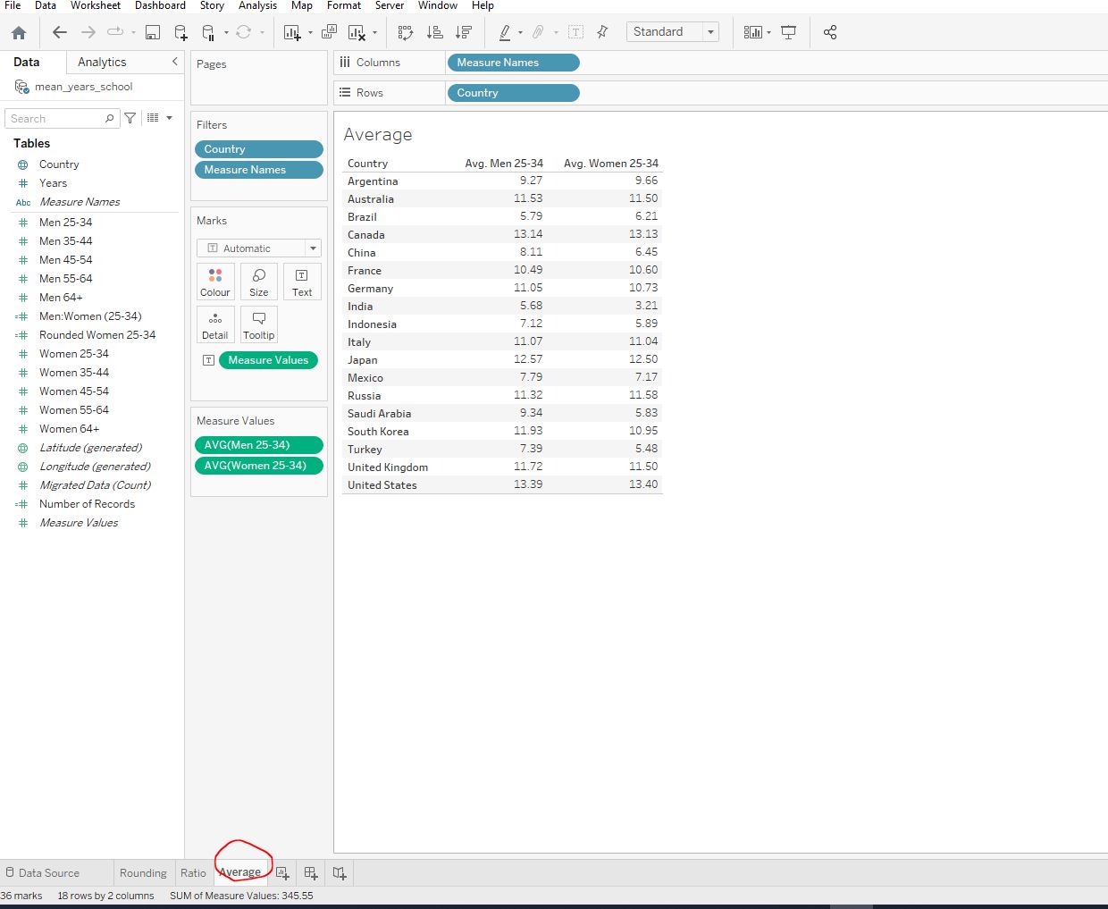
Let’s now create a field for the average across women and women in the age group 25-34.
Navigate to the Average worksheet:
Create a new field called 25-34 that sums the values for men and women in the 25-34 age group and divides them by 2 to get the average:
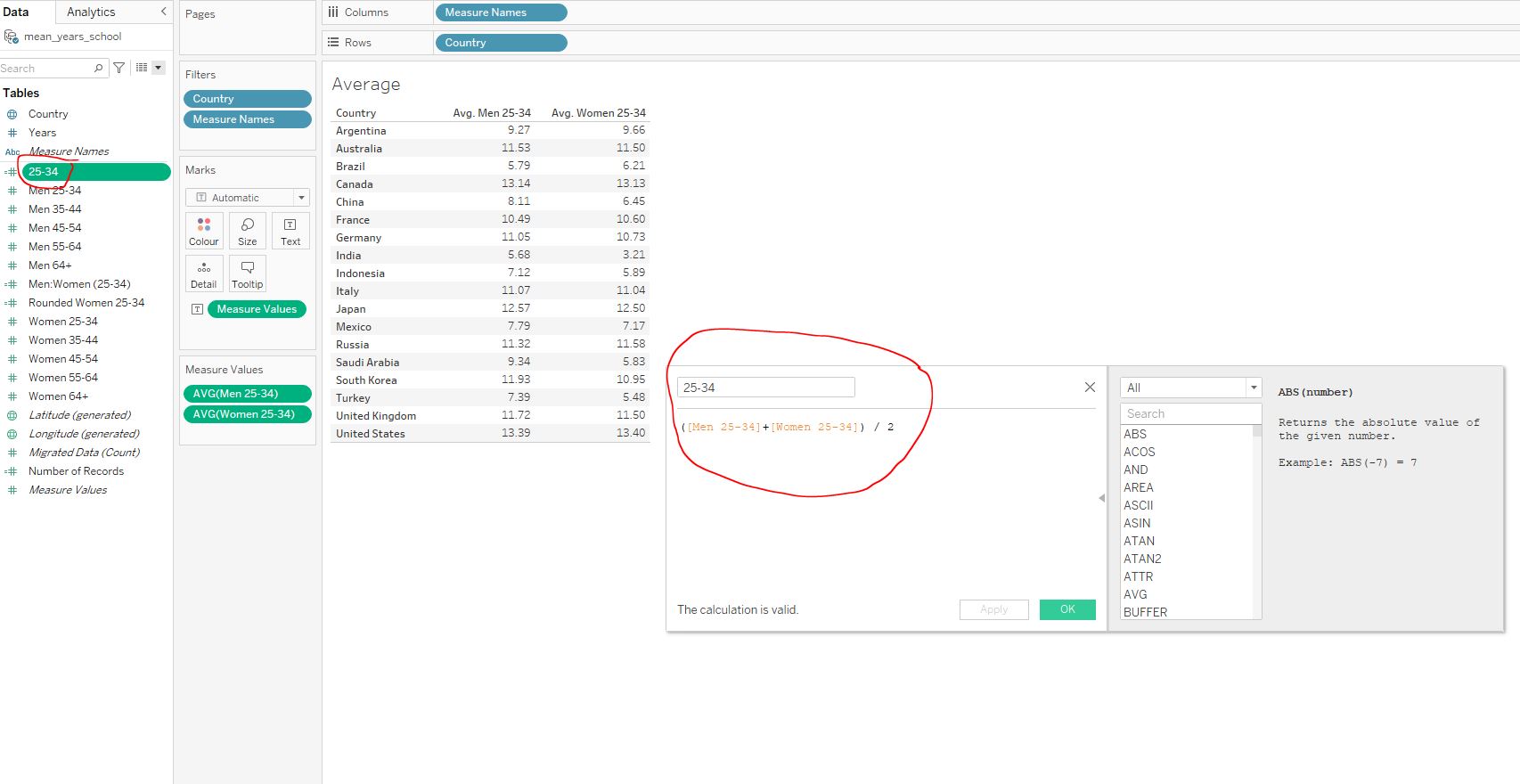
Add the new field to the table. Make sure to change the aggregation from SUM to AVG :
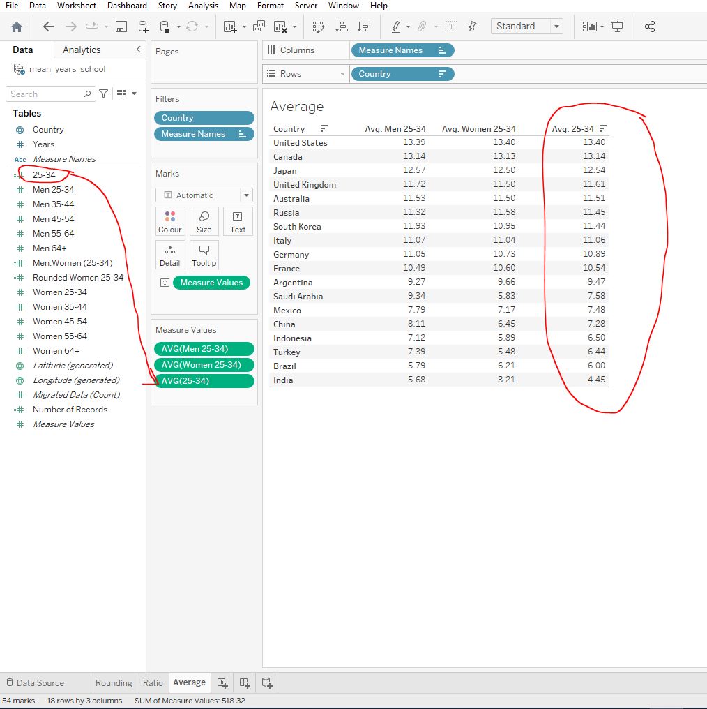
25-34 average for a country?
13.40
Remember, this isn’t a weighted average. To make this calculation more accurate, we could add the country’s population data for each gender and age group. Then we could alter the calculated field’s formula to have weighted proportions.
3. Digging Deeper
Let’s dive deeper into analytics by learning how to visualize geographic data and plot data onto a map visualization. We’ll learn how to work with dates in Tableau and explore how the data changes with time. We will also learn how to add reference, trend, and forecasting lines to our views. We will do all of this exploring health statistics worldwide.
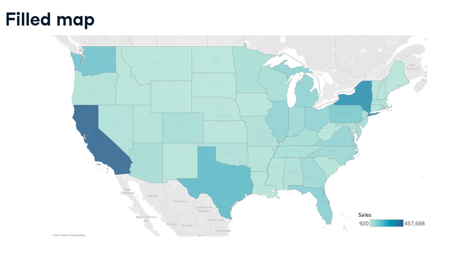
3.1 Mapping our data
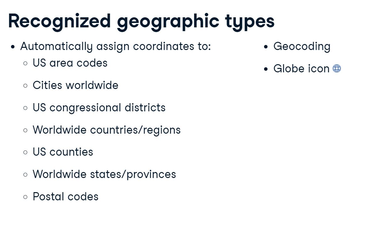
Note that Tableau does not geocode territories, as these are customized region/country groupings that are used differently by people and organizations.
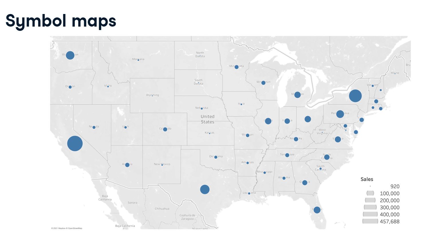
3.2 Creating a symbol map
Open the workbook 3_1_your_first_symbol_map.twbx and navigate to the Symbol Map worksheet. Initialize a symbol map with a circle in each country:
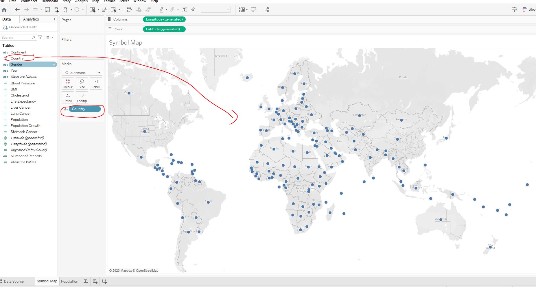
Adjust the sizes of the circles based on the country’s number of Stomach Cancer cases :
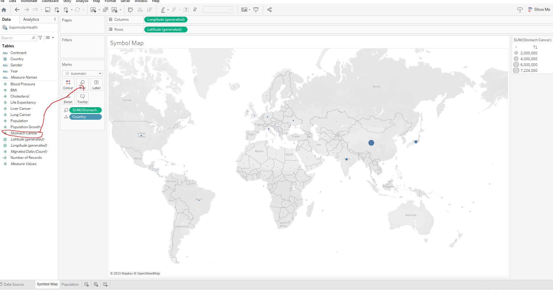
Increase the size of the circles to make it easier to read the map :
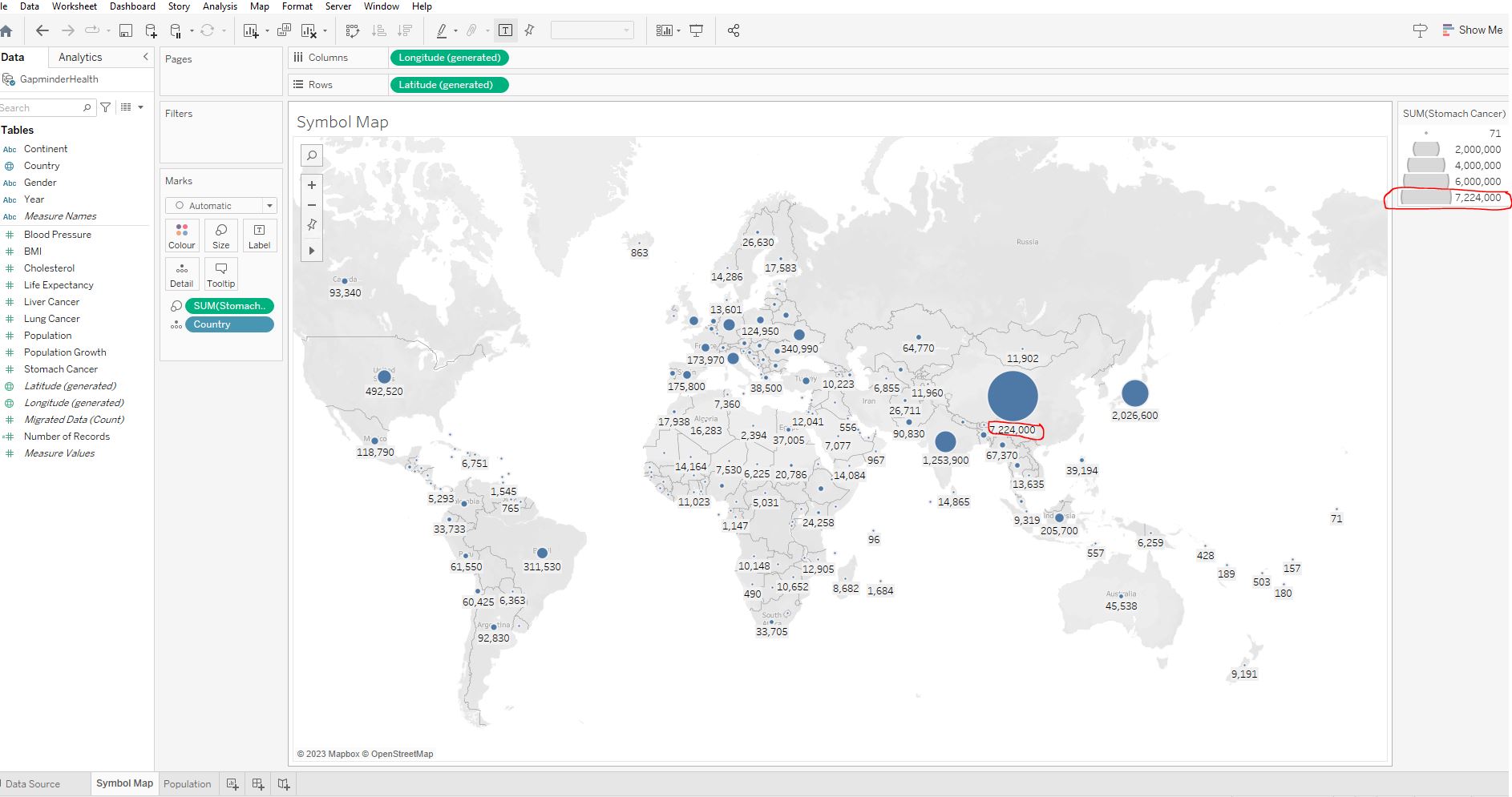
7,224,000
During the period 7,224,000 people were diagnosed with stomach cancer in China. Using automatically generated latitude and longitude, Tableau lets you quickly generate powerful spatial visualizations.
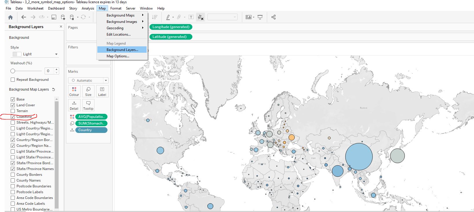
Let’s add some colour to this map. We are asked to add some information about the countries’ population growth. To make the map clearer, we decide to add the coastline.
Colour the circles based on the average Population Growth :
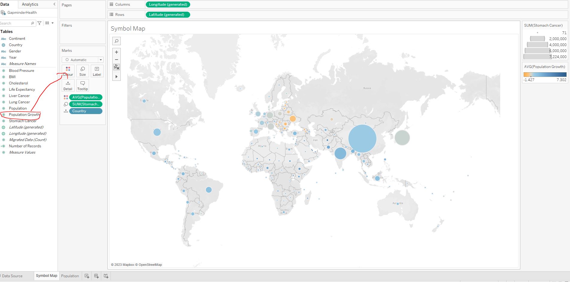
Add a black border around the circles :
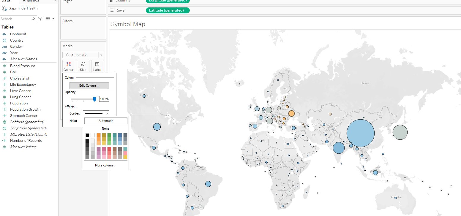
Remove the halo :
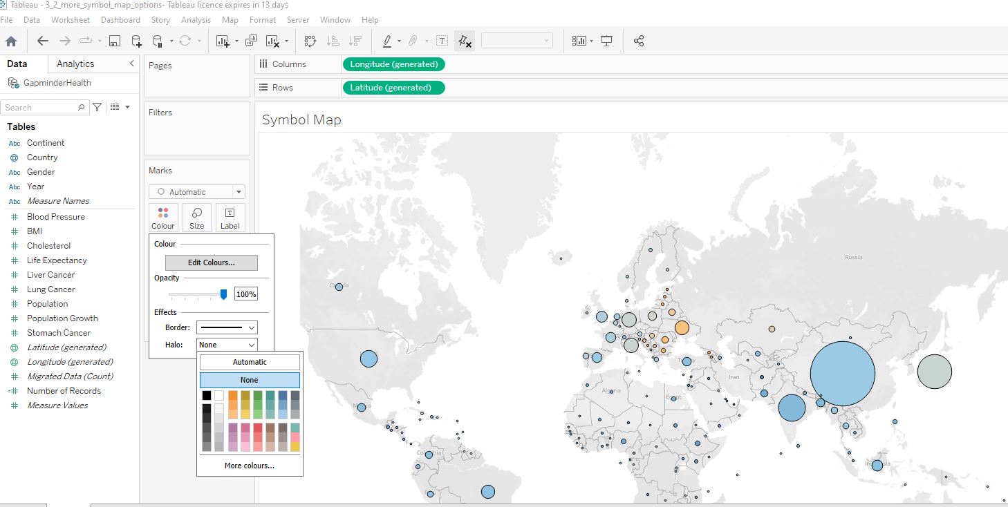
Add a Map layer responsible for showing the Coastline :
Positive. The colour of the circle is blue which represents positive growth. The orange circles represent negative growth.
Lets’ combine everything we’ve learned so far. In this final exercise we will create a symbol map that will make it easy to look at the countries’ population and population growth rates. With this information the World Health Organization can decide on which countries they need to focus on preventing health risks due to overpopulation.
Navigate to the Population worksheet and create a symbol map with varying circle sizes based on Population :
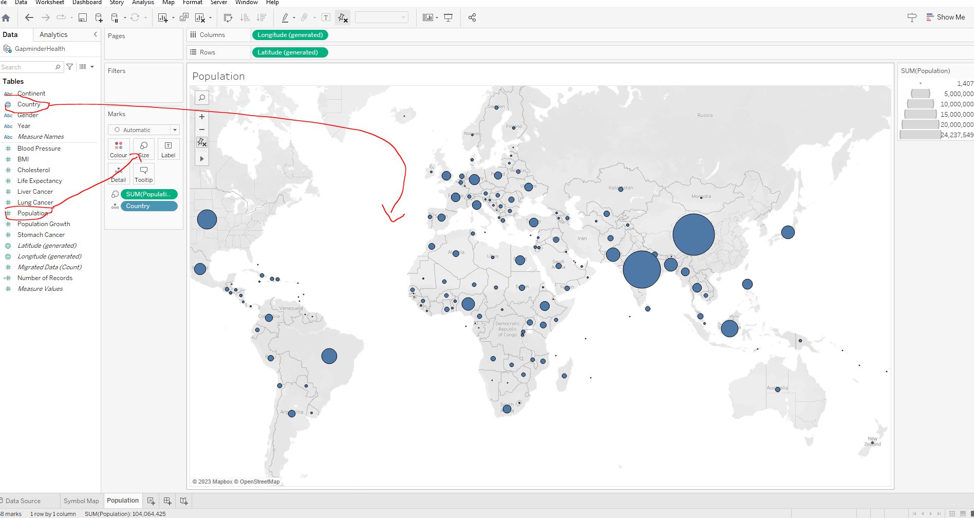
Colour the circles based on average Population Growth :
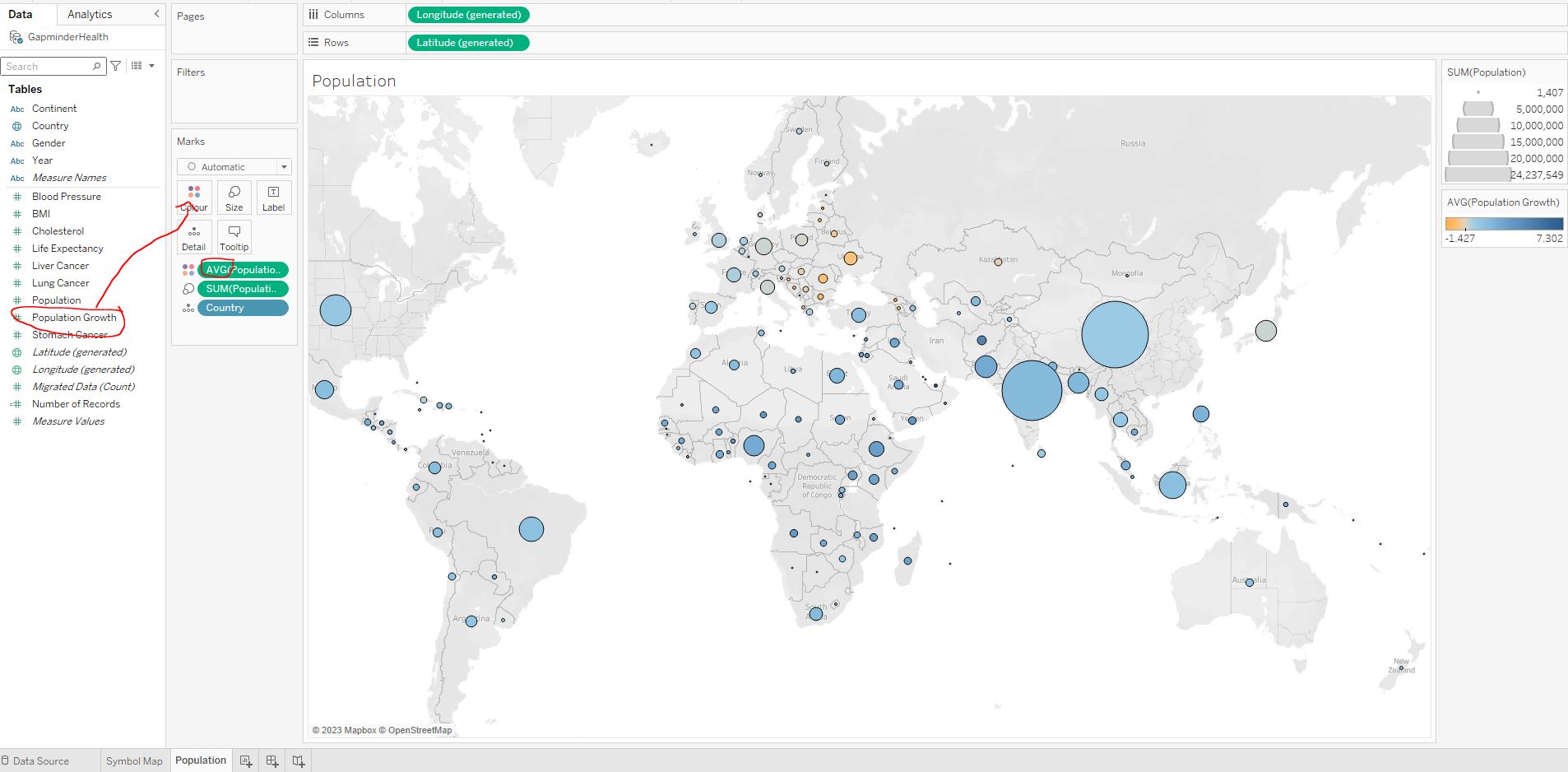
Add a black border around the circles, remove the halo, and filter year to include 2008 data :
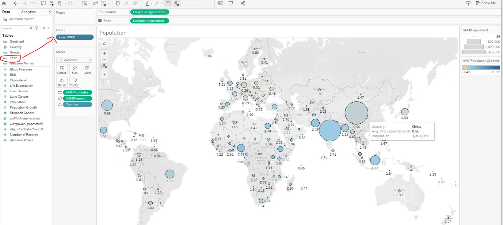
0.56 - China.
China had a growth rate of 0.56 in 2008. It’s positive but not as high as other countries on the map. India’s growth rate for example is 1.48. India might surpass China in terms of population during the following years. The World Health Organization should make sure that they think about India’s high population and rapid growth.
3.3 Working with dates
3.3.1 Date hierarchies
3.4 Visualizing dates
3.4.1 Our data by year
Our task is to analyze natality in Poland over the past 40 years. The World Health Organization is interested in how the number of births has evolved.
Open workbook 3_4_your_data_by_year.twbx and navigate to the Births worksheet. Create a linechart with the date (in years) as columns and the total number of births as rows :
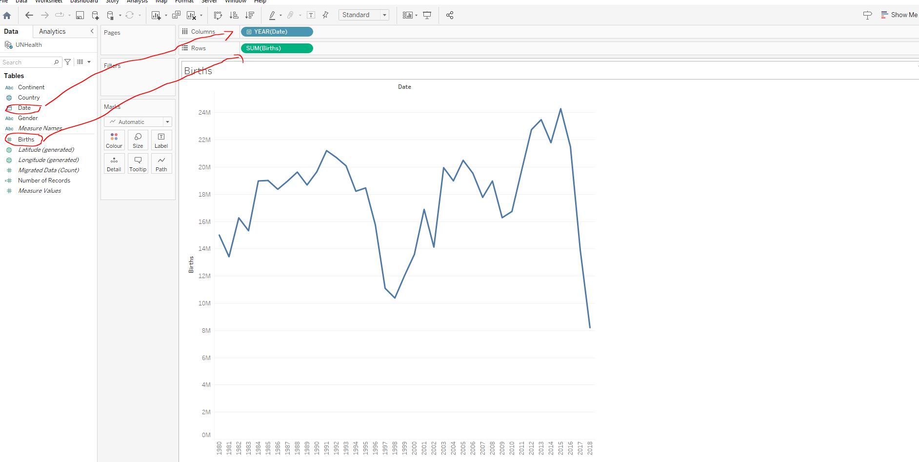
Filter the data on Country to only include Poland :
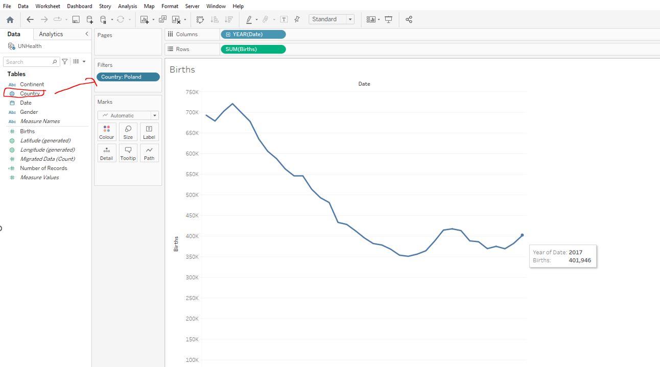
401,946.
The number of births in Poland declined between 1983 and 2003, increased in the years to 2009, and then dipped and resurfaced, centred around 2009 levels in the period 2009 to 2017. But what if we are interested in the births at a more granular level? Let’s analyze the data on a monthly level next.
3.4.2 Our data by month
The World Health Organization has asked us to focus specifically on the last five years available data and look at the monthly number of births.
Open the workbook 3_5_your_data_by_month.twbx and navigate to the Births worksheet. Display the date as continuous month values :
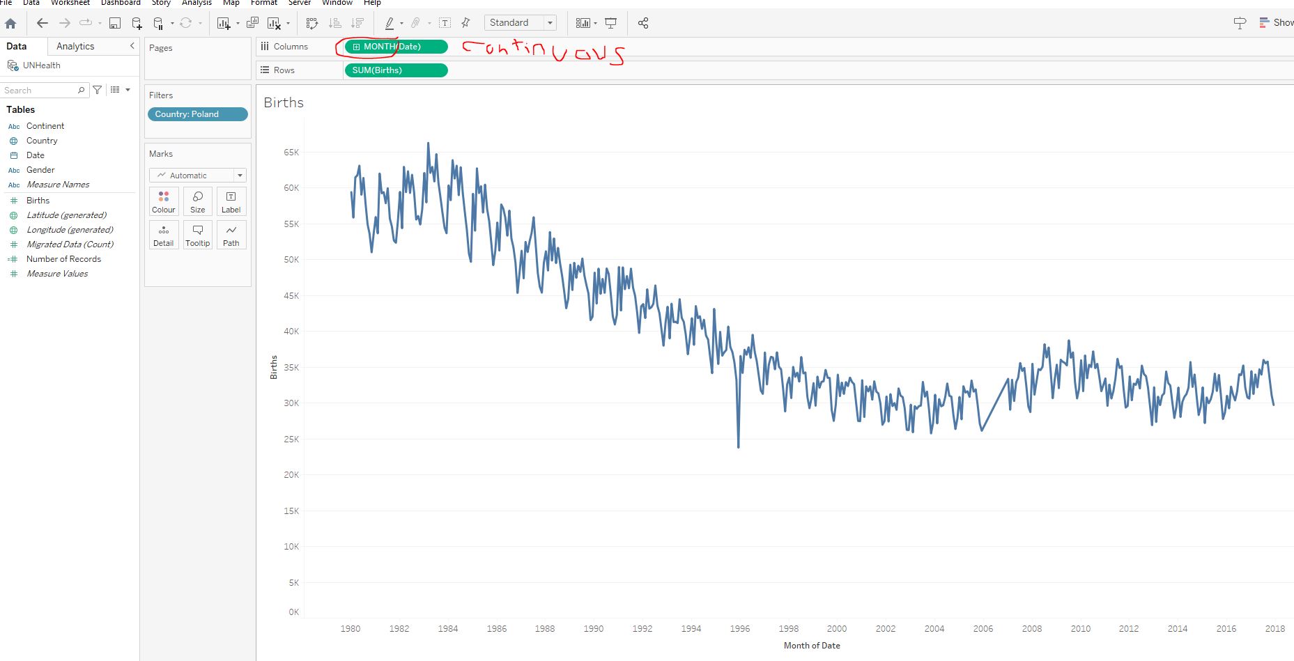
Filter the data on the Years 2013-2017 :
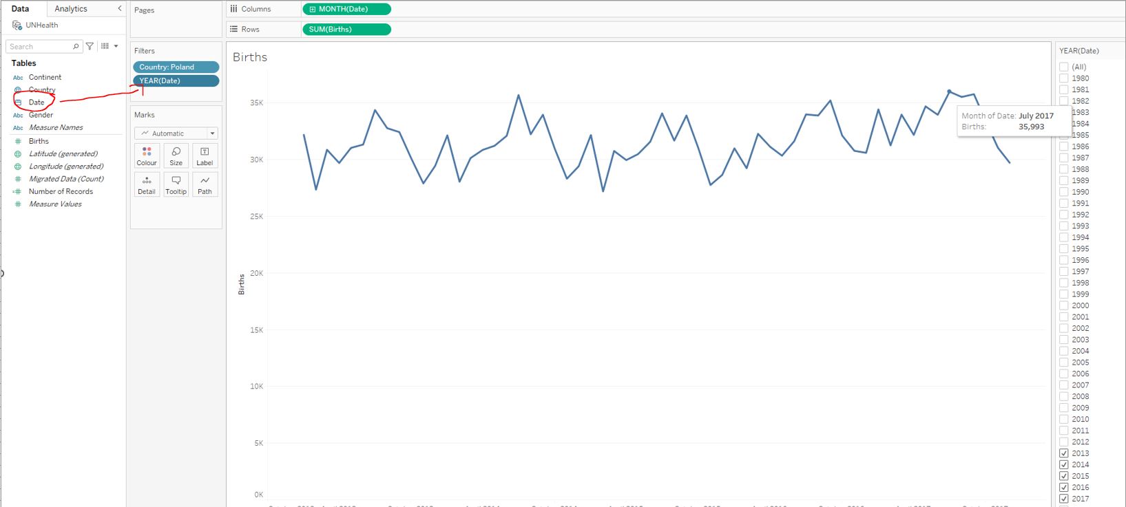
July 2017.
In July 2017, a total number of 35,993 babies were born in Poland. Note how easy Tableau makes changing the granularity level of the date variable.
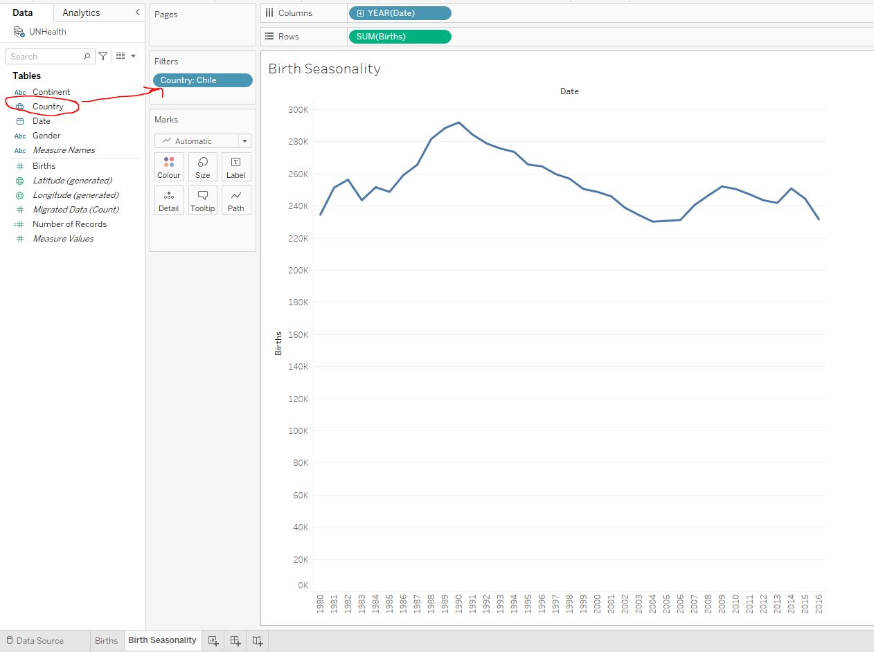
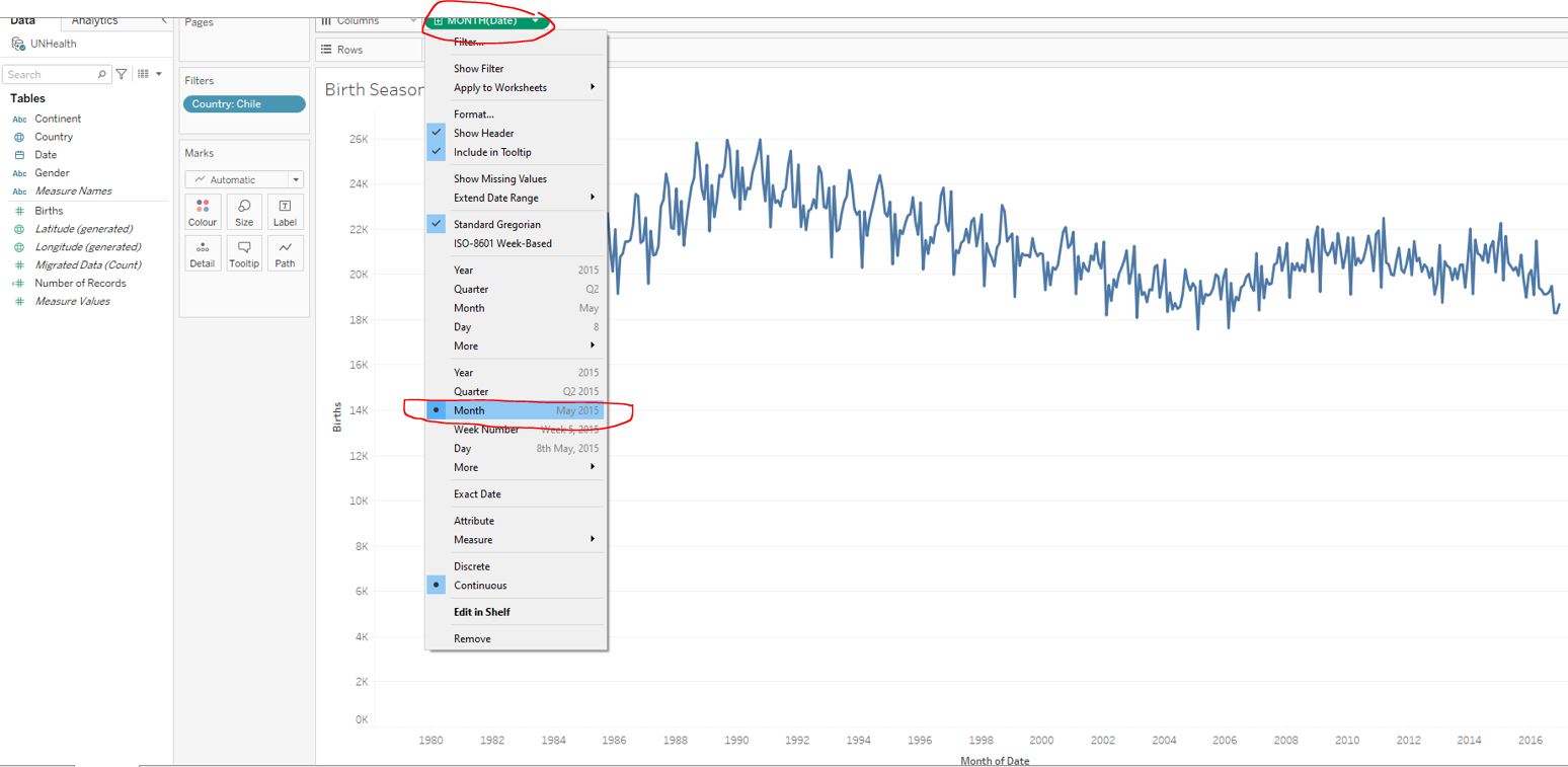
3.4.3 Birth seasonality
Let’s combine everything we have learned so far in our final exercise. We will create a line chart that will help the World Health Organization plan how many resources should be sent to Chile to ensure newborn care at birth throughout the year.
Load the workbook 3_6_birth_seasonality.twbx and navigate to the Birth Seasonality worksheet. Create a line chart with the date (in years) as columns and the total number of births as rows:
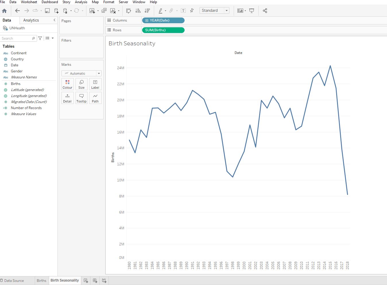
Filter the data on Country to include only Chile :
Display the date as continuous month values:
Filter the data on the Years 1995-1999 :
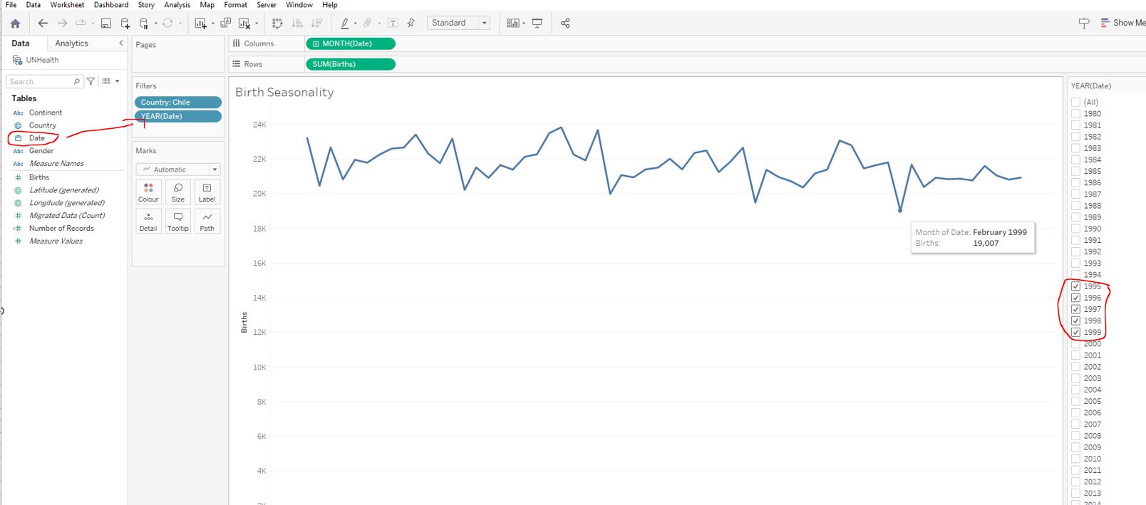
February 1999.
It looks like there is some seasonality in the natality data. During the 1995-1999 period, fewer babies were born each February, although note that this is most likely because February is the shortest month.
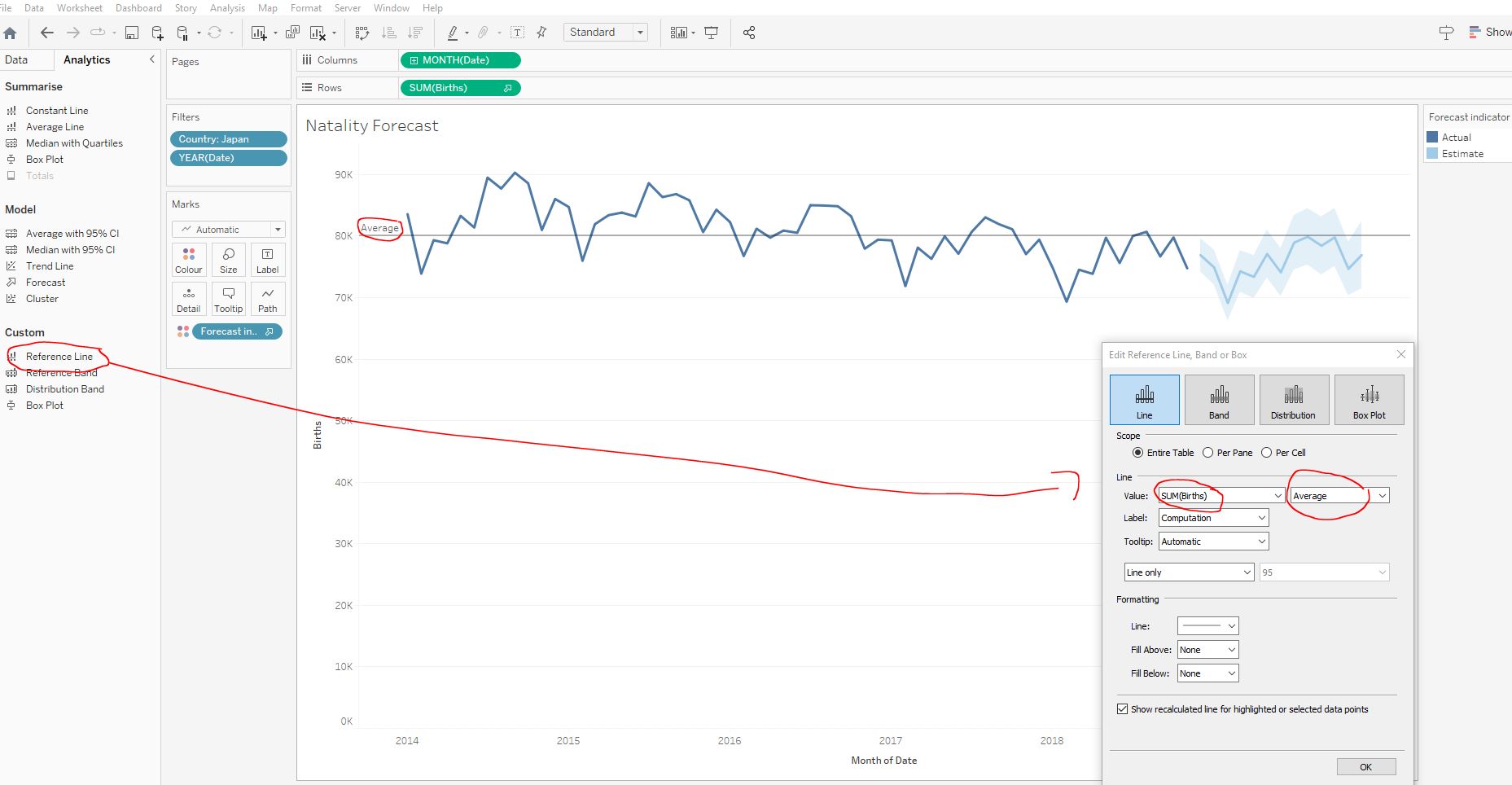
3.5 Reference lines, trend lines, and forecasting
3.5.1 Reference lines
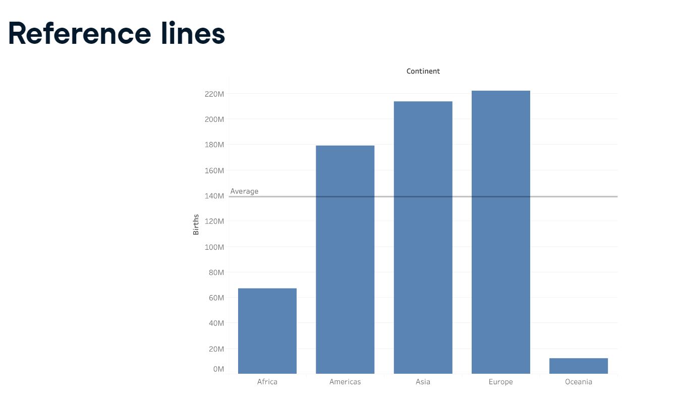
Our task is to analyze the number of births in Denmark over the last six years. We have been asked to add a reference line to our graph indicating the minimum monthly births over the period.
Open up the workbook 3_7_reference_lines.twbx and navigate to the Reference, Trends & Forecasting worksheet. Create a line chart with the date (continuous month values) as columns and the total number of births as rows:
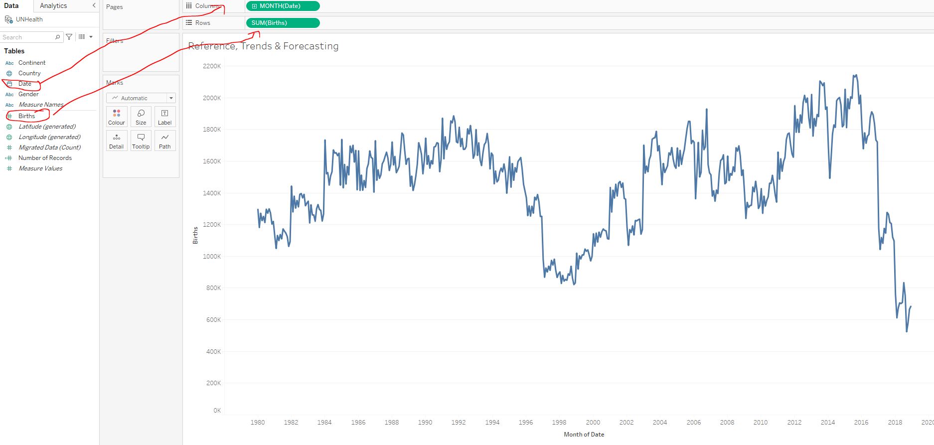
Filter the data on Country to only include Denmark, and Date to only include 2012-2017 :
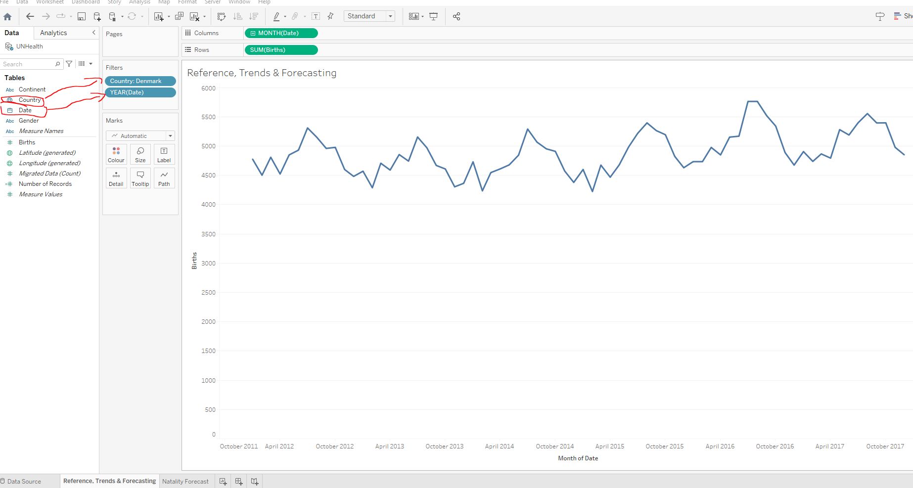
Add a reference line indicating the minimum number of births in the chart :

4,225.
In February 2015, 4,225 babies were born in Denmark. With the reference line chart, we can easily see how the number of births in a certain month compares to the minimum of that period.
3.5.2 Trend lines
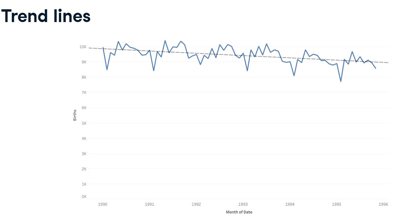
Next, we are asked to investigate the trend in the number of female births during the same period. We can easily spot this by adding a trend line. Load the workbook 3_9_trend_lines.twbx and filter to show only female births :
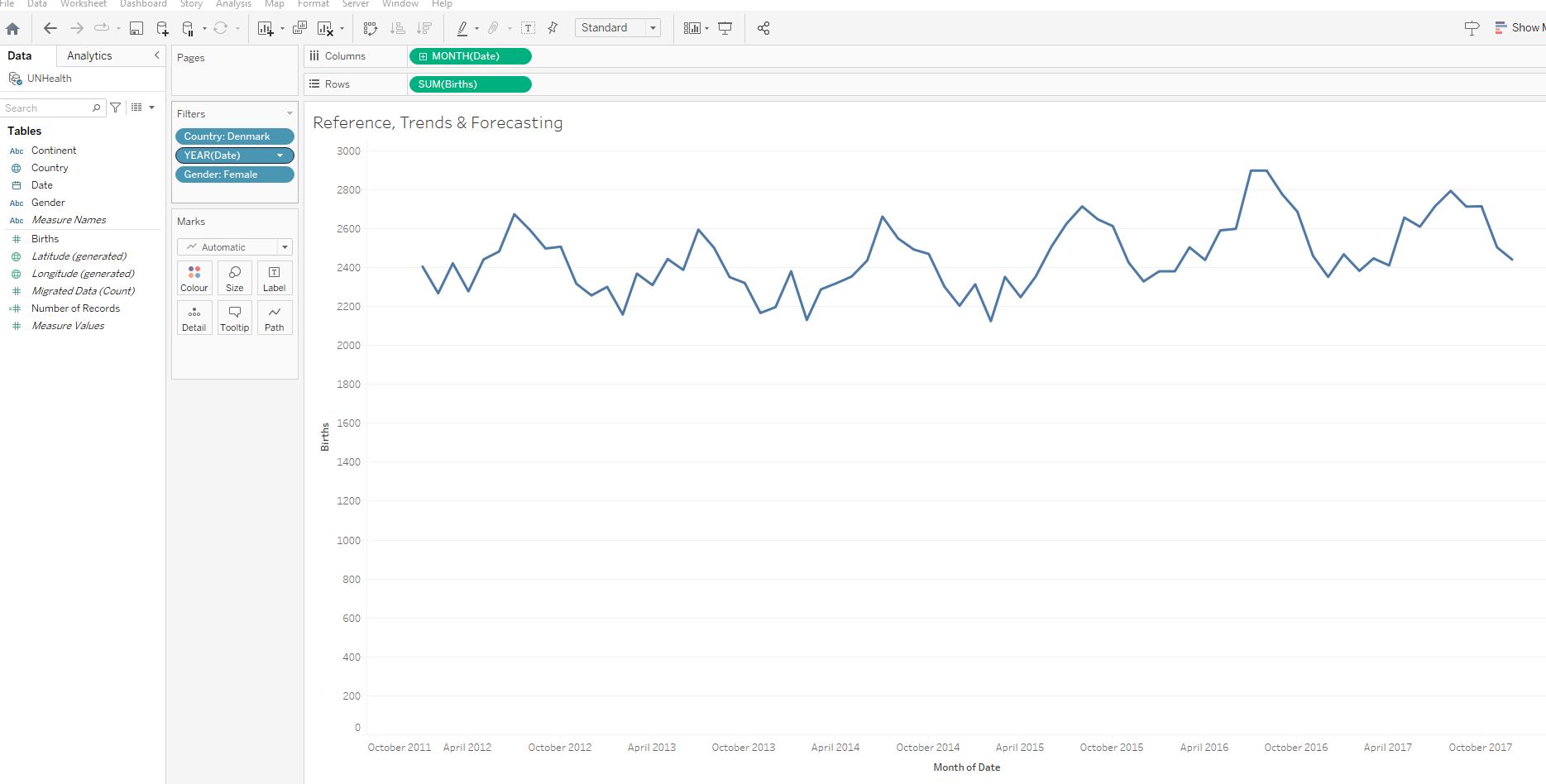
Add a linear trend line for the number of births over time :
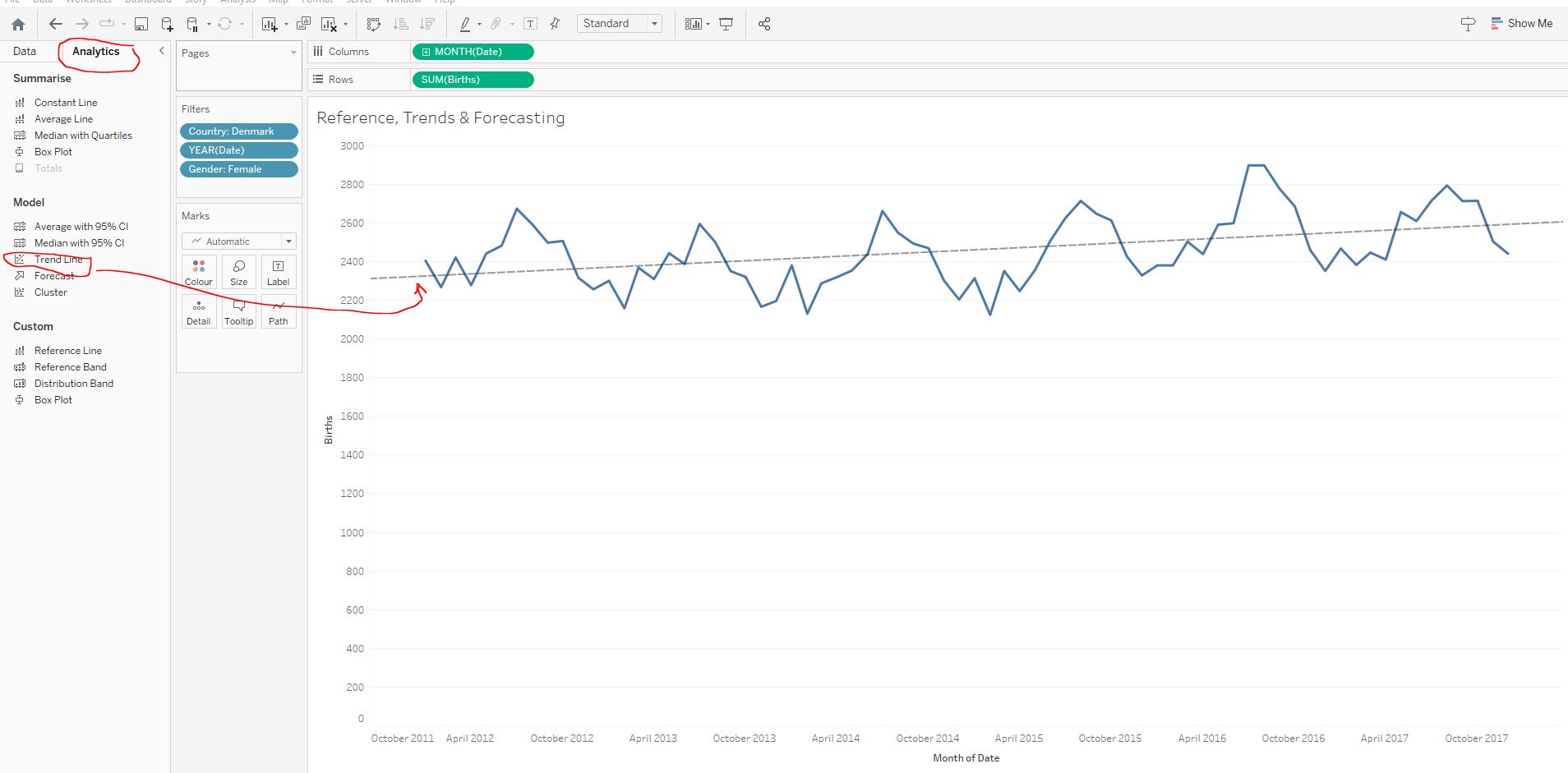
Upward.
Overall, the number of female births in Denmark has been slowly increasing over the last couple of years. This is much easier to spot with the trend line added to our visualization.
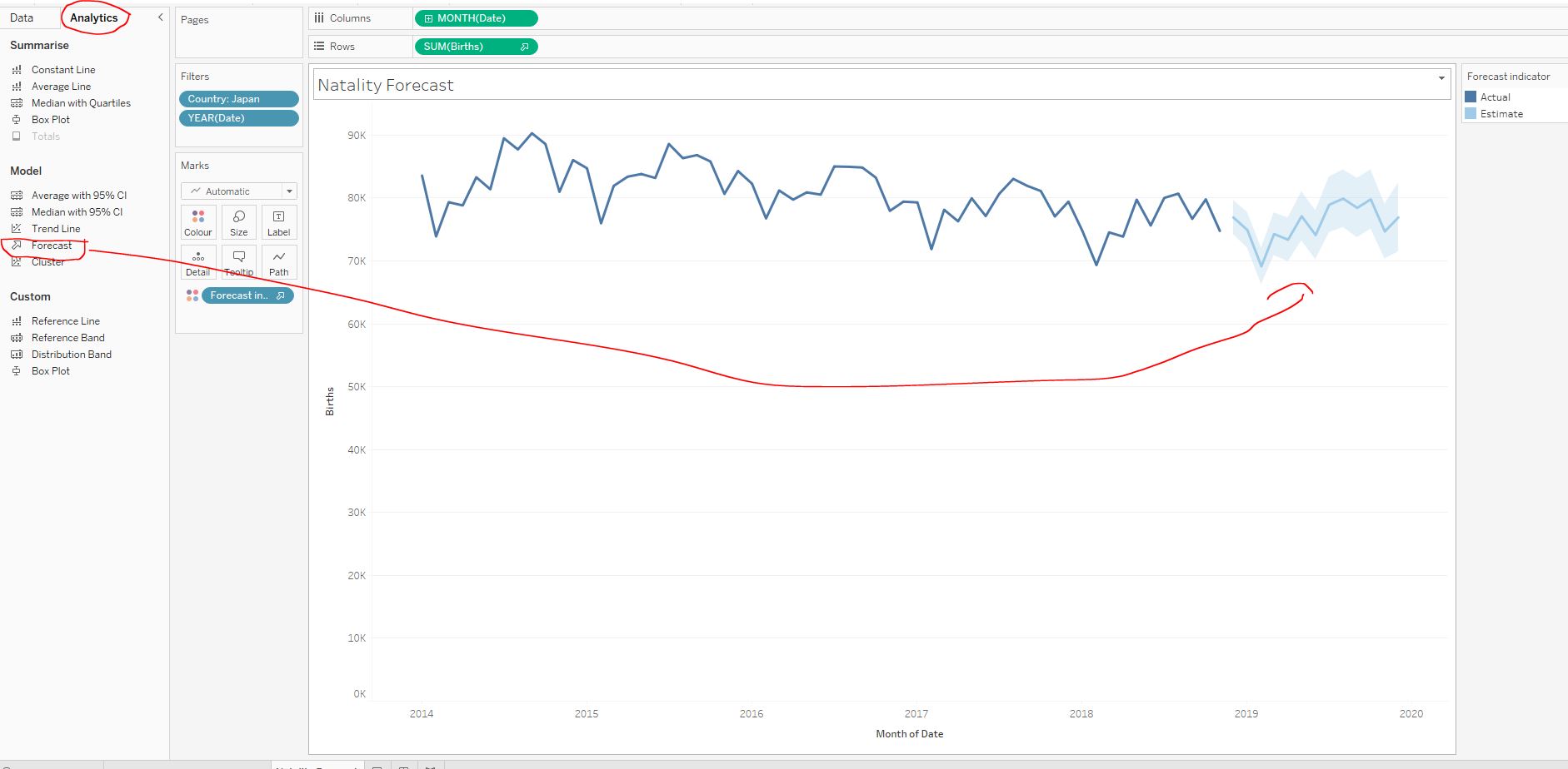
3.5.3 Forecasting
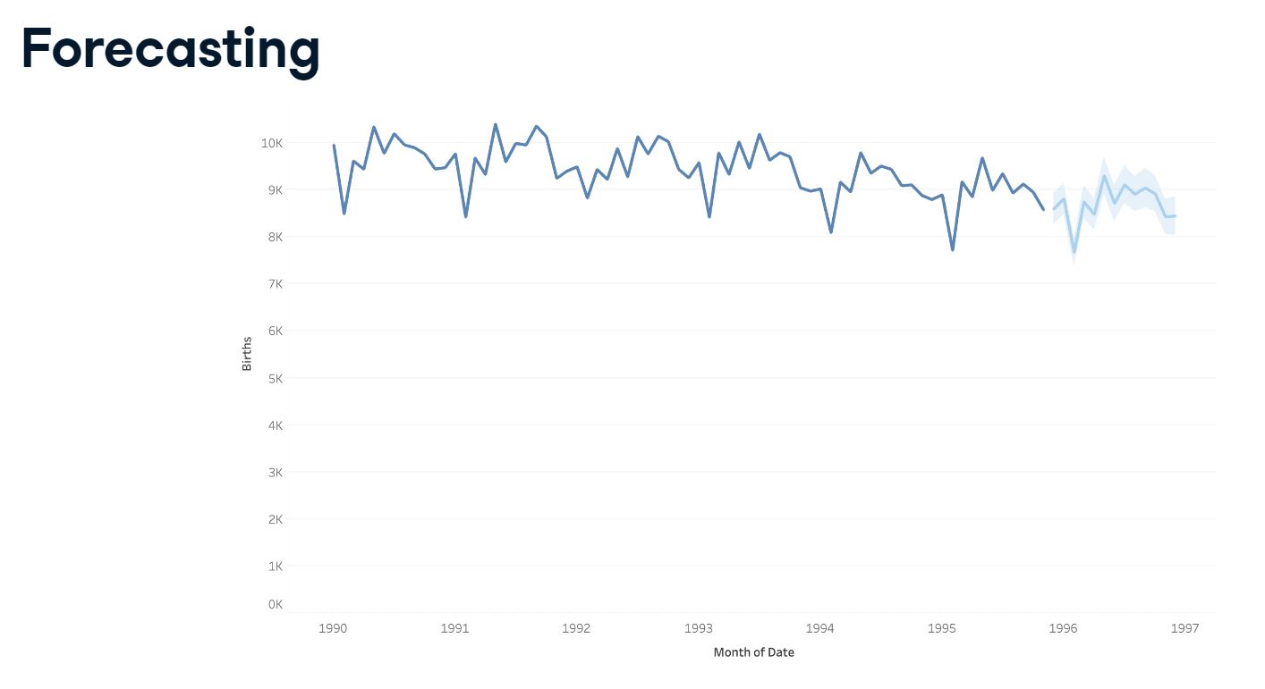
Forecasting is a valuable technique that can help us anticipate and make informed decisions for the future. Let’s do some forecasting. This time we are tasked with forecasting the number of female births in Denmark for the next year.
Load the workbook 3_9_forecasting.twbx and remove the trend line we created before. Add a forecast for the number of female births during 2018 :
2,890.
The forecast tells us that we can expect 2,890 new baby girls in Denmark in August 2018. Forecasting future events can put us in a position to be proactive instead of reactive.
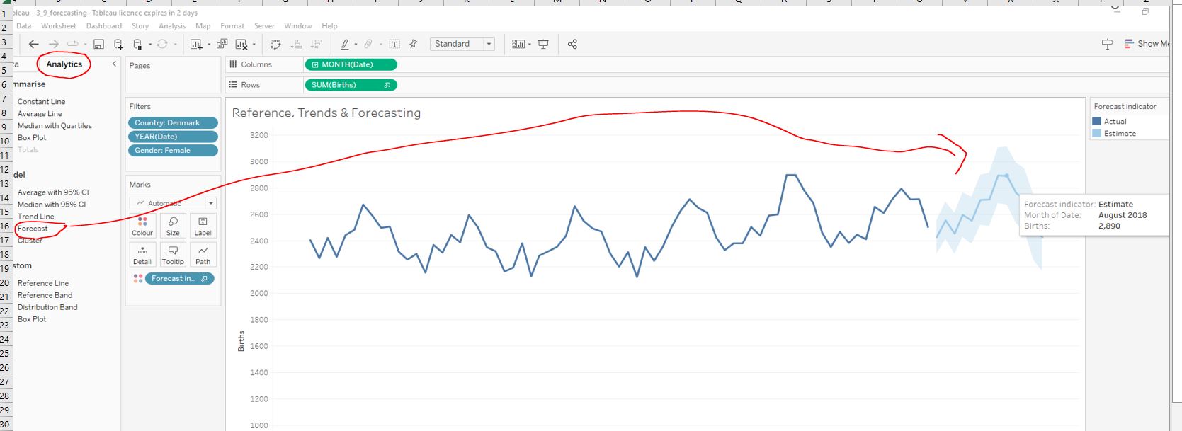
3.5.4 Bringing it all together
Let’s combine what we’ve learned so far. Let’s create a line chart which that will make it easy to answer the following question:
Is the forecasted number of births in Japan during December 2019 higher than the average over the last five years?
Load the workbook 3_10_natality_forecast and navigate to the Natality Forecast worksheet. Create a line chart with the date (continuous month values) as columns and the total number of births as rows :
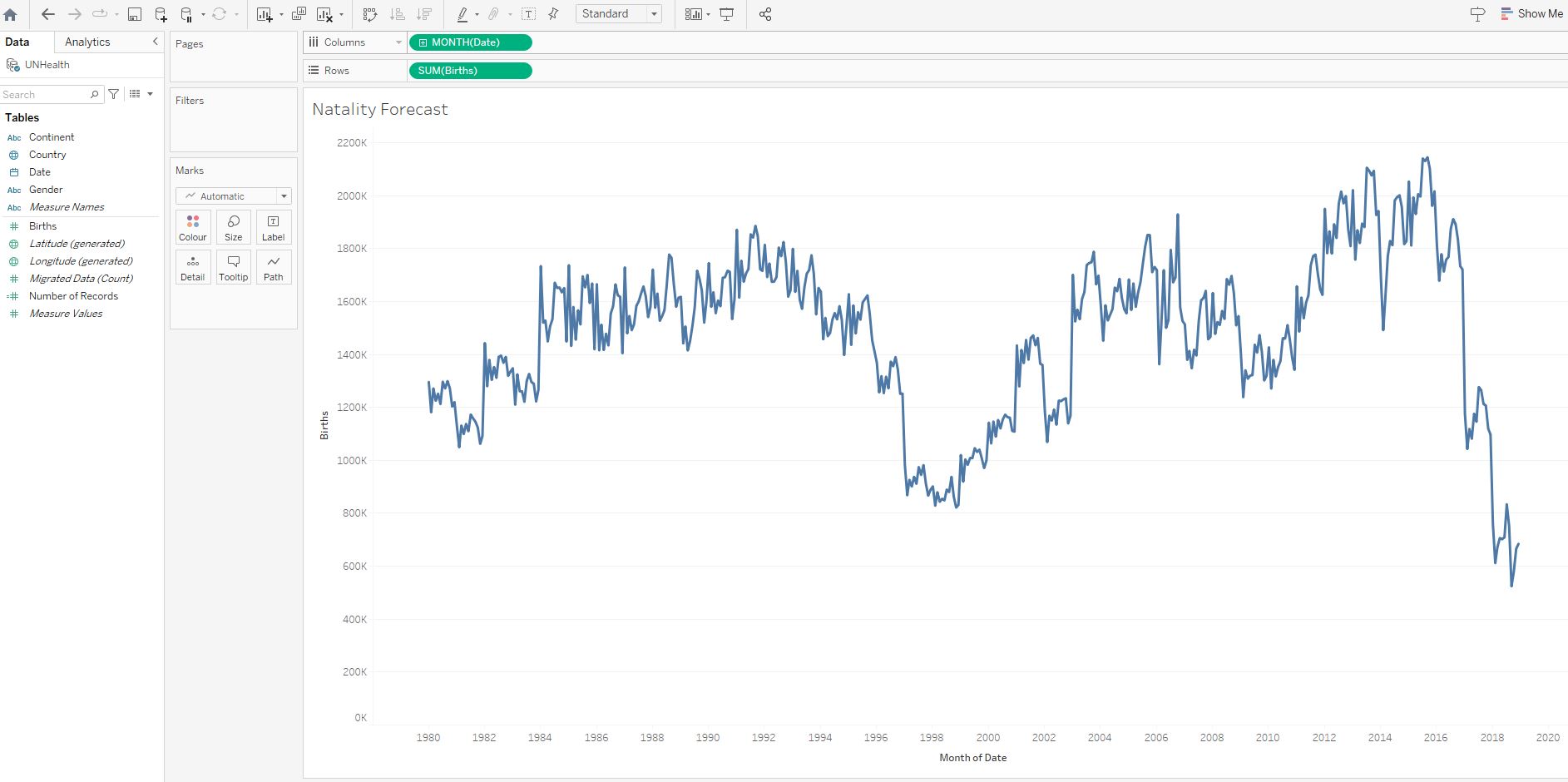
Filter the data on Country to only include Japan and on Date to only include years 2014-2018 :
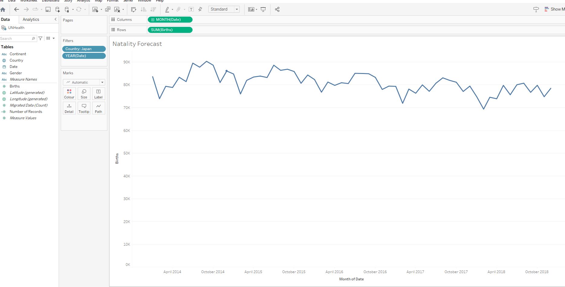
Add a forecast for the number of births during 2019 :
Add a reference line indicating the average number of births in the chart:
No.
The number of births in December 2019 is forecast to be lower so the World Health Organization might need to send over fewer resources during that period.
4. Presenting Our Data
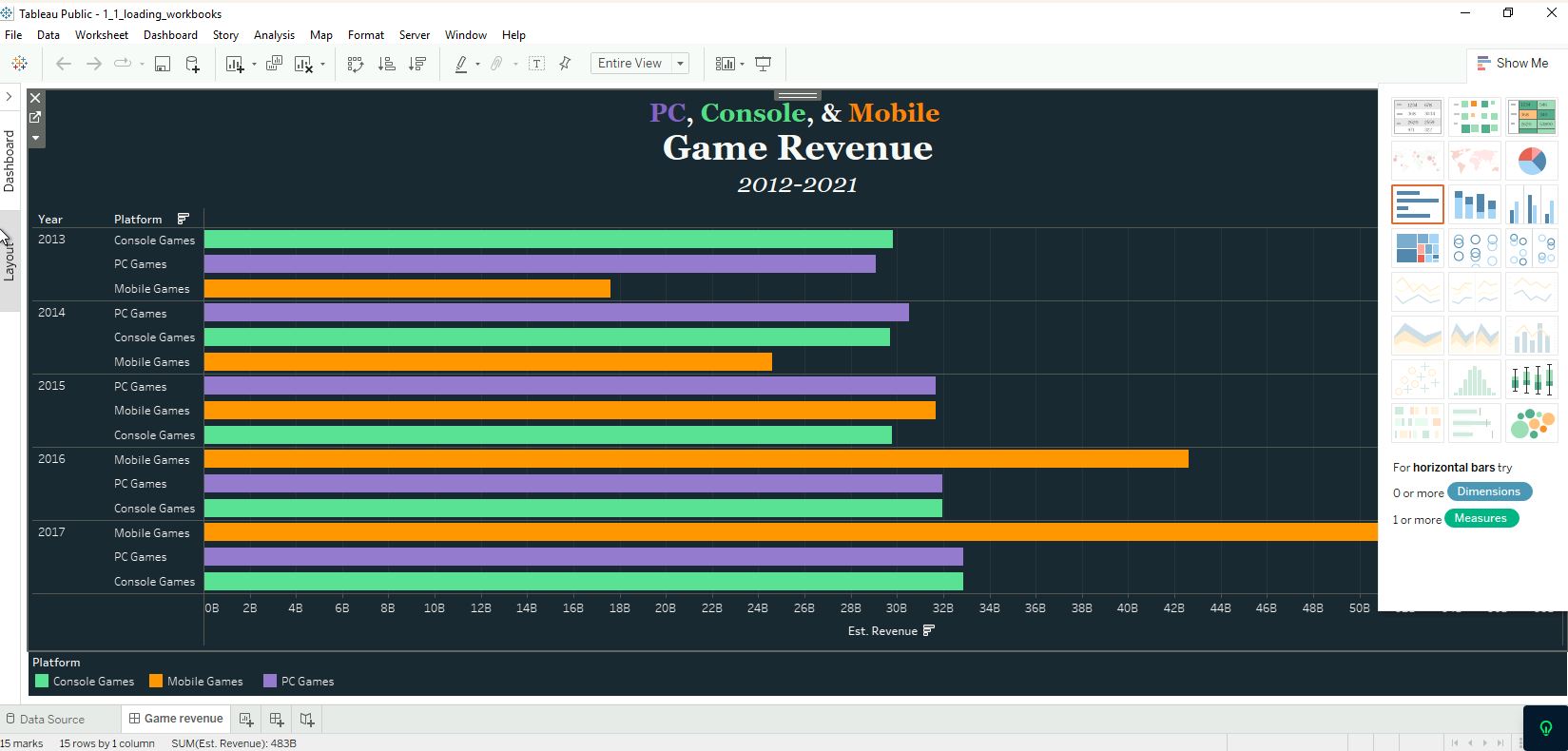
Our data is full of interesting stories and insights still waiting to be told. Learn best practices for formatting and presenting visualisations to tell data-driven stories. Using a new dataset on video game sales we’ll be building our first dashboard!
4.1 Make our data visually appealing
4.2 Applying visual best practices
4.2.1 Create a dual-axis graph
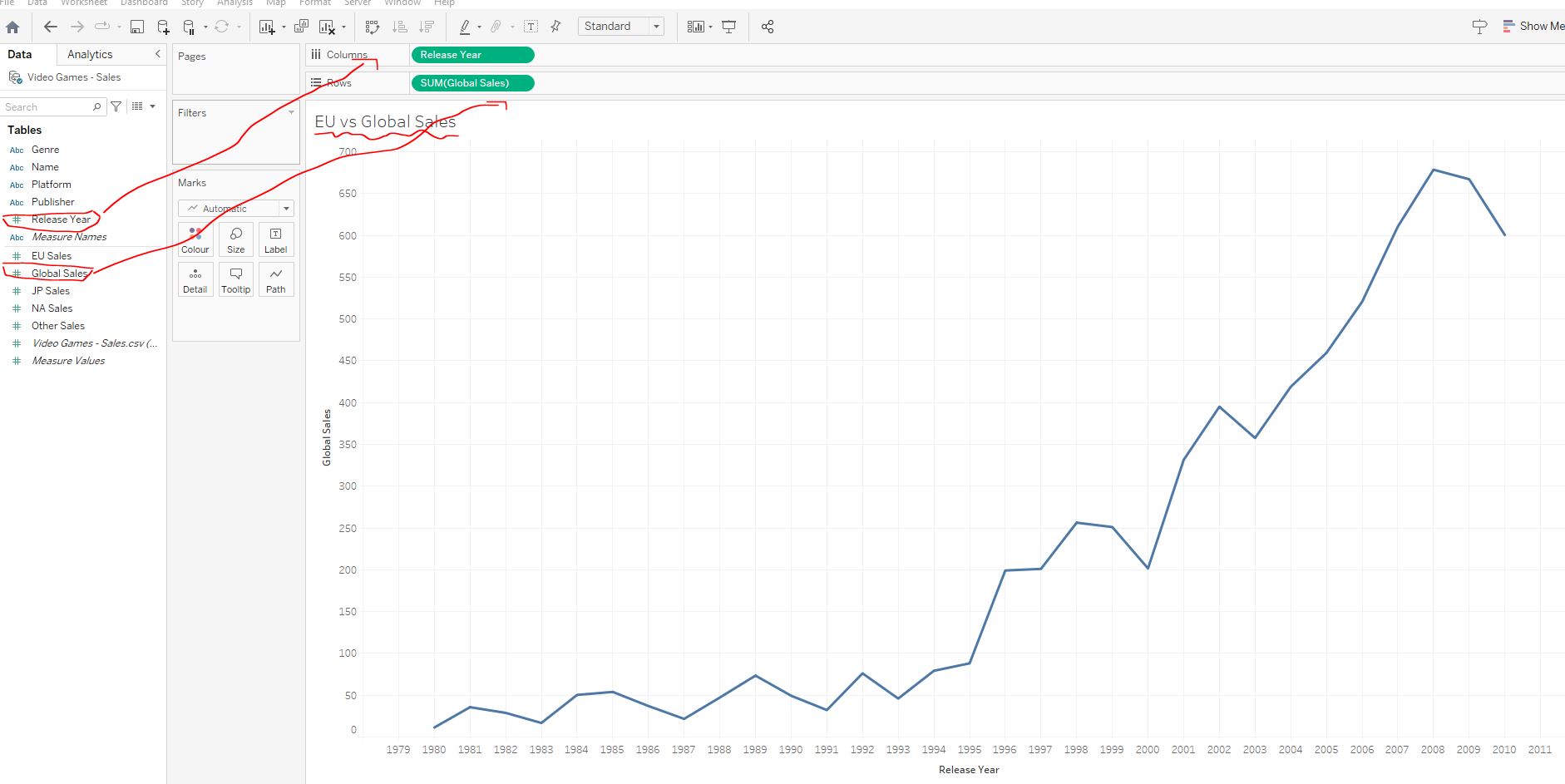
The video games dataset contains information on video game sales from 1990 until 2010. Our task is to investigate the dataset and uncover insights about the gaming industry. Our first job is to investigate global and European sales of Atari over time - we can do so by creating a dual-axis graph.
Open WorkBook 4_1_dual_axis.twbx and rename Sheet 1 tab to EU vs Global Sales - drag Release Year to columns, and Global Sales to rows :
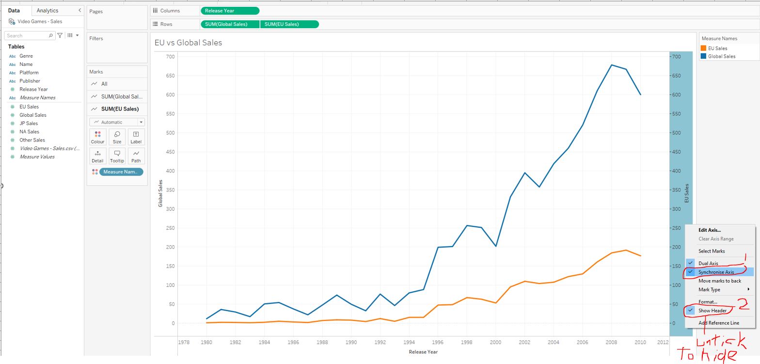
Drag EU sales to the right of the graph until a dotted line appears. Synchronize and hide the right axis :
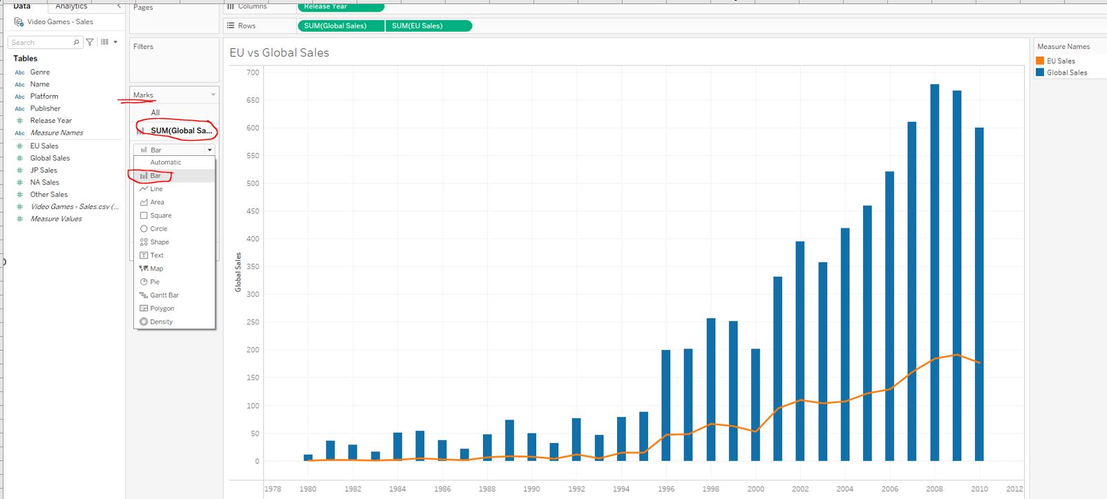
Change Global Sales from a line to a bar chart using the Marks card. This will make it more evident Global Sales is the sum of all regions :
Clean up the graph and add a filter:
- centre the title of the graph
- rename the y-axis to
Video Game Sales (millions of units) - filter
PublisherforAtari
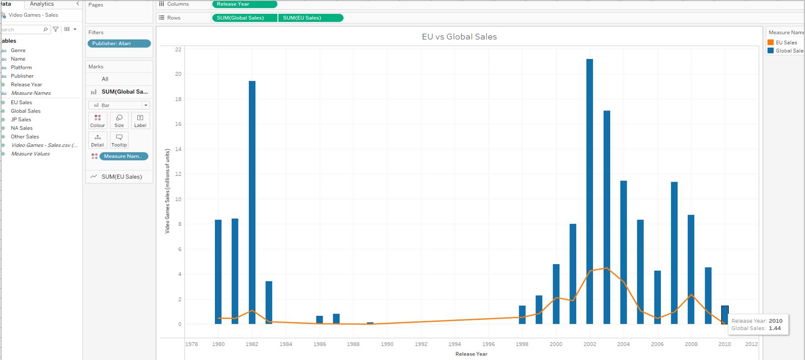
1.44
The visualization shows Atari game sales went downhill fast after a second successful stint in the ear;y 2000s, eventually resulting in their bankruptcy in 2013.
4.2.2 Expanding a dual-axis graph
Breaking video gaame sales down by Genre can reveal many insights. We have been asked to investigate Nintendo's Puzzle video game sales in North America.
Duplicate the EU vs Global Sales worksheet and rename it All Regions - Sales. Next, drag Measure Values on top of EU Sales in the rows section. By doing this, Tableau automatically adds all Measures (highlighted in green) to the graph :
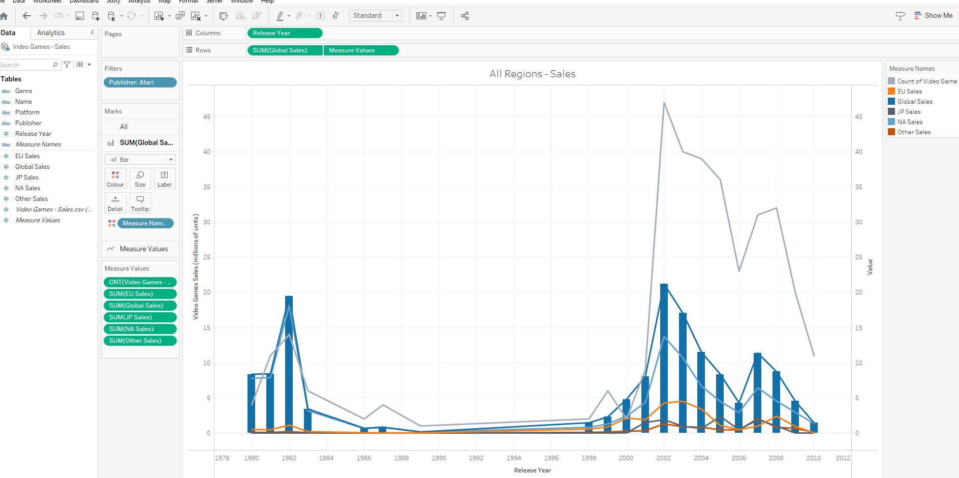
Next, remove the following from Measure Values (below the Marks cars) that are not needed:
Video Games - Sales.csv (count). This is a count of rows of the database generated by Tableau. In this case, it does not add any infoGlobal SalesThe measure is already visualized on the bar chart on the left axis
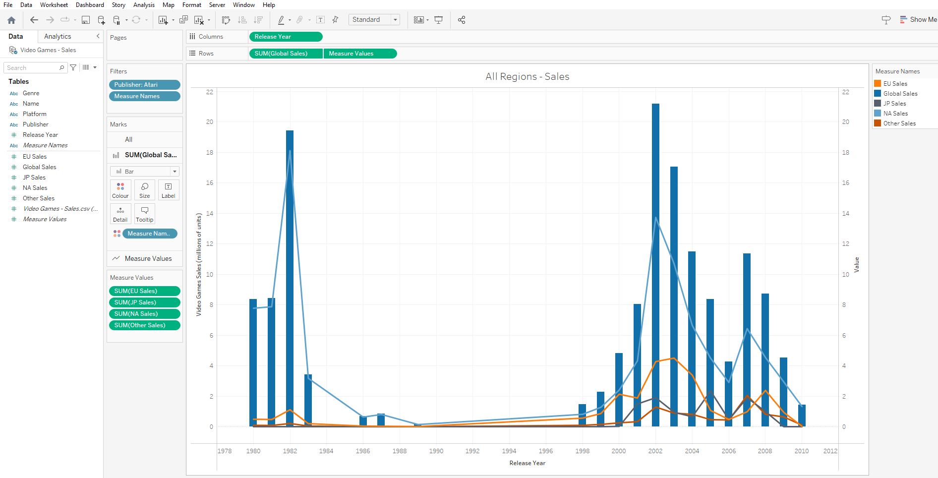
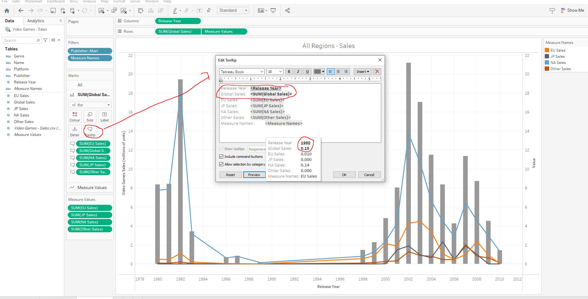
Expand the tooltip to allow us to hover over the bar :
- Add
EU Sales,Global Sales,NA Sales, andOther SalestoTooltipsand edit to our liking:
Include a Genre filter for Puzzle and change Publisher filter to Nintendo :
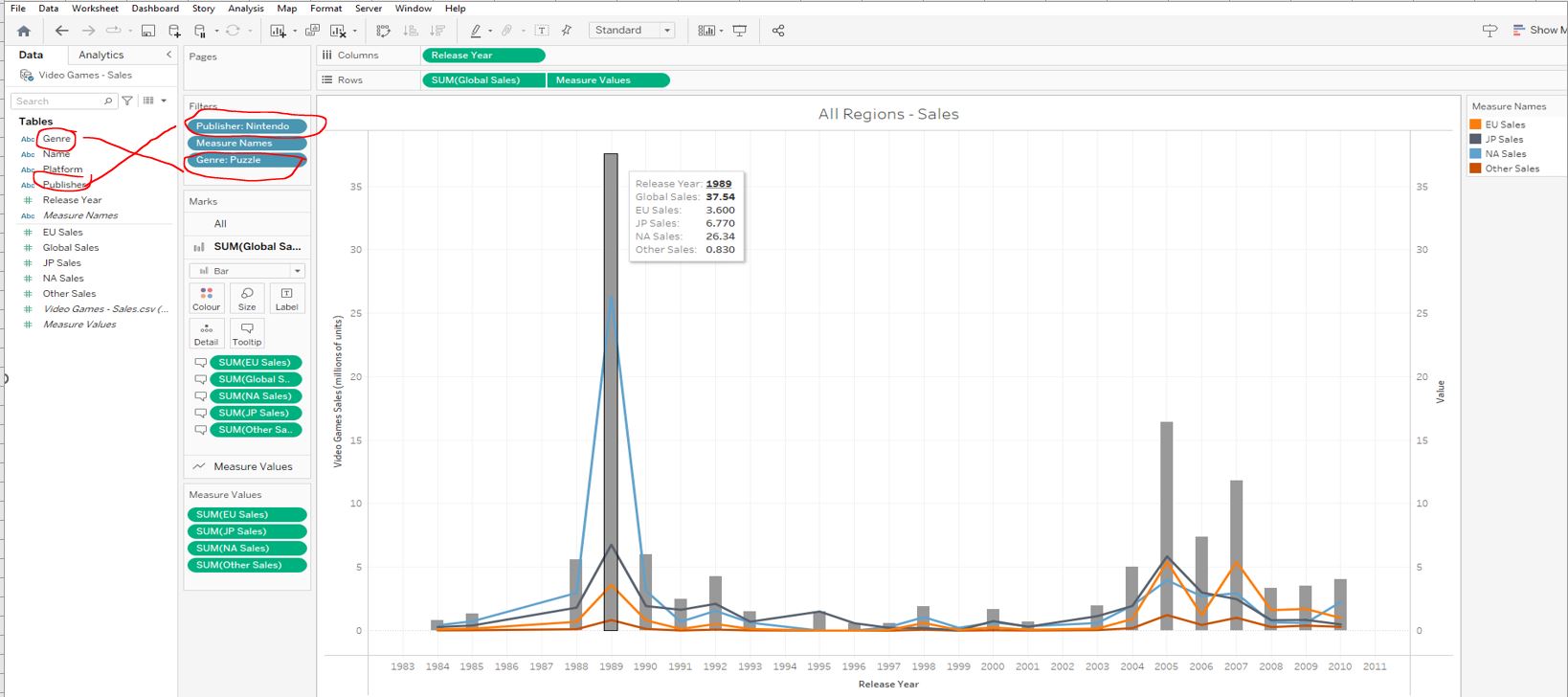
Puzzle genre video games sold (million units) by Nintendo in North America that were released in 1989 ?
26.34
The massive spike in the puzzle genre in 1989, is thanks to the success of Tetris. It accounts for almost 90% of sales from that release year!
4.2.3 Formatting our visualization
Time to play around with colours. Create a new worksheet and rename it Global Sales Breakdown. Create a bar chart of Global Sales by Release Year, centre the title of the graph, and change its font size to 16 :
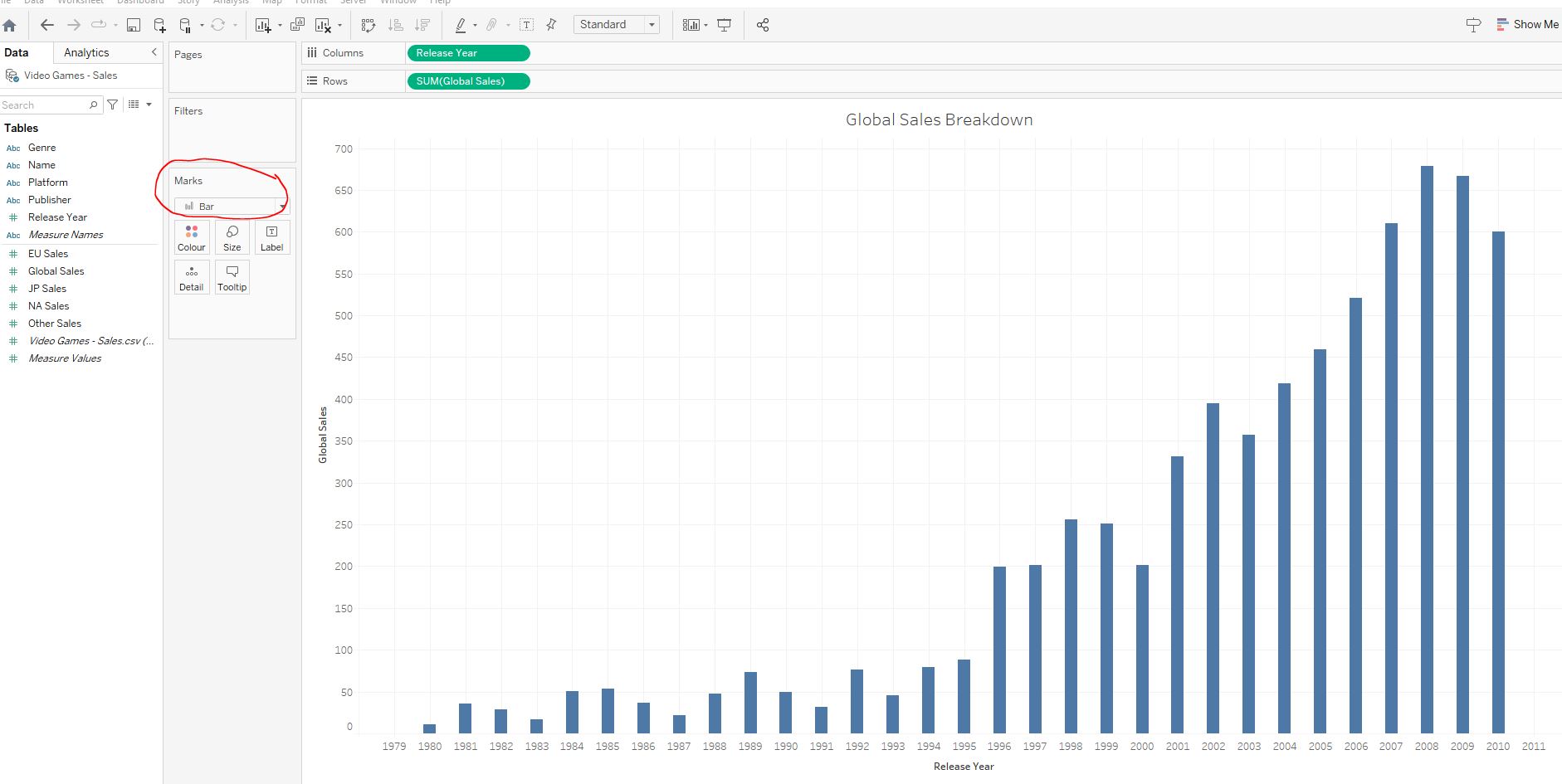
Add different Dimensions to the colours pane to see what happens:
- add
Name- ignore the warning and pressAdd all members:
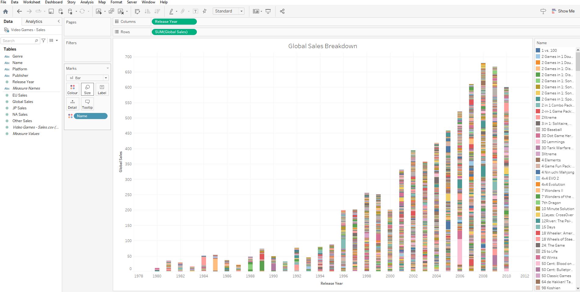
- replace
NamewithRelease Yearby dragging it on top :
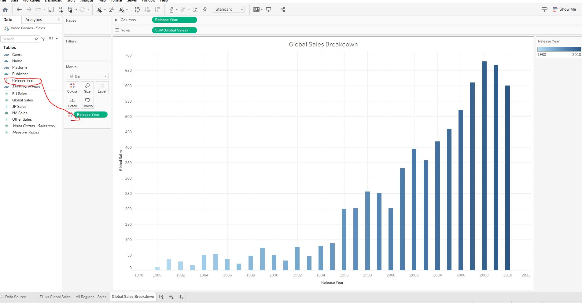
- replace
Release YearwithGenreby dragging it on top :
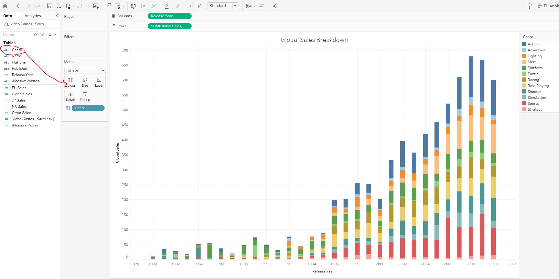
Genre.
Genre is the only option that adds extra information to the graph and is thus the most useful.
4.3 Dashboards and stories

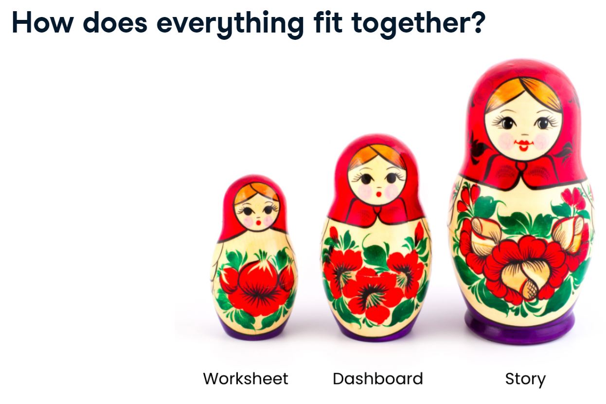
4.3.1 Worksheet vs. dashboard vs. story
4.4 Creating dashboards and stories
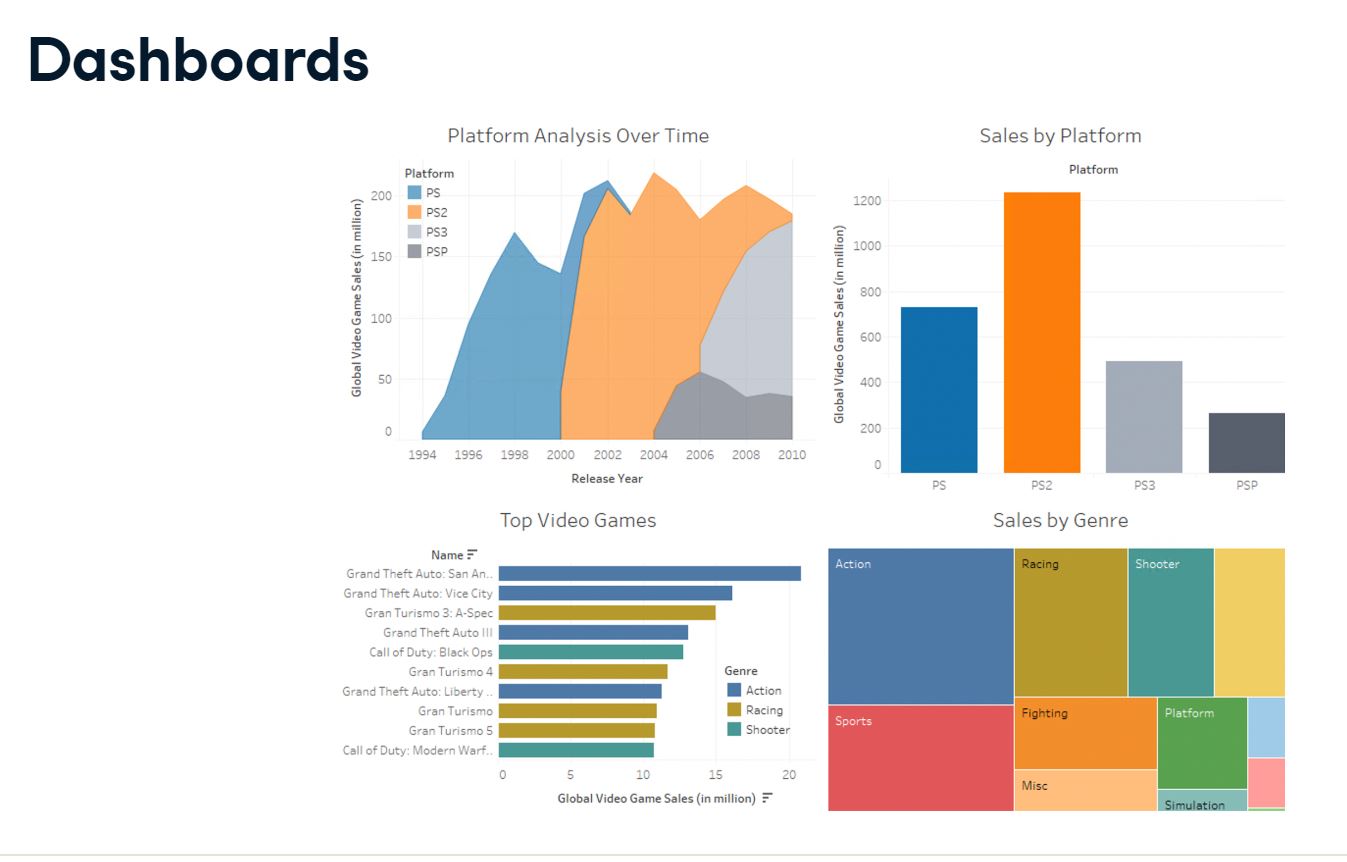
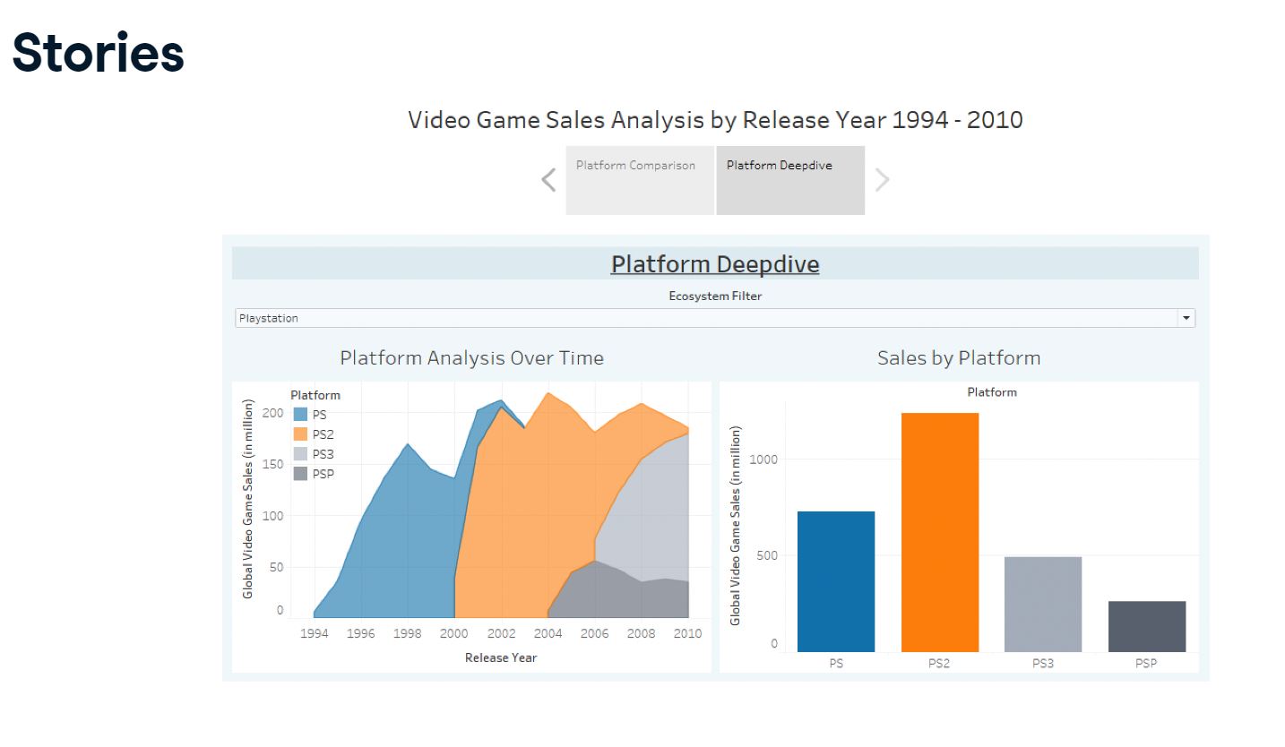
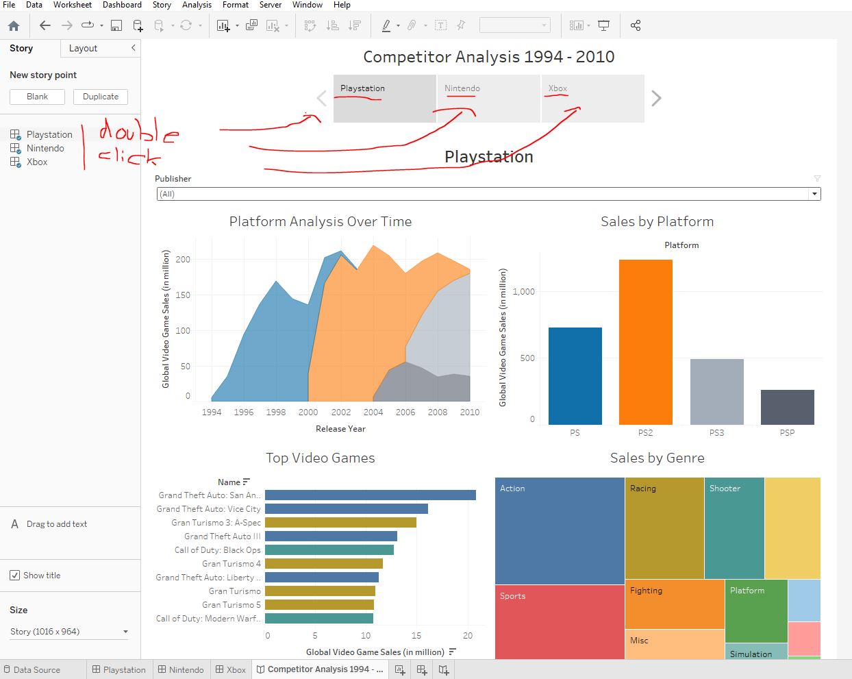
We have been asked to investigate how Playstation video game sales developed over time, which platform was the most popular, and which were its most popular games and genres. Let’s create a dashboard to answer these questions.
4.4.1 Building a dashboard
Load the WorkBook 4_4_first_dashboard.twbx and navigate to the empty dashboard Playstation Overview 1994 - 2010.
Make Platform analysis over time visible on the dashboard, make the legend floating, and add the other three sheets so they appear in a 2 x 2 grid clockwise, like so:
[Platform Analysis over Time] [Sales by Platform]
[Top Video Games] [Sales by Genre]
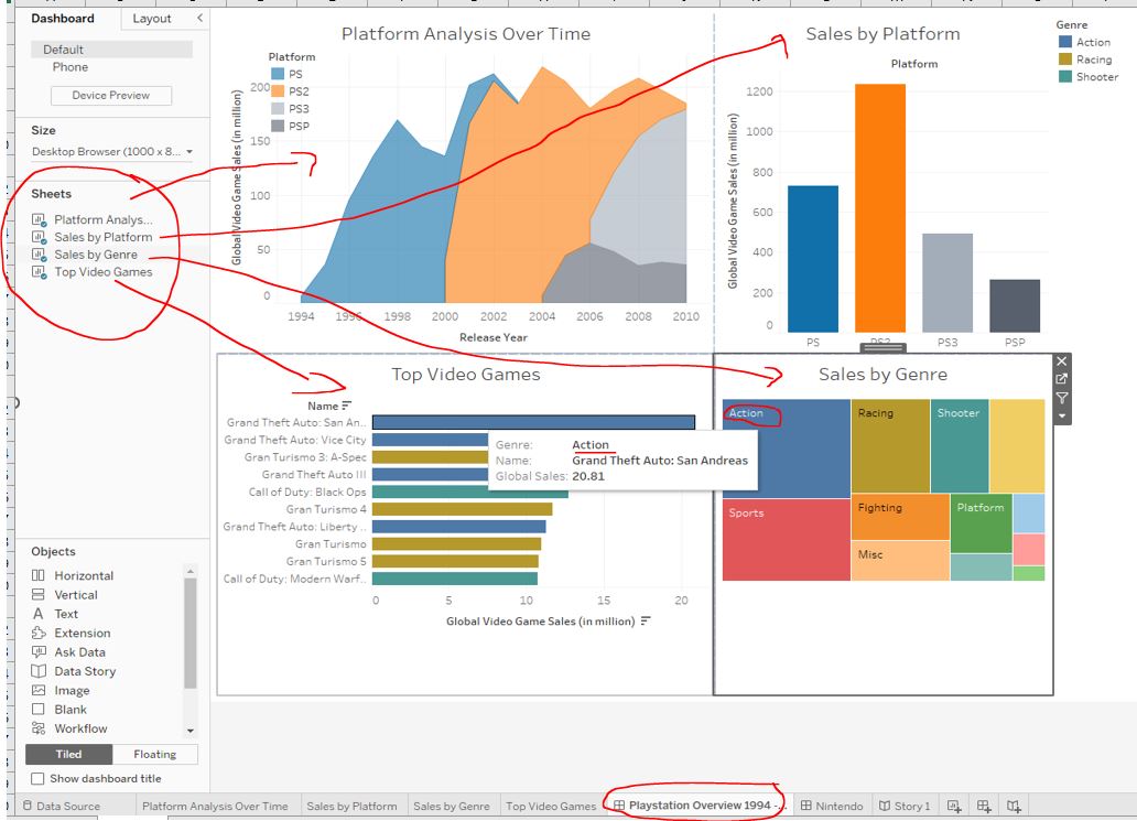
GTA San Andreas, the top selling Playstation game? Is it equal to the most popular Playstation genre?
Action. Yes.
4.4.2 Filters and dashboards
The dashboard is a great start but what if we are only interested in games from a specific publisher (like “Sony Entertainment”) for a particular game? Let’s make this possible by adding a Publisher filter and enabling the Treemap to function as a genre filter.
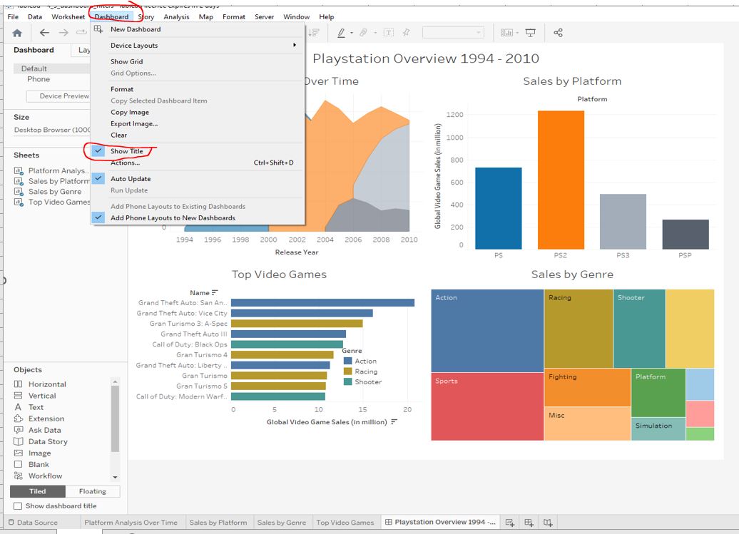
Display the dashboard title, centre it and change the font size to 20 :
Add a Publisher filter, click on any graph and click on Analysis in the toolbar, navigate to Filters in the dropdown menu and select Publisher :
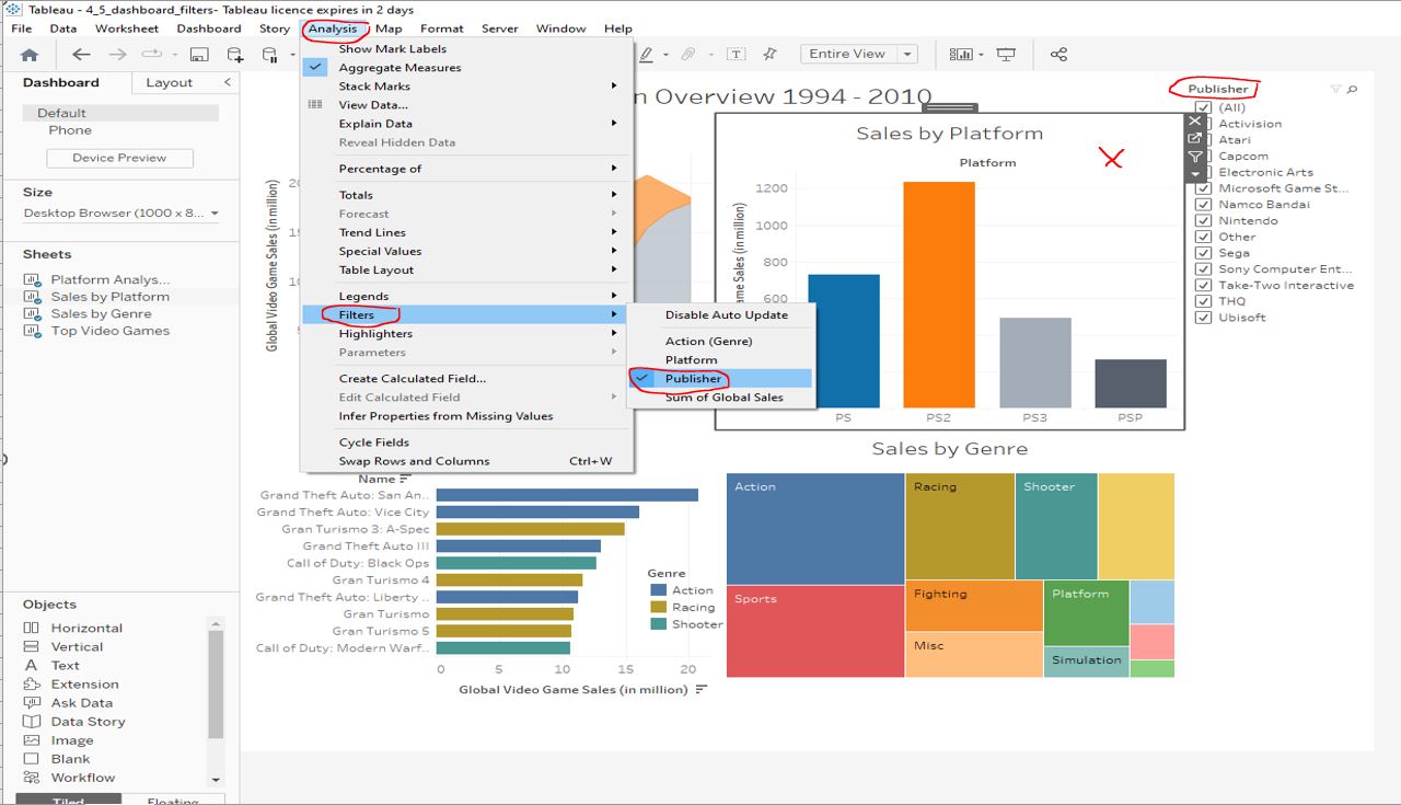
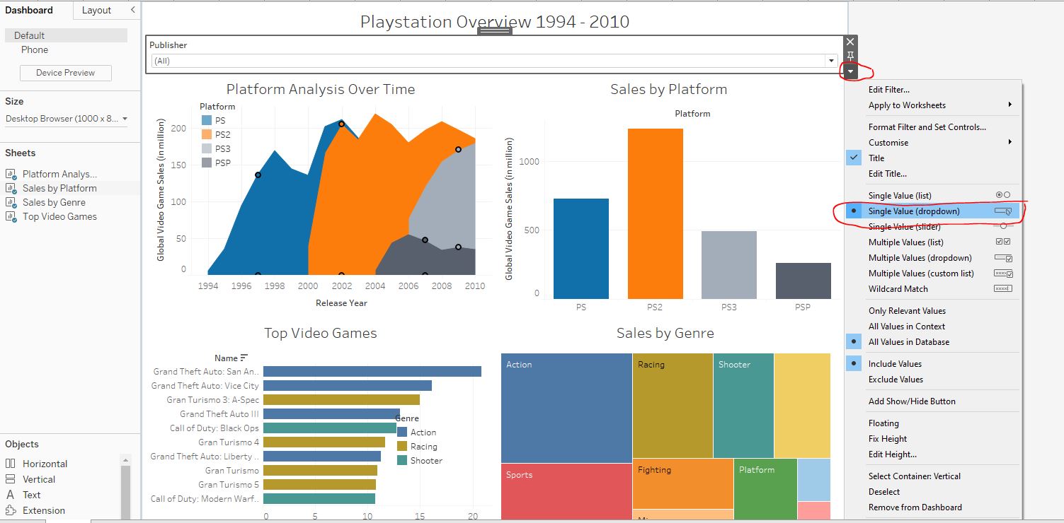
Change the filter style to Single Value (dropdown) and drag the filter below the title without making it floating :
Enable the option to use the Treemap as a filter. Note that the graph on the TOP RIGHT changes depending on how you select your filter(s) e.g. select the genre by clicking on Racing on the Treemap chart in the bottom right, and select Sony Computer Entertainment from the dropdown Publisher filter under the title :
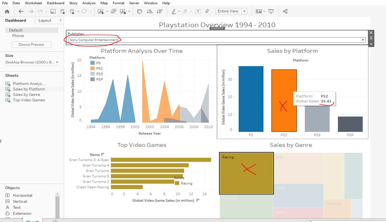
Racing genre?
35.41.
Sopny Computer Entertainment sold 35.41 million units thanks to its success with the Gran Turismo series.
4.4.3 Creating and navigating a story
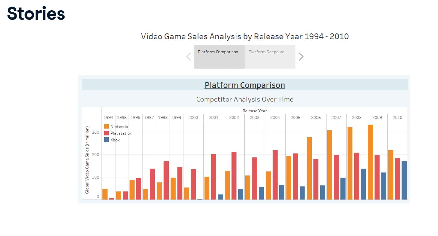
Load the WorkBook 4_6_first_story and create a new story named Competitor Analysis 1994 - 2010. Centre the story’s title :
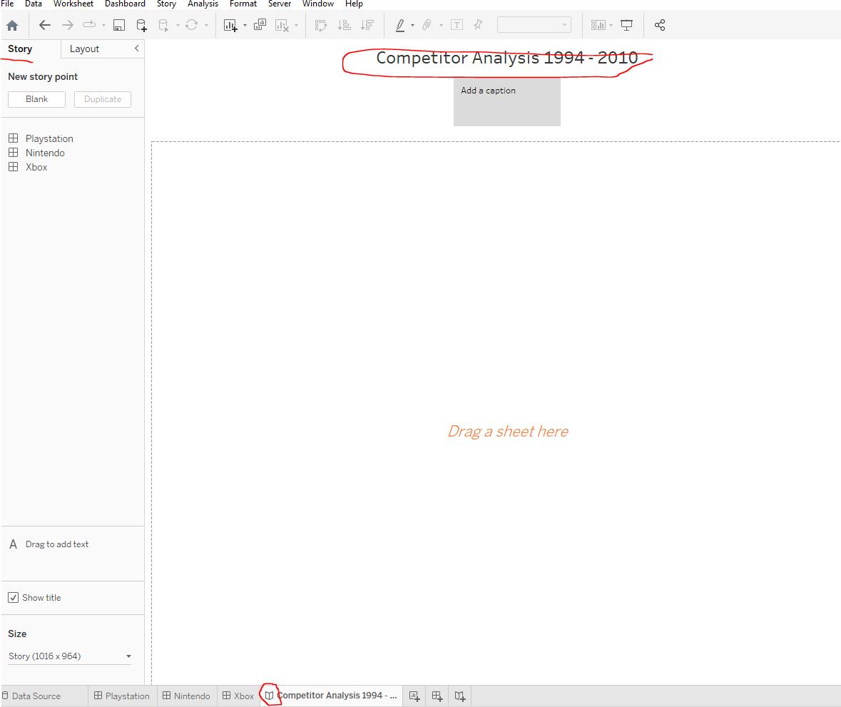
Add the Playstation, Nintendo, and Xbox dashboards to the story. Rename the captions accordingly :
Shooter on both the Playstation(PS) and the Xbox was Call of Duty:Black Ops. On which platform did it have the highest sales? Playstation or Xbox ?
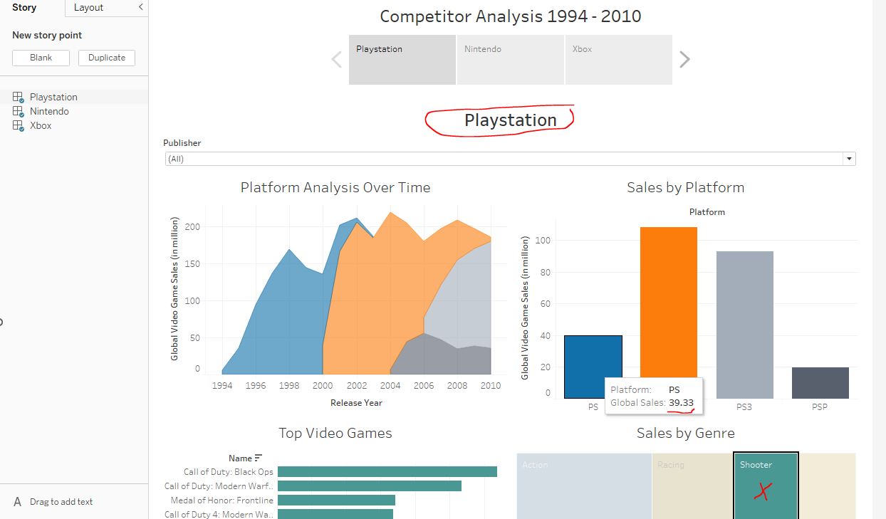
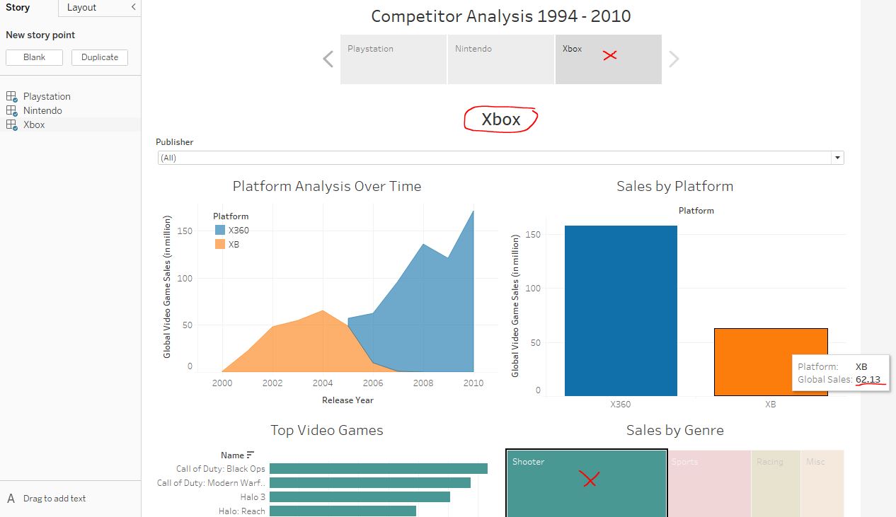
The Playstation version of Call of Duty: Black Ops shifted 39.33 million units. The Xbox version sold 62.13 million.
Electronic Arts in the Simulation genre ?
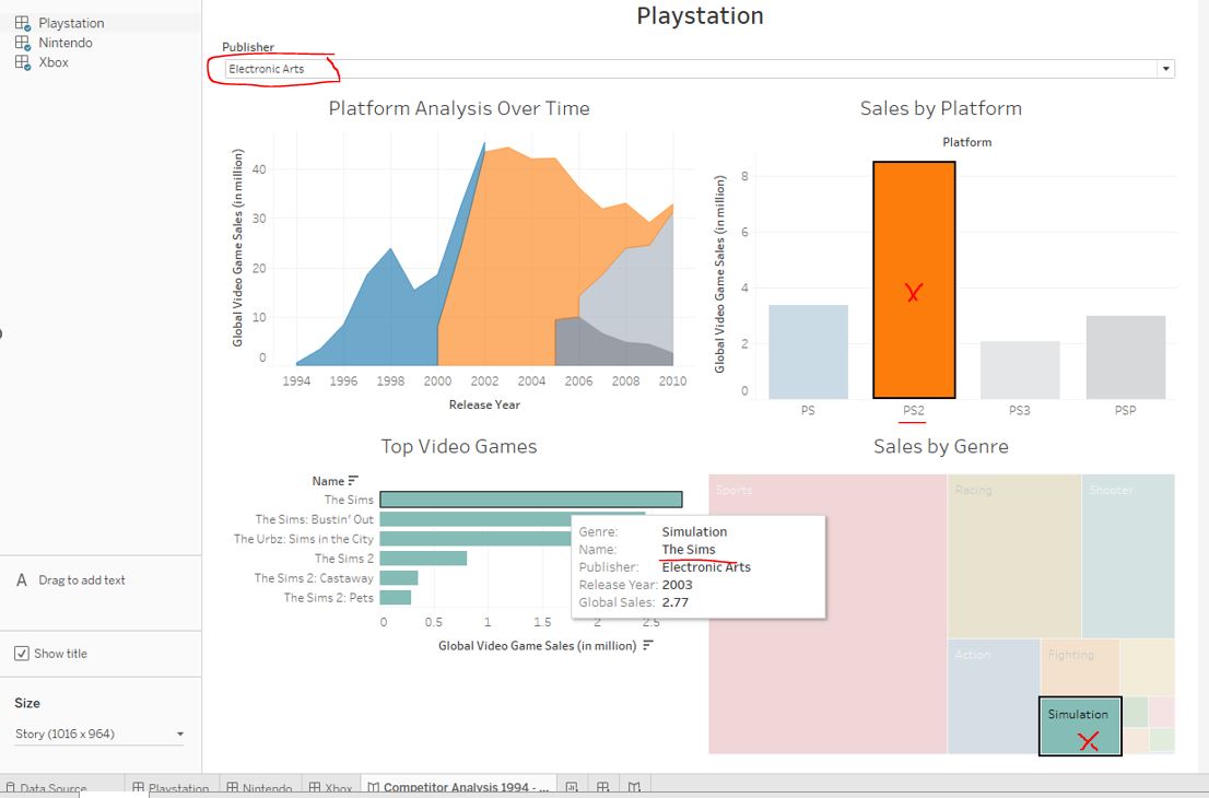
The best selling Simulation genre game on the Playstation 2 (PS2) published by Electronic Arts was The Sims with sales of 2.77 million units globally.
Key Takeaways and Acknowledgements
Thanks to Maarten Van den Broeck, Lis Sulmont, Sara Billen, and Carl Rosseel for introducing me to Tableau.
Section 1
- load data and workbooks and how to navigate the Tableau interface
- build visualizations using stacked bar charts
Section 2
- sliced, diced, and ordered data using sorting and filtering, and aggregation
- created new columns from existing info (calculated fields)
Section 3
- mapped geographical data
- worked with dates
- enhanced visualisations using reference lines, trend lines, and forecasting
Section 4
- how to improve and format our visualizations
- convey findings with Dashboards and Stories